New Charmander and Pikachu Ultra PRO Accessories in 2025!

Water Pokémon Master

I like Pokemon more than you! :p
Webmaster
Elite Member
Advanced Member
Member
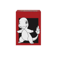
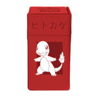
Ultra PRO will be producing new lines of Charmander and Pikachu accessories this year. We don’t know the release date or pricing yet.
Unusually, Charmander’s products display its Japanese name (ヒトカゲ Hitokage). This is the second time Ultra PRO has released a Charmander line.


16595-200x200.jpg


4-Pocket Portfolio


16596-200x200.jpg


9-Pocket Porfolio


16593-200x200.jpg


9-Pocket PRO-Binder


2-inch-Charmander-Album-200x200.webp


2″ Album (Binder)


16592-200x200.jpg


Deck Box


16599-200x200.jpg


M2 Deck Box...

Continue reading...
 
Last edited:
"Yeah, just use the stock art for charmander. What? Pokemon just released it on an ETB a few months ago? Throw some Japanese text on it, that will make it unique!"

"And what about pikachu, sir?"

"Use the same exact render as the last 10 years of releases... but zoom it in and offset it so much that he's barely on there so we can save on printing costs"

Ultra Pro's Ultra Amateur designers
 
the Pikachu one is real "Graphic Design is my passion" vibes from Ultra Pro
At least the Charmander one is kind of a cool colorway + the Japanese text looks kind of interesting on it.
This, except it all applies to both. Japanese text doesn’t make anything more interesting. That’s early 2000 design-thinking.
 
Pikachu not going all the way to the edge of the card sleeve bugs me. They should have either made it go all the way to the edge, or added a border that’s not the same exact color as the background. Even a slight color difference would have looked better.
 
You summoned me?

Loving the Pokédex/non-TCG trading cards vibes from the Charmander merch. I'll probably get a set of the card sleeves to use when I build/print out Charizard/Dodrio/Stall for Prop 15/3 (Fun fact, base set Charizard is actually a viable deck in this most unique of official formats. It's probably a tier 2 deck).
 
Pikachu not going all the way to the edge of the card sleeve bugs me. They should have either made it go all the way to the edge, or added a border that’s not the same exact color as the background. Even a slight color difference would have looked better.
Not disagreeing about it looking weird, but the Play! Pokémon Tournament Rules Handbook does say that the artwork may not go to the edge. A solid black border would have made it look much better.


5.2.2 Card Sleeves
Card sleeves must satisfy the same criteria as the cards themselves with regard to markings and wear. In addition, to be legal for tournament play, all card sleeves within each competitor’s deck must:
• Enclose a single card in its entirety;
• Be the same color/design, condition, size, and texture;
• Have all edges be a single, solid color (i.e., artwork should not extend to the very edge of the
sleeve);

• Be either a single, solid color or an officially licensed Pokémon design;
• Not be reflective to the extent that the faces of cards may be clearly determined from looking at
their surface.
 
"Yeah, just use the stock art for charmander. What? Pokemon just released it on an ETB a few months ago? Throw some Japanese text on it, that will make it unique!"

"And what about pikachu, sir?"

"Use the same exact render as the last 10 years of releases... but zoom it in and offset it so much that he's barely on there so we can save on printing costs"

Ultra Pro's Ultra Amateur designers
It's not that, it's because they are only allowed to use stock images. Granted there are ways to make even the stock images better. But they are still just stock images.
 
Unpopular opinion... I have been enjoying some of the ultra pro binders recently.

My favs have been the Gallery Series, specifically the four seasonal ones, followed by the Shimmering Skyline and Scorching Summit. Also enjoyed the recent pikachu/mimikyu binder.

I don't like the new Charizard one, but the Pikachu one brings me joy and will probably find a place on my shelf.
 
Back
Top