i think these pokemon look pretty cooli'm not goingto take all the credit because it wasent just me who made them. i hade help from light ho-oh,kyle xd001 and then me , if you woud like the names and types for them just ask me and i willl give them to you thanks and i always like what you think of them

You are using an out of date browser. It may not display this or other websites correctly.
You should upgrade or use an alternative browser.
You should upgrade or use an alternative browser.
New pokemon for a new generation? hopefully some will make it
- Thread starter Persianmaster
- Start date
- Status
- Not open for further replies.

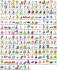
Most of those are really good good job guys. The only one I don't like is the lugia at the bottom.
yeah that wasfor part of our story we were doing then we didnt no if we should put him on. hes ??? type because it was Xd001 who was fused with the ??? plate by giovanni to destroy mewtwo
These are the names and the types for all of the pokemon. Tell me what you thnk about the pokemon and if you like the types i gave for each one thanks
001. RILEAF [GRASS/FLYING]
002. BIRTEE [GRASS/FLYING]
003. BIRDANT [GRASS/FLYING]
004. GRIFLAR [FIRE]
005. FLAMURN [FIRE]
006. BIRESSE [FIRE/FLYING]
007. FLOFAL [WATER]
008. RANZAR [WATER]
009. KYREEN [WATER/ICE]
010. DARCHICK [DARK]
011. GARGUTCH [DARK/FLYING]
012. PYSCHICK [PSYCHIC]
013. HARPAIL [PSYCHIC/FLYING]
014. RAIIUP [ELECTRIC]
015. VOLTIE [ELECTRIC]
016. DRAUSECT [BUG/DRAGON]
017. REGNAD [POISON]
018. EGGMER [POISON]
019. FLAMI [NORMAL]
020. PIFLAM [NORMAL/FLYING]
021. FLAMEGO [NORMAL/FLYING]
022. PHASEY [NORMAL]
023. PHASSIO [NORMAL/FLYING]
024. PHASULT [NORMAL/FLYING]
025. ZIGZIRD [DARK]
026. HAWKREY [DARK/FLYING]
027. WORFLY [BUG/POISON]
028. DRAFLY [BUG/POISON]
029. CAPRE [GROUND]
030. CAHORN [GROUND]
031. CAPRIBEX [GROUND]
032. HASCOST [GHOST]
033. STOMPERIUM [WATER/GROUND]
034. FURYTHE [GRASS]
035. FURCUT [GRASS/BUG]
036. EVOLF [NORMAL]
037. WATEUS [WATER]
038. ZAPEUS [ELECTRIC]
039. FEUS [FIRE]
040. FLOREUS [GRASS]
041. DARKEUS [DARK]
042. ROSINA [BUG]
043. EPHEMAY [BUG]
044. INASITE [BUG/POISON]
045. LIOXIC [WATER/POISON]
046. IBUP [NORMAL]
047. IBOUND [NORMAL]
048. KANBEAT [FIGHT]
049. KANFAINT [FIGHT]
050. SANTER [GROUND]
051. GRENTER [GROUND]
052. SEATOISE [WATER]
053. TRIBERUS [FIRE]
054. DOCSARR [STEEL]
055. MOLARK [DARK/GROUND]
056. QUAKRILL [DARK/GROUND]
057. SPECTRE [GHOST]
058. ABADOST [GHOST]
059. SCARO [GHOST]
060. DRAWTAR [POISON]
061. ARMEEL [STEEL]
062. STEERMOR [STEEL]
063. SPHER [WATER]
064. PIHUNT [WATER]
065. GLARK [ELECTRIC/FLYING]
066. TSUNARTLE [WATER/GROUND]
067. TORROCTAIN [WATER/ROCK]
068. FISHALL [WATER/ELECTRIC]
069. FISHEL [WATER/ELECTRIC]
070. WHIR [WATER/ICE]
071. SENEMI [WATER/ICE]
072. CNIDIN [WATER/ICE]
I love your "Evoltlutions." and Rilfaf. Great work!!! The only thing I would change would be that a could of the pokes look a little "too mean," if you know what I mean.
and Rilfaf. Great work!!! The only thing I would change would be that a could of the pokes look a little "too mean," if you know what I mean.hmmmmm. not that i do. i dont understand. yeah i guess some do look a little meaner than the other series have had but dontyou think thatwe need some meaner looking pokemon . because i think we have to many cute pokemon anyways so why no a fewmean looking ones?
the second sheet is shinies. i need to find the good one but i dint remember where on my computer it is
come on people post on herei want to know what you think about the sprites
the second sheet is shinies. i need to find the good one but i dint remember where on my computer it is
come on people post on herei want to know what you think about the sprites
plz rate them
they are awsome seriouslly thats some good talent
p.s. you quadrouple posted!
p.s. you quadrouple posted!
yeah i know i have no idea how i did that sorry.
170 is the coolest one to me. alot of them seem like they'll bite my face off. XD
They are okay, however, a few don't seem too good.
Mainly the following: 11, 18, 101, 102, 105, 139, and 199.
11 is fused.
18 is just rather odd. The concept is okay, however, the sprite wasn't done well.
101 quite obviously uses parts from Quilava.
102, Typhlosion and the hue shifting doesn't work, plus is apparently absent of and shading.
105, wow! This is extremely obviously fused. Nidoqueen, Charizard, etc.
139 needs more contrast and see all above.
199, Lugia. That is all.
Now these are just the most obvious. On 53 get a unique pallette. About half of them are stiff and overuse dithering, usually at the same time. Only a few wow me. The quality is very inconsistant. If you are using the same style, even with different spriters, the quality should be the same. There a quite a few other not so good ones, but I'll take a lighter note.
37-41 are good Eeveelution subsitutes. 36 doesn't make a good sprite though. Personal favorites are: 68, 81, 89, 153, 172, and 180.
68: Texturing could be done better, but for Pokemon style it is nice. Good use of AA and hue shifting. I love the design.
81: Anatomy is done very well and the shading really defines the shape. Congrats to whoever made this.
89: Uses the limited pallette to his/her advantage. I love the way the lighting is portrayed on the holly.
153: This and 89 were obviously done by the same person. My very favorite of all 203. Once again the pallette is used nicely. The texturing really gives the feel that the wing and the body are very different even where they use the same colors. The pallette is very beautiful and eye-pleasing.
172: The pallette makes me happy. That and the pose is nice.
180: The highlighting is done well and the contrast is very nice. Hue shifts make this pallette nice.
Every one of the above has a great, dynamic, pose. Congratulations to whoever made the ones I showed above and help the one who made the beginning ones improve.
The ones that look a little angry are:
18
49
53
97
98
115
148
149
151
152
199
202
18
49
53
97
98
115
148
149
151
152
199
202
Wichu said:LOL Art thief.
These are from Concorde's hack, Pokémon Battle Fire.
It so is. You fail, Persianmaster. :/
Please don't post in threads older than two weeks. Be sure to check out the Forum Rules.jaycee said:I would like to have a ghost type eevee...
this is my first time here...
this is my creation...
I hope you like it...{M}

*Locked*
- Status
- Not open for further replies.