TCG Fakes Sourtoshi's Image-Based Original and Altered Cards

Nick Sourtoshi

Aspiring Trainer
Member
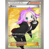
Hey, Just wanted to share some cards that I've either designed or altered. Will add more as I complete them. Tierno took a great level of attention to detail in order to match (at least from what I can tell) the standards of a full art Trainer card. I have a template put together with every item as a separate layer if anyone is interested in using it. I used an image manipulation program called Gimp which is 100% free to create all my artwork.
fullart tierno2.png punkrockbianca.png
 
Last edited:
Moved from the Smeargle's Canvas to the IPOF Forums as these forums are were you should post your original cards. ~bb

It's great to see a new image-based faker, Sourtoshi! I like how you've taken initiative to take the TCG scans and make them into a template to create something new! That's very cool. Most of us will use various resources named "blanks" that have been already created by the community so we don't need to waste time ripping pieces from scans. You may find using these already made blanks will be great, as it gives you more versatility and should be slightly more accurate. =) You may also like to look into resources called "holosheets". These sheets can be used with the right blending modes to make your cards look more real, adding shines and textures to your Full Arts (here is an example of mine). They can take some time to get the hang of, however.

You said that you paid particular attention to detail, and it is quite noticeable! Tierno looks very nice and smooth, not jagged or edgy unlike many other fan-made FA Supporters. There is a few details that you may have missed, however. First off, the border you've got around the card (both Tierno and Bianca) is rectangular and a bit too wide. Secondly, for Tierno, in place of the set numbers you had for Bianca, you should add a promo number (e.g. NS001) like official promos. The promo number is in the font Frutiger LT Standard (you can find a free download of all fonts required for image-based faking on that resources page).

Anyways, I look forward to more of your work, particularly your original cards. Also, in case you are unsure, when you've completed a card, feel free to make a new post rather than just adding it to the OP, as to alert your thread followers of your new works. ^_^

Thanks for your feedback and advice. The extra long frames were due to the method in which the art was obtained. These were all .dds texture files pulled directly from the ptcgo database. They probably used the extra wide borders for an overscan safety net for resolution differences I would assume. I will definitely take a look at these blanks and most likely begin using those instead. Looking forward to posting more soon.
 
Just a heads up I believe there is an inconsistency with the font used on those blanks that were created by paulsnoopes. Looking at specifically the footer text which explains how the supporter card works. I discovered that "a"s appear different when written in italics. (a a). Looking at the blanks they don't match up with the ones I have from the dds files.
fa_trainer_supporterfonterror.png


Also I wanted to share an outline of Shauna that I made which I thought looked really neat. Was going to use it to make a Fullart shauna but decided not to because the regular card uses the same image. The Colorless outline does look pretty neat however and thought it would be a shame to let it go to waste. This entire image was created using only the path tool in gimp. Added a colored version too just because I felt compelled to fill it in.
shauna2.png shauna2color.png
 
Last edited by a moderator:
Snoops' blanks do have some small inaccuracies unfortunately, but they are the highest quality blanks for BW and XY available. Aschefield has old, smaller XY blanks that are virtually accurate (the Basic, Stage 1, Stage 2 bars were created from scratch, and thus have extremely small differences noticeable only on layer comparison). I prefer these over Snoops' blanks. I did just compare some Gill Sans fonts to official cards, and it turns out that Gill Sans Standard is the correct font. It has Gill Sans Standard - it has the proper italicised a and f.

Your supporter footer looks promising, however its edges would need some smoothing as it looks bitsy, and the text is similarly jagged. There is also about a pixel gap between the red and the silver bar on the left, so that'd need a quick touch up. I did just noticed that both yours and Snoops' footer bar is without the shadow on the right that official cards have.
 
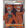
Well here is my first attempt at a foil map card I have been working on. Feedback and suggestions are strongly encouraged! Thanks guys.
fullart grunt.png

Edit:I'm already embarrassed by some obvious missed spots that I didn't catch while editing. (Most notably the effect text)
 
Last edited:
The art's very well done; I love that you made your own! That said, though, I do have a few suggestions––
  • Foil textures are usually a bit ... well, more foil-y. I'm not sure how you're applying the textures (GIMP isn't something I have much experience with), but if you were using Photoshop, I'd recommend overlaying them as a Multiply 50% layer under a Color Dodge 70-100% layer.
  • You could also try applying a holosheet over the card. @Nekoban Ryo has made some brilliant ones, which you can find over at his dA page.
  • Textures also often extend all the way to the borders. The wavy texture you're already using is perfect for that.
  • And last––did you mean to include text? :p
Hope that all helps. Looking forward to seeing more of your work! :)
 
The art's very well done; I love that you made your own! That said, though, I do have a few suggestions––
  • Foil textures are usually a bit ... well, more foil-y. I'm not sure how you're applying the textures (GIMP isn't something I have much experience with), but if you were using Photoshop, I'd recommend overlaying them as a Multiply 50% layer under a Color Dodge 70-100% layer
Thanks, yeah I've been messing around with different filters and effects trying to achieve the foil effect but just haven't quite figured it out yet. Speaking of which, I examined bbninja's example above and I am stunned on how beautifully designed it was. I haven't quite figured out how that foil effect was accomplished but am eager to learn the process!
  • You could also try applying a holosheet over the card. @Nekoban Ryo has made some brilliant ones, which you can find over at his dA page.
Yeh I've tried a couple of holo sheets so far from the resources page but haven't found anything yet that seems to work well for me. (or I'm just not using them correctly. I will admit that everything I know about gimp and photoshop was self taught so I'm sure there are quite a few tools and filters that I am unfamiliar with)
  • Textures also often extend all the way to the borders. The wavy texture you're already using is perfect for that.
Yeh I originally did have it extend out onto the borders but I didn't like how it looked so I edited it out. I will need to play around with the filters a bit more until I can find a texture that I am happy with, but I wanted to showcase what I had come up with and get some opinions on how to proceed.
  • And last––did you mean to include text? :p
Yeah, I've got a bad habit of forgetting to include the text. Need to do a dummy check I guess before I make any future releases :p

Hope that all helps. Looking forward to seeing more of your work!

Thanks I look forward to submitting it!
:)
 
Last edited:
Thanks, yeah I've been messing around with different filters and effects trying to achieve the foil effect but just haven't quite figured it out yet. Speaking of which, I examined bbninja's example above and I am stunned on how beautifully designed it was. I haven't quite figured out how that foil effect was accomplished but am eager to learn the process!

For the textures, I used Overlay at 100% (50% for border + the metal parts of the card). For the holosheets, I actually used seventeen identical copies of Asche's diagonal XY holosheet rotated so the lines were vertical. The only differences was the blending modes (i.e. Overlay, Color Dodge), opacity and clipping masks. For the Gardevoir-EX FA, I used the following (in this list, holosheets at the top were on layers above holosheets listed underneath them):

- a holosheet that covered only the EX symbol. Set to Overlay 100%.
- a holosheet that covered the entire card excluding the text and EX symbol. This layer was above all textures. Set to Hard Light 30%.
- two holosheets that covered only the gold of the EX rule bar. This layer was below the bar texture.
- Top set to Color Burn 5%.
- Bottom set to Overlay 100%.​
- two holosheets that covered only the gold outline of the Pokemon art. This layer was above the gold outline itself.
- Top set to Overlay 100%.
- Bottom set to Hard Light 100%.​
- four holosheets that covered only the Gardevoir art itself (so, not the background). This layer was underneath the golden outlines but above all Gardevoir textures.
- Top set to Color Dodge 55%.
- Middle Top set to Soft Light 60%
- Middle Bottom set to Multiply 15%
- Bottom set to Color Burn 40%​
- three holosheets that covered only the borders. This layer was above the border textures.
- Top set to Color Dodge 70%
- Middle set to Soft Light 40%
- Bottom set to Multiply 40%​
- four holosheets that covered only the background of the card. This layer was below the background textures (yes, the background has textures), the art and the border.
- Top set to Color Dodge 50%
- Middle Top set to Multiply 50%
- Middle Bottom set to Overlay 50%
- Bottom set to Color Dodge 50%​

It probably looks a bit daunting, but it's really not. A lot of what I do is trial-and-error. With the amount of time I've spent holosheeting cards and just playing with blending modes in general, I have a pretty good idea of what each blending mode does. For an example, if I want the image to be darker but want the colours to pop a little, I can use Multiply. Color Dodge and Soft Light are good to place on top of Multiply to lighten the image up but still keep beautiful colours. I use combinations of Multiply, Overlay, Soft Light, Hard Light, Color Dodge and Color Burn; Multiply, Overlay and Soft Light most often.

Anyways, a few tips from me. The first thing is that after you holosheet your piece, the art may look a little washed out. You may need to duplicate the art and put a few blending modes on top of the original, un-filtered piece. I used a Multiply 100% and Soft Light 50% for this Gardevoir. In addition to darkening the image, it also enhanced the colours and make them look really nice with the holosheets and textures.

My second tip would be to experiment and tweak. The specifications I used worked for this Gardevoir, but they would need tweaking or even completely changing for other pieces, particularly darker ones.

My final tip would be not to overdo it. Sometimes I catch myself having 6 or so holosheets right on top of each other on the same part of the art. To be honest, taking away a couple of these sheets can make things look much nicer. Turning layers off and on, and using redo/undo shortcuts rapidly can be really nice to compare.

Anyways, good luck! I'm really looking forward to what you produce.
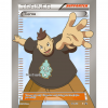
 
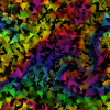
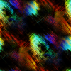
Speaking of holosheets, these are the ones that are used in the online game if anyone is interested in them. They are upside down but I don't think that makes any noticeable difference.

foilmaptriangles2.png foilmaptrangles.png
 
Last edited:
@Snoops blanks, those cards are official ones from PTCGO + that holosheet is again from the online game, but really isn't viable in that form :)
I'm not sure what you're getting at exactly, but your right about the holosheets being from the online game. As stated above that's precisely where I retrieved them from. I would also have to agree with you about the viability of using them to build custom cards because when viewed in game these holosheets are actively scrolling behind a "foil map" of the card. Here is a quick example of one of these foil maps
Full Art Trainer Foil Maps.png (Note: I added the black background to improve visibility)
 
I forgot to quote your supporter post above, so my post had no context lol

But yeah basically his cards are lifted directly from the official game, so any errors that appear to us would actually be missed by Ninty/TPCi, and official ones have stage bar errors anywho, such as being 1 pixel overlapped everywhere on Stage1/2 :)

Mine however are made from scratch, with some rips such as textures and the like. I remove errors like the one mentioned above as they get on my nerves :D
 
Back
Top