I agree. I feel older artists can get away with sneaking some weird off model things in (like the realistic grandma in Mimikyu AR from Shiny Treasure), but it sucks to see how newer artists are railroaded into following the reference sheets to a T. I actually would have preferred the draft Arcanine with the stubbier mane and ears.The cards should be less on model
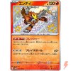
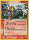
Compare the shiny Enteis. In my opinion the Star's more dynamic angle, edgier line art, and slight goofiness make it more charming than the perfect newer one.