Contest August 2021 CaC: Top Cards (Results Are Up!)

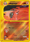
Well, for the past, we’ll, I’m not sure how long, but for at least a month, I have been working on creating a custom e-card inspired template (yes, you heard me right, E-CARD) using CardPone’s Omnium template as a base, incorporating additional elements from Aschefield and IcyCatElf. While the template itself is not yet complete, it is rapidly approaching completion, and this will be my first complete card (indeed THE first complete card) made using this template. A template which, I may add, STILL doesn’t have a name. I’m considering using Latin or something to make a more interesting title, but as most people these days (myself included) aren’t fluent in Latin, it would make the template/series prefix sound more mysterious at the cost of making it illegible.
0A53E1A4-FCA2-4923-9033-E64A6636E76C.png
When I first began designing my CaC, I had planned to create a Flaaffy, and I even had a text fake all ready, but then I changed my mind and decided to make a Magcargo. I still intend to use the Flaaffy text fake later, for a future set project. Anyways, the first effect was the Poké-Power Melting Hunt. I actually have to credit the idea of this effect to Nyora (perhaps I’ll get pinged a few points for not having made up the effect myself, but I guess it can’t be helped). With this power, you can mill out the bottom two cards of your deck, then put a card from your discard pile on the top of your deck. The idea when I set out to create Magcargo’s power was to make a variation of Smooth Over, and when Nyora mentioned this idea it seemed the perfect fit. There is something really important to know about this power; don’t expect to use this effect to save your skin if you mill yourself to death or if your opponent controls you into the ground; you MUST discard two cards from the bottom of your deck to retrieve a card. As for Mix Lava, that attack has gone through several renditions. For one thing, before Magcargo’s current state, it had an attack called Spinning Slime that was almost a carbon copy of the first attack of Raichu from Arceus, only the effect is triggered by a Special Energy instead of a Tool card. At the time I was considering possible interactions with Pokémon SP, but as Picky-BA (or EM-Isthmus on Pokébeach, unless I’m mixing up two people with the same profile photo), pointed out, Raichu couldn’t retrieve a discarded tool to enhance its own attack. As for Mix Lava, it was a rather vanilla attack with the same effect as Pokédex from XY Evolutions that also did damage. The current Mix Lava has a more interesting secondary effect, and one which I hav had a hard time wording. Each player reveals the top card of their deck, and if the cards both have the same name, the effect acts as a dual Trash Exchange, which can allow for all kinds of shenanigans in Control, even if it is rather unpredictable. Mix Lava pairs well with Melting Hunt because Mix Lava can allow you to stack the deck, and if you have some other means of examining the top card of your opponent’s deck, you can be hitting this effect far more reliably. But if mixing up your discard pile and your deck is not to your advantage, you don’t have to activate this secondary effect.
P.S. I had to post this comment before I finished typing it, then edit it, because of a minor technical difficulty. Just so y’all don’t wonder why this comment has been edited. Since I’ve heard that you can edit the card you entered, but you get dinged points for it, and since I haven’t actually edited my ENTRY, only the COMMENT, and have no desire to lose points needlessly.
Sorry, I only just remembered that I never said what era I was balancing this card for (fourth generation, DPPt) or what era’s wording I was using (Sun and Moon).
 
Last edited:
→→↓↓ Then, use your strength to open these spoilers.
regirock_cac.png
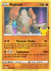
I happened to see some of the Celebrations cards and I noticed that both Kyogre and Groudon had an attack that interacted with the top cards of the deck, so I thought it would be fitting to do a similar card in the style of Celebrations with another Hoenn Legendary.
Regirock's first attack, Mountain Climber, is named partly after its species, the Rock Peak Pokémon, and the move Rock Climb from which the attack's effect takes some inspiration. It does a meager 60 damage, but if you choose to return Regirock to the top of your deck, it will leave the opponent Confused. Worth noting is that Regirock and all its cards are along for the ride, and you can sort them as you like. This can be utilized in a number of ways, such as having easy access to a Twin Energy or Pokémon Tool that was attached to it next turn for a Regirock or other Pokémon on your Bench, or putting an Energy on top of the deck to combo with Coalossal VMAX. Its main damage dealing attack would be Superpower, which can do up to 160 damage at the cost of 70 HP. With a Vitality Band, it's even possible to OHKO Eternatus VMAX!
At 130 HP, a Cape of Toughness brings it up to a respectable 180 HP, keeping it from getting Knocked Out by a number of VMAX attacks. As a Fighting-type Pokémon, it can supplement this bulk with Stone Fighting Energy, or perhaps Zamazenta V's Growl of the Shield Ability from Celebrations. Overall, Regirock is a versatile card that could be the basis of a single-prize deck or a support for a larger Fighting-type deck that appreciates the resource management it brings.
CRE Liepard V ("You may put this Pokémon and all attached cards..."), CRE Expedition Uniform ("...on top of your deck in any order."), SUM Bewear (Superpower), VIV Regirock ("This Pokémon also does... damage to itself.")
 
Kartana_CaC_2.png

This is certainly a bit of a weird one.

I had a very interesting idea for an effect to put on this. As is with most of my ideas, it evolved into the monstrosity you see before you. I am really digging the asymmetric, border-popping look to it. At this point, I am starting to care less about remaining conventional with my visuals and I just want to try to push into weird territory. If my score takes a blow as a result of this, that's totally okay. I can't really explain my decision-making process that led to the card doing what it does, it just sorta happened.

I had a lot of references for this but I can't find them... plus I am sleepy. Goodnight everyone!
 
That's a slightly-late wrap on submissions! Stay tuned for judging at the end of the month!
 
I am sorry I would have to drop out of this one. There is something wrong with my photoshop license and it can run. It's a shame that I got a really really neat piece of artwork and I can't use it. Best of luck for all the participants in this round!
 
Image-Based Results

Judge: @Jabberwock

It’s been really great to see so many faces around CaC lately! If you’re new to the contest, welcome! If you’ve been around for ages, welcome back! And if you’re poking around this thread, thinking you might enter in some future month, don’t hesitate to join us! We’d be glad to have you.

There’s some administrative business to mention for this month, but I’ll put it in a spoiler for brevity:

We’re back after our one-month hiatus, and you might have already noticed some restructuring around the competition. Two of our team, The Ωmega One and 47bennyg, have decided to step down from their positions for the time being, leaving myself and PMJ as the two remaining judges. We’re confident in our ability to keep things running around here, but it’s going to mean a few changes moving forward.

First, as you saw in this round’s OP, we’re requiring that people sign up in the first week of the month. You still have the rest of the month to submit, but requiring early sign-ups helps us know how much scoring we’ll be doing at the end of every competition. This lets us plan accordingly and get results out to you as fast as possible.

Second, starting next month, CaC will be moving back to a bimonthly schedule — that is, the next round will be posted on September 1, you’ll have until September 30 to submit, and then judging will be completed as soon as possible in October. The next rounds after that will be posted on November 1, January 1, etc. This is both to help entrants avoid time crunches by allotting an extra week for submissions, and to help us judges avoid burnout. We know this might be an unpopular decision, but it's the best one for CaC's long-term future.

Third, on a happier note, CaC’s tenth anniversary is coming up! In October 2011, CMP posted the very first Create-a-Card competition on PokeBeach, and ten years later we’re still going strong. Keep an eye out for some celebratory events, themes, and miscellanea coming up over the next few months.

And with that out of the way, let’s get on to this month’s scores. Congrats to all of you on your work this month — it was a pleasure as always to judge. :)

~~Jabberwock


Xerneas_CAC08.png


Beautiful choice of art — as with all of Xous’s non-Sugimori stuff. I don’t think I’ve seen this particular piece used since the man himself put it on a Pokémon LEGEND, but it definitely works on a pseudo-borderless Full Art card like this one. My one gripe with it is that Xerneas feels weirdly small, like there’s a lot of empty space around its head that doesn’t really add much to the card. You probably could have afforded to upscale it more, potentially even to the point of its nose almost reaching the name “Xerneas”.

The effects are neat; after struggling through the wording on YGO’s Ma’at, I definitely see what you were going for. The two cards are extremely similar, but in this instance I don’t think I have a problem with that. You’ve taken inspiration from another game, adapted it to Pokémon, and clearly considered the ramifications of how it might play. The core idea may not be wholly original, but there’s some solid creativity there nonetheless.

Does it pull through without being game-breaking? That’s a more complicated question. We’ve seen card-draw Abilities on Basic Pokémon to a surprising extent in the SwSh era already, from Zacian V to Kricketune V to Oranguru, but they’re all either quite difficult to use or entail really huge drawbacks, such as ending your turn. With this one, it’s both extremely powerful and quite easy to use, with the biggest drawback being losing something you didn’t mean to lose just then.

Let’s say you’re playing any deck, and you need a combination of three particular cards this turn in order to pull off your three-Prize-winning attack. (Not an unreasonable assumption in the SwSh era.) Then let’s say you have four Xerneas in play. Provided you have those three cards anywhere in the top twelve cards of your deck, you can simply activate the Ability four times, naming the same cards each time, and you’re going to get them. Sure, you may have discarded up to nine other cards in the process, but who cares? You’re halfway to winning the game! And you can even mitigate the discards if you happen to see any of your three combo pieces earlier than the fourth activation — then you can switch that card’s name in your future activations to some other card you don’t want to lose, and be assured you won’t discard that one if you see it.

I’m sure it’s easy to see how this could be game-breaking. It’s a huge consistency boon for any deck that can spare the Bench space for it, to such an extent that they could probably afford to cut their other consistency cards like Crobat V. SwSh games are already very simple; it’s just a matter of finding the key cards on every turn to take your Prizes as fast as possible. With an Ability like this, the question is how you ever wouldn’t find those key cards. At that point the actual steps of the game are basically a formality.

And that’s not even taking into account the attack. I’d say it’s fine if there were no way to know the top three cards of your deck, but you even mentioned Expedition Uniform in your notes, so I know you must have been thinking about it. It makes the full damage output about as reliable as you could want, and 2-for-240 is a lot of damage, even for SwSh. That’s top-tier VMAX levels of power.

Still, solid concept overall — this particular YGO effect just needs a little more refining to balance it for a game as fast-paced as Pokémon. And again, beautiful art.

Wording errors:
- The “(before your attack)” clause got phased out with the beginning of the SwSh era — cards these days just say “Once during your turn, …” [-2 points]
- “Then,” isn’t necessary; the last line of the Ability should just say “Discard the other cards.” [Zacian V, Charizard VIV, Hapu]
- The rest of the wording looks fine to me. New effects are always tricky, but I reckon you did well here.

Fonts and Placement errors:
- Looks fine. I’d be concerned that the Ability/attack text wouldn’t be properly vertically centered in the frame if the blank weren’t Full Art, but there’s nothing to suggest that a non-FA version of this card would even exist, so you get a sort of GX/V pass here. :p

Creativity/Originality: 13/15
(Neat concept; I like the reworking of a YGO effect. Unfortunately I think it’s just a little bit too similar to the original to get full points here, but bringing new design space into Pokémon is always cool nonetheless.)
Believability/Playability: 8/15
(The attack is only a little overpowered, but the Ability, and the unrivalled consistency it brings to a format where games are already pretty linear, is game-breaking.)
Wording: 7/10
(Broadly good, but with a couple of simple mistakes. References are useful even if the effect is brand-new — they keep you from forgetting stuff like omitting the “before your attack”.)
Fonts and Placement: 5/5
(Looks fine.)
Aesthetics: 4/5
(Beautiful choice of art; it works perfectly with the pseudo-borderless FA Omnium blank. One point docked here because I reckon the art could have done with a fair bit more upscaling.)
Total: 37/50
99-5-png.16039


There’s been a million takes on Ditto as a move-copier in the wide world of custom cards, but I don’t think I’ve ever seen one that uses the top card of the deck before. It’s a unique way to balance effects that allow Basic Pokémon to use the attacks of higher-Stage Pokémon, which ordinarily can be format-warping (see Mewtwo & Mew-GX). This particular iteration forces the player to have some additional setup cards, like an Oranguru SSH–style Ability to stack a Pokémon on top of the deck, and I think that extra step helps balance it.

All in all, it’s an innovative take on the top card mechanic we asked for this month. Granted, it’s pretty much exactly what I’d expect if somebody said the words “Ditto” and “top card of the deck” together in a sentence, but there’s still some real creativity there in getting from the brief to the product.

That being said, you mentioned having almost no time — and unfortunately, it shows in the card. Most of the important fonts are off, the wording looks like it hasn’t had much proofreading at all, and the art, while cool in its own right, isn’t super fitting for a Pokémon V. Even cutting out the Ditto and having it overlap the border would have gone a long way. If you’re pressed for time, asking for help with wording in the Discord can get the most egregious mistakes out of the way and bring your score up somewhat. If you’re really pressed for time, a high-effort card like a Pokémon V might just not be the way to go.

Wording errors:
- “turn” shouldn’t be capitalized. [-1 point]
- “Active”, as in “Active Pokémon”, should be capitalized. [-1 point]
- “Pokémon” needs an accented “é”. [-1 point]
- “you can look” -> “you may look”. [-1 point]
- “If it’s a Pokémon”, not “If it’s a Pokémon card”, per Poké Kid. [-1 point]
- “this Pokemon can use one attack that Pokemon knows” is incorrect. There’s a couple things you could do here that I’d probably accept — my favorite, for how brief it is, would be “choose 1 of that Pokémon’s attacks and use it as this Ability”. But using attacks as Abilities has no precedent, so you might also want to include something more, like “choose 1 of that Pokémon’s attacks and apply all effects of that attack, including damage, as effects of this Ability”. Which is clunkier, but might be more accurate. [-2 points]
- “(You still need the necessary Energy to use each attack.)” should be italicized, since it’s reminder text. If you go with one of the options in the previous bullet point, though, you would delete this text entirely and replace it with something like the text on Kecleon PLF’s Imittack. “This action counts as an attack” isn’t necessary. [-2 points]
- The only case in which you wouldn’t discard the card is if it’s a Pokémon and has an attack that you could use, but you choose not to. It feels weird for that to be the only exception, but either way you need something to say what happens to the card in that case. Does it go back to the top of the deck? Your hand? Shuffled in? [-3 points]
- The second-to-last sentence should read something like “If it’s not a Pokémon, if this Pokémon used an attack from it, or if this Pokémon couldn’t use an attack from it, discard that card.” [-2 points]

Obviously this is a lot, so the better question might just be “What would it look like if worded correctly?” The answer turns out to be kinda complicated if you’re going for the exact same effect (i.e. not discarding the card if and only if it’s a Pokémon and you choose not to use an attack that you otherwise could use). But you can make it drastically simpler quite easily with only a few small changes:

[C] MV-Transform
Discard the top card of your deck. If it’s a Pokémon, you may choose 1 of its attacks. If this Pokémon has the necessary Energy to use that attack, use it as this attack.

[References: Magcargo-GX, Poké Kid, Kecleon PLF]

Now it’s an attack, not an Ability, and the card gets discarded no matter what, but we’ve achieved virtually the same effect with only like half as many words. Going for brevity over complexity where possible is usually a good idea, especially in the SwSh era.

Fonts and Placement errors:
- The name font (“Ditto”) is off; it should be Gill Sans Bold or Gill Sans Bold Condensed (either one might require some additional horizontal compression). [-1 point]
- The Ability text font is also off, and should be Gill Sans Regular. [-1 point]
- The bottom (bottom-left) text is off too, most noticeably the Illus text. It looks like you might be using a lighter version of the font? It should be Futura std Bold Oblique, iirc. [-1 point]

Creativity/Originality: 11/15
(It’s about what I’d expect from a Ditto V in a contest where the brief is “make it care about the top card(s) of the deck”, but it’s interesting new design space for a Ditto nonetheless.)
Believability/Playability: 14/15
(On the merits of the effects alone, I don’t have any trouble imagining this being printed. Docking a cautious point for the Retreat Cost being unusually low.)
Wording: 0/10
(See notes on brevity versus complexity above, and keep an eye out for simple mistakes like forgetting an é. There were lots of errors, but we don’t go below 0 here.)
Fonts and Placement: 2/5
(A few font errors.)
Aesthetics: 2/5
(I like the art for what it is, but I don’t think it works so well for a Pokémon V.)
Total: 29/50
illumatrix-png.16041


Lol okay, solid mon, solid concept. I’m sorry to say I’ve never heard of Pokémon Clover and generally don’t know too many popular Fakemon, but I’ve got nothing against them in principle. Clearly you’ve paid attention to the Pokémon’s lore and in-game attributes and crafted a card that fits them accordingly, and I can’t ask more than that.

Anyway, it’s certainly a potent control card — if you were going for an effect “that could be oppressive in the right deck”, I don’t think anybody could disagree that you succeeded. The combination of controlling your opponent’s next several topdecks along with knowing what’s in their hand at all times is hard to beat.

Anytime a single card can come that close to establishing a perfect lock, it’s cause for concern. TPCi has banned cards for establishing locks much less perfect than this one. As you know, it’s all about information — and here, knowing every single card they’re going to have access to on their turn is just … well, oppressive is the right word for it. I get what you mean about there being a lot of shuffle and draw effects in SwSh, but with Eye of Providence you’re never in doubt about whether or not your opponent has one. All you need is to get them into an unplayable hand once in a game and they’ll never be able to come back from it.

The main thing that makes it just “worrying” and not “game-breaking”, imo, is that it’s a Stage 1 that needs three Energy to attack. But even then, you don’t necessarily need to attach all those Energy for the card to start being oppressive — just knowing your opponent’s hand at all times is huge. You could have Illumatrix on your Bench, get lucky off a Marnie, and attack with a boring Future Sight user like Lunatone DAA to establish a lock as early as turn two. Then later in the game, once you’ve powered up your Illumatrix, you use Twist Fate, plan out exactly how your opponent’s next several turns go, and then what? You don’t even have to keep attacking with Illumatrix if you can dig 8 cards deep — just Twist Fate once and then start walloping them with something bigger, and they can’t do anything about it.

It’s a cool concept, and I like takes like this on control archetypes, but I think it needs a bit more work to be balanced. Control’s always a fine line to walk.

Wording errors:
- Looks good.

Fonts and Placement errors:
- The kerning of the HP looks off; this is a known problem, where TPCi’s numerals for “110” have the 1s closer together than Futura would normally put them. (Compare to cards like Slurpuff CRE.) In Photoshop this can be fixed by changing the kerning from Metrics to Optical, but in other programs it might require simply making two separate layers for the HP (a “1” layer and a “10” layer) and moving them closer together manually. [-0.5 point]
- The Pokédex text font looks wrong too, specifically the middle bars on the uppercase E’s, which look too high to me. The correct font is something like Optima Medium, iirc. It’s not noticeable enough to dock points for here; just something to look into for next time. [-0 points]

Creativity/Originality: 12/15
(Solid self-synergy. Even if the information-gathering effects aren’t too different from Abilities and attacks we’ve seen before, I like the adaptation of old Future Sight–style effects to make a more broadly playable and even self-contained archetype.)
Believability/Playability: 10/15
(Unfortunately it edges too far into oppressive territory; it only needs like one or two other cards and a little luck to lock your opponent out of the game from fairly early on. Control’s hard to balance. Also, while I get that the dex entry and the evocon are taken from the actual fangame Illumatrix is from, I have to dock a couple points for them too on the believability front, since this contest’s rubric adheres to conventions laid out by TPCi and not the makers of Pokémon Clover.)
Wording: 10/10
(Looks good.)
Fonts and Placement: 4.5/5
(Watch the 1s in the HP.)
Aesthetics: 5/5
(Nice blending of the Sugimori-style art with the subtle glow and the background. I rarely give perfect scores here for cards without holosheets or some other “wow” factor, but the construction of the art alone is actually some really solid work, and the card overall looks crisp and credible.)
Total: 41.5/50
deppgz5-45b384b5-510b-4f0f-8287-0739cfc743b6.png


Fairly straightforward, but elegant in its simplicity. You take some cards from the top of your deck, rearrange them, and if you see at least three of the same type of card (probably Trainer) then you can pull off a 3-for-200 attack. The top 3 cards will all go into your hand, but the other cards stay on top, meaning you can get a neat sort of delayed bonus by fixing your topdeck for the next turn.

There’s a few things going into its balancing, and intentional or not, I like them. For one, 3-for-200 might be a lot of damage in some contexts, but this is effectively a Stage 2 that can’t be cheated out with Rare Candy. That might even have made it underpowered for a multi-Prize Pokémon in SwSh, but then you also get to draw a bunch of cards from it, which definitely boosts the power level if Abilities like Zacian V’s Intrepid Sword are anything to go by. You can also use the attack for just two Energy attachments if you’re playing in a format like Expanded where DCE is available, but then you can’t dig so deep with the Ability, meaning you’re likely to be doing just 100 damage and drawing a few cards for those 2 Energy. But that’s nothing to laugh at; 2-for-100 is still plenty useful in a pinch!

Relatedly, I like the similarities to Lucario-EX’s Corkscrew Smash in the damage-plus-card-draw effect of the attack. It’s cool when similar-yet-different effects come back on the same Pokémon.

The art, blank, and holosheet all work together very well; it’s a visually impressive card overall, and fits in well with the other cards I’ve seen from you in the past. I’m not so hot on the Pokémon-BY mechanic, but that might just be because it doesn’t do anything too far out of the ordinary. Whatever else there is to say about it, it’s certainly believable.

Wording errors:
- I feel like your “double” in the Ability should be “twice” instead, but my only reference to back that up is Blaine’s Gamble, and who knows how TPCi would word it 20 years later. The OED accepts either word in this context, so I’ll allow it. [-0 points]
- It’s unclear to me from your notes whether Pokémon-BY are supposed to be able to use the attacks/Abilities of their previous Evolutions the way Pokémon BREAK and Pokémon LV.X can, but if so, there needs to be a Rule Box to that effect on the card. No points docked because I’m going off the card alone and not making an assumption about what you might have meant.

Fonts and Placement errors:
- Nothing too weird. Your blank, your rules.

Creativity/Originality: 13/15
(Straightforward, but elegant. Its creativity comes from things we’ve seen before done in fresh new ways, and it works. The last couple of points here would come from something to branch out from its relative linearity, offering the player more choices or creating more unique gameplay in general.)
Believability/Playability: 15/15
(As discussed above, it has a lot of things working in tandem to make it quite well balanced. I’d be fascinated to see how it plays out in a real game.)
Wording: 10/10
(A couple of quibbles but nothing to dock for.)
Fonts and Placement: 5/5
(Your blank, your rules.)
Aesthetics: 5/5
(Nice blank, nice art, nice holosheet. Looks believable and yet unique, which is a great balance for custom blanks to strike.)
Total: 48/50
uc


Ohman, way to hit it out of the park once again, Nemes. Your proclivity for diving into unexplored types of cards is always a delight to see in action, and SwSh-era Secret Rares are no exception.

I know the concept for this card has gone through a few iterations from following along with the conversation on Discord, but I think it’s ended up in the best possible place it could have. It’s an ingenious take on this theme — it brings in new design space in the Ability’s activation clause, skill-testing decisions as you pick your Conjure targets each turn, and fantastic gameplay potential in the mind games you can force depending on what you pick.

One of the things you mentioned worrying about was whether it was enough of a staple to deserve a Secret Rare card. I think it manages that to a tee for a certain type of deck — any archetype that aims to play out of the discard pile, such as discard-based Energy acceleration like Malamar FLI, would surely love to play a Mimikyu or four to help it set up. Grab a card you want in the discard pile, plus a powerful card like Professor’s Research to sweeten the deal, and entice your opponent into discarding them both. Then you can do the same thing on the next turn, but grab another powerful card you want in your hand as a topdeck for the turn after. Overall a very neat trick, and one that I could easily see being an asset to any metagame it was introduced to.

What more is there to say? I love the card. You’re always very good with both your aesthetics and your effects, but I think this is something special even for you. Well done.

Wording errors:
- Per Mallow, you’ve got one too many uses of “your deck” in the second sentence of the attack — it should just read “put those cards on top of it in any order”. [-1 point]

Fonts and Placement errors:
- Pixel-perfect.

Creativity/Originality: 15/15
(Intriguing new design space, excellent gameplay potential, skill-testing in a great new way — this card has it all. It’s not an every-deck-in-format staple, but it carves out a niche for itself and fills it beautifully. There’s not a thing I would do differently.)
Believability/Playability: 15/15
(The eternal question for effects that rely on your opponent making a decision, effects that so often present barely any decision at all, is how far you can push the opponent toward one option or the other. I think this card provides some great opportunities for that, depending on what you Conjure up as a choice for them. So I would say it is playable, and well balanced at that.)
Wording: 9/10
(One minor error. I’m generally somewhat lenient about stuff getting replaced with “it” or vice versa, but there’s a recent perfect reference for this one, and when scores get this high I get nitpicky anyway.)
Fonts and Placement: 5/5
(Pixel-perfect.)
Aesthetics: 5/5
(Outstanding, and all the more impressive considering how many of these resources you made from scratch this month. Truly a testament to some incredible faking prowess.)
Total: 49/50
igVOHv6.png


A duo! We so rarely get duos anymore, it’s great to see you two teaming up. It’s clear you each brought your own separate talents to the card like Vom’s trademark seven-line Abilities lmao Seriously though, props for communicating well, forming a solid partnership, and producing a solid entry out of it. That ain’t easy to do.

True to Porygon-Z form, this card’s a gimmicky one. Essentially it’s a Pokémon-GX that doubles as a free DCE if you’re lucky enough — or play enough deck-stacking resources — to draw it as your topdeck for the turn. This has the potential to be quite scary, given that effects like this don’t count as your attachment for the turn unless you explicitly state that they do. You can’t use more than one Up-Grade in a turn except under super specific circumstances, but even still the potential to attach multiple additional DCE for free over the course of the game is a little worrying.

It also has a nifty GX attack that might see some situational play. The trouble with this GX attack is the huge amount of hand disruption effects that would render it not only useless, but actively detrimental after just one turn. Can you imagine using Early Access and then immediately getting your hand shuffled away with something like Reset Stamp? Not only are you down from a monstrously big hand to a pitifully small one, you’re still under the attack’s restriction — you won’t be able to draw for turn for the rest of the game. You can Early Access again to draw a new hand, but what if they Knocked Out the Pokémon Porygon-Z was attached to? For all intents and purposes, you’d be stuck with that new tiny hand.

To be clear, I like the concept behind the GX attack. I like the concept of front-loading all your draws for the game at the cost of an attack, and it’s got some interesting anti-synergy with the Ability in that you can’t use Up-Grade anymore after using Early Access. I think it would work fine in a format without any hand disruption. But formats like this are virtually non-existent in the TCG’s history, and that has to be a factor when designing effects like this.

The art is nice; I’m a fan of Volmise’s work. I’m not sure this particular piece really fits the GX vibe, though — it’s a hard thing to get right, but as a general rule anything too pale or too flat will stand out and look out of place. I also like to see holosheets on cards like Pokémon-GX, and there’d be very little room for that on this card. Keep poking around for art, and take a look at the art on other GXs, both fanmade and official, to get an idea of what I mean.

It’s definitely solid work overall, though. Congrats again on producing this as a team.

Wording errors:
- “While attached in this way, this card provides [C] [C] Energy” -> “This card provides [C][C] Energy only while it’s attached to a Pokémon”, per Charjabug UNB. [-2 points]
- “Draw 10 cards, then …” -> “Draw 10 cards. Then,” per Kahili and TV Reporter. [-1 point]
- “you do not draw” -> “you can’t draw”, per Luvdisc FLF. [-1 point]

Fonts and Placement errors:
- The name and HP are both a few pixels too high. [-0.5 point]
- The Ability name is too dark. There’s some leeway on this since not all scans agree on the exact color, but this one is definitely a darker red than I’d ever expect an Ability name to be. [-0.5 point]
- The font for the Illus text is too thick; iirc the correct one is Futura std Bold Oblique. [-1 point]
- I believe the vertical spacing between the lines of your Ability/attack text is too much, but it’s not noticeable enough to dock for. Just remember to make sure it’s always the same point value as the font. [-0 points]

Creativity/Originality: 13/15
(I like the concept; it’s unique and feels very Porygon-Z in flavor. Taking an advance on your card draws and then sacrificing all the rest of your draws-for-turn for the rest of the game is some design space I don’t think I’ve ever seen explored before. There’s a couple of choices I question, like why you should have to discard a card for each of your Benched Pokémon-GX, or why the anti-synergy with the Ability is necessary, but overall it’s certainly an intriguing concept.)
Believability/Playability: 12/15
(Unfortunately the balancing is off; the Ability seems just a bit too good and the GX attack just a bit too bad. See above for details. In both cases I think they’re fixable without having to rework the whole concept, though.)
Wording: 6/10
(A few errors.)
Fonts and Placement: 3/5
(A few very minor errors; watch out for these.)
Aesthetics: 2/5
(Not too shabby; I particularly like that you cut out the horn on Porygon-Z’s head to make it overlap the border. The art doesn’t really fit a Pokémon-GX, though, and that’s costing you some points here.)
Total: 36/50
0a53e1a4-fca2-4923-9033-e64a6636e76c-png.16067


I wanna start off by complimenting you on your drive to finish these blanks — custom blanks can be a daunting project, but you persevered and got it to a place you’re happy with, and that’s truly commendable. What’s more, they look pretty solid! A few things aside, which I’ll get to, this card showcases a neat blend of e-cards and Omnium, and you should be proud of having made it to this point.

Some things I like, in no particular order:
  • It keeps the e-card aesthetic but maximizes space. The border is slightly diminished in size, and that allots more room for effect text.
  • The border looks clean. There’s a couple of rough patches around the holes in the left-hand side, but overall it looks well made.
  • The placement of all the stuff on the bottom looks well organized. I especially like that there’s room for flavor text and (one assumes) Rule Boxes.

A couple of things I think could use improvement:
  • Parts of the blank look very blurry — the evo bar, for instance, or the “Stage 1 Pokémon” text. This is the result of trying to upscale resources from a smaller blank to Omnium proportions.
  • The luminous orbs are nifty, but /very/ bright in comparison with the rest of the blank. You might consider brightening up the border and background textures to bring it all in line, and/or use brighter blending modes for the holosheet.

As far as the effects themselves go, I think they’re creative and tie into each other (and other cards!) in interesting ways. Mix Lava is complex and gimmicky (the sheer volume of the text gives it a very e-card feel on its own lol) and what’s more, quite hard for you as the player to control, but it’s a fun meme regardless. Melting Hunt helps facilitate the meme, but isn’t enough on its own, so you have to bring in some kind of Trick Shovel or something to use it to its full capacity. That part’s great design.

Overall, it’s a fun card. The variance involved makes it hard for me to see any way to make it viable competitively, but fun cards have their own place, and I can imagine Mix Lava being a blast to pull off.

Wording errors:
- “this Poké-Power” -> “this power” [-1 point]
- In that vein, Poké-Powers need the “This power can’t be used if [name] is affected by a Special Condition” text. There are very few exceptions for on-drop powers and the like, but this effect isn’t one of them. [-2 points]
- The middle two sentences of the attack should be combined into one, i.e. “... each player returns that card to the top of their deck, counts the cards in their discard pile, shuffles them into their deck, then discards that many cards from the top of their deck”. Otherwise, when you begin the latter sentence with “each player”, it becomes ambiguous which number “that many” refers to. Is it the total number of cards counted by both players? etc. This is a subtle distinction, but it’s an important one. [-2 points]
- The last sentence of the attack should be deleted; you’ve already directed each player to return the card to the top of their deck. [-2 points]

Fonts and Placement errors:
- The leading (vertical spacing) for the attack text looks quite a bit bigger than it should be. Generally, for older eras, it ought to be about 1 pt higher than the font size. [-1 point]
- The attack text for Mix Lava has been either compressed vertically or stretched horizontally vis-a-vis the text for Melting Hunt. [-0.5 point]
- Melting Hunt’s text is Justified while Mix Lava’s text isn’t. It could go either way on a custom cross-era blank like this, but it’s gotta be consistent. [-1 point]

Creativity/Originality: 13/15
(It’s a really out-there effect, and those tend to do pretty well here, but that’s not the entirety of the score. I also like how the effects tie into each other, and how they still require an external piece like a Trick Shovel to be used best. Good synergistic design. To boost this score further, you might think about how the card would play out in an actual game, and how you can streamline its effects to achieve the best gameplay potential you can. This might seem like a playability thing at first, and it’s not unrelated, but it’s an important part of the creative process to envision the final product’s function and work off that in your designs.)
Believability/Playability: 12/15
(It’s a meme card in the grand tradition of cards like Gyarados Star. It can be very powerful situationally, but it’s virtually impossible to control, and that hurts its playability.)
Wording: 3/10
(A few errors; be careful of these.)
Fonts and Placement: 2.5/5
(A few more errors. I think at least a couple of these were pointed out to you on Discord; make sure to keep a closer eye on the feedback you receive there.)
Aesthetics: 4/5
(Not bad at all; huge props for making a custom blank. I reckon there’s several things to clean up before it’s perfect, which you can see above, but at a glance it looks pretty good!)
Edited: [-2 points]
Total: 32.5/50
regirock_cac-png.16069


I like the inspiration coming from the Celebrations set. Noticing the kinds of cards that already have topdeck-related effects and using that as a springboard for your own designs seems like a great way to approach this theme.

Mountain Climber is probably the main attraction of the card, as well it should be, given the brief. For two Fighting Energy you not only get to do some chip damage and maybe be a minor annoyance with Confusion, but also clear your Regirock out of harm’s way. This lets you fully heal the Regirock if it’s already got some damage on it, prevent the opponent from taking a Knock Out on it on the following turn, and most importantly, promote a different Pokémon (maybe an Item-locker like Trevenant XY?) to take the Active Spot for your opponent’s turn.

U-turn effects like this have been a staple of the game for a long time, and this is just an interesting new twist on it. Going to the top of the deck instead of the Bench makes it a little harder to stream attackers, but also grants you a defensive boon in that your attacker is out of harm’s way. Overall I like it, and I like the attention to flavor by linking it to the in-game attack Rock Climb.

I’m less sold on Superpower as a secondary attack. Being able to do more damage is generally a good option for any card to have, but the drawback here feels out of place — why would such a defensive card want to damage itself? It makes the physical bulk argument less credible; being able to survive attacks from VMAXs doesn’t mean much when your main damage-dealing attack would Knock you Out immediately afterward. I guess if you’re in a really overwhelmingly good position, you can Superpower a couple of times, rack up damage on Regirock, and then remove it all with Mountain Climber, but that requires your opponent to just sit quietly and not do any damage for at least a couple turns. The attack is useful in its own right, for sure — being able to do 160+ damage for 2 Energy attachments is no joke. I’m just not sure how well it fits in with the rest of the card.

Wording errors:
- Looks good; well referenced.

Fonts and Placement errors:
- Perfect.

Creativity/Originality: 10/15
(I like the attention to Rock Climb’s flavor and the new twist on U-turn–style effects in the first attack, but unfortunately the originality beyond that is pretty limited. Superpower is an attack we’ve seen before on real cards, and I don’t really get the gameplay perspective behind including it on an otherwise defensive card.)
Believability/Playability: 15/15
(2-for-60 on a U-turn–style effect is reasonable per Celebi V; Superpower’s damage output might be a little high, but the drawback is significant. Balancing looks fine overall; I don’t have any trouble seeing it as a real card.)
Wording: 10/10
(Well referenced.)
Fonts and Placement: 5/5
(Perfect.)
Aesthetics: 4/5
(It’s solid work for sure, and I like the attention to detail with little things like the 25th anniversary logo, but as a whole the card just doesn’t wow me enough for the final point. If you’re looking for things to add or change, the first thing for me would probably be raising the visibility of the holosheet.)
Total: 44/50
Kartana_CaC_2.png


Oh wow! It’s good to see you stepping outside your comfort zone with aesthetics — outside anybody’s comfort zone, really. Dare I say, you’re exploring some new aesthetic design space!

By and large, I think you’re onto something. The traditional sketch-like art style definitely has merit for a certain kind of custom card. But I know we’ve talked about art-blank aesthetic synergy before, and I think there’s a bit of a disconnect here between the two. The next step I would take would be to push the blank toward a sketch-like design as well — I think MtG has done something similar lately with sketch-like variants as alternate arts for certain cards in their recent sets. Apply the right Photoshop filters and I’m sure the same thing would be achievable here, and you’re generally good with your blank edits anyway.

Effect-wise, I like the way this can cantrip itself into any other card if drawn as a topdeck. Very useful effect on its own, very versatile in practice. “Pocket Aces” indeed. I also like the other route you can take with it, a linear sequence of events that lets you cheat out any Pokémon from your deck for the cost of an attack and most of your Kartana’s HP.

Together, though, I think they’re a bit much. Options for the sake of options isn’t always the best design; sometimes streamlining the card for the sake of simplicity is the way to go. Otherwise one option might become dominant and the rest of the card just ends up being superfluous. Here, for instance, I think the cantrip-into-any-card effect is just so ubiquitously good, the cheat-out-any-Pokémon effect would pale by comparison.

On a redesign, if it were me, I think I’d go the latter route — cut the “put it into your hand” mode from the Ability; just put the card on top of the deck so as to encourage the use of the attack. Cutting the “put it into your hand” mode also forces the player to work a little harder for the card if they do want it in their hand; now you have to play a Supporter or something to get it. Requiring external interactions like that is generally a good thing.

Overall, some cool concepts here on both the creative and the aesthetic ends of things. I know you ran into a bit of a time crunch this month, and that might be why things feel a little less polished than I usually expect from you, but it’s still a solid entry and I like where your design space is at. Maybe just start earlier next time. :p

Wording errors:
- Per Magcargo CES, Seismitoad CEC, and Reserved Ticket, effects like this Ability just mash the whole search-shuffle-stack thing into one sentence, but I can see the case for a second sentence on the grounds that you’re introducing another clause with the “put it into your hand” option”. Still, you would need a comma after “Then” and you would need to cut the “you may”. [-2 points]
- There are two ways I would go for the last sentence of the attack: Either “If this Pokémon has any damage counters on it, this attack does nothing”, per Escavalier UNM; or “You can’t use this attack if this Pokémon has any damage counters on it”, per Beedrill TEU. I have a slight preference for the first, but I think either is viable. [-2 points]

Fonts and Placement errors:
- I get why you shifted the stats in the middle bar over to the right — I’ve even done it myself in the past for similar reasons — but it’s hard for me to countenance it in a CaC context given that TPCi never does it. The best move would probably be to (a) let the text overlap the image, maybe with a soft white outer glow to make it easily readable; or (b) just cut the text entirely. [-1 point]

Creativity/Originality: 13/15
(There’s a huge variety of stuff you can do with the card, allowing for some great gameplay potential. That being said, there are so many options that some of them begin to feel superfluous. A ton of options is great as a starting point, but streamlining can also be an important part of a design, and that’s where the last couple points here would come from.)
Believability/Playability: 12/15
(The balancing seems fine. The cantrip-into-anything effect seems great when you draw it, but probably only playable in decks that can stack Kartana on top, so no staple concerns there. The docked points here come from it being an Ultra Beast that doesn’t care about Prize cards, as well as an SM-era card with a free attack that isn’t an Alolan Pokémon.)
Wording: 6/10
(Keep those references handy!)
Fonts and Placement: 4/5
(Minor dock for moving the dex stats.)
Aesthetics: 4/5
(I like the concept, but think there’s room to improve. Extending the art style to the blank might be a great next step.)
Total: 39/50

3rd Place: EM-isthmus’s Regirock, with 44/50 points.
2nd Place: AlphaLad’s Lucario-BY, with 48/50 points.
1st Place: Nemes’s Mimikyu, with 49/50 points.
 
Text-Based Results

I was disappointed to see so few entries (but also glad because I haven't had a lot of free time this month). Not much to say, other than keep new set releases in mind for new wording.

Mew CRYSTAL 100HP [C]
CRYSTAL EVOLUTION
Evolves from Mew

[Mew CRYSTAL retains the attacks, Poké-Power, Poké-Body Weakness, Resistance and Retreat cost of its previous Evolution.]
[ID:Q-16-5]

Poké-POWER Special Crystal
Once during your turn (before your attack), you may discard 2 cards from the top of your deck. If you do, attach a Special Energy card from your hand to Mew CRYSTAL. This power can't be used if Mew CRYSTAL is affected by a Special Condition.

I think this is an example of a decent idea that was executed poorly. First of all, there aren't any good Mew cards to evolve from in this era - there are only four of them and none of them are Crystal. You cited being able to attach Special Energy cards using the power, but the only Special Energy that doesn't provide Colorless is Rainbow Energy. It's difficult to see just how useful this power could be because Mew doesn't need it and this card doesn't have any multicolored attacks with which to take advantage of the extra attachment.

I also don't really like how this card is a crystal type (I'm assuming it is) but CRYSTAL evolves from something without the Crystal Type body, or that this is so limited in its application since there are so few Crystal cards to begin with. It might have had a little better application to be able to attach an Energy card to anything with the Crystal Type Poke-Body.

Wording errors:
General
- The "put [pokemon] on the [stage]" text is missing. This is present on all classic era cards, so it would be on this card, too. [-1 point]
Crystal Rule
- Poke-Powers should be plural. (adapted from BREAK Evolution rule) [-1 point]
- Poke-Bodies should be plural. (adapted from BREAK Evolution rule) [-1 point]
- There should be a comma after Poke-Bodies. [-1 point]
- Retreat Cost should be capitalized. [-1 point]
Special Crystal
- Surprisingly, there are no cards that can discard cards off the top of your deck in this era. So you're off the hook. [-0 points]

Creativity/Originality: 15/20
(I like the idea of buffing Crystal Types somehow, and you were almost there with this idea, but ultimately fell a little short.)
Wording: 10/15
(Real simple errors that could have been avoided. Make sure you double check everything and don't rush.)
Believability/Playability: 12/15
(The idea works in theory. Just needs a bit of tweaking to really get me excited about using it.)
Total: 37/50
Hoopa p HP: 70 [P]
Basic
hoopa.png

p (Prism Star) Rule: You can’t have more than 1 p card with the same name in your deck. If a p card would go to the discard pile, put it in the Lost Zone instead.

Ability: Wormhole Sealing
Once during your opponent's turn, after they draw a card for the start of their turn, you may Knock Out this Pokémon and put it face-up on top of your opponent's deck. While this card is face-up on top of your opponent's deck, your opponent cannot draw cards, search their deck, or shuffle their deck with a card effect. At the end of your next turn after using this Ability, put this card into the Lost Zone.

[P][P] Junk Sifting
Search your deck for a card, reveal it, and put it into your hand. Then, shuffle your deck. If you do, discard the top 2 cards of your deck.

Weakness: [D] x2
Resistance: [F] -20
Retreat: [C]

It gathers things it likes and passes them through its loop to teleport them to a secret place.

I like it, in theory. Being able to lock down the opponent's deck for a turn once per game is a fitting power for a Prism Star. But having to kill yourself to do it is a pretty steep cost that I don't think is worth paying in most instances, especially since your opponent can still attack. Being able to use it only once per game and having this be on a Basic you can start with is already limiting enough, I think.

Powers that activate during your opponent's turn are an awful idea because they slow down the game. Once this hits your Bench, your opponent needs to stop and wait for you to announce the power or not at the start of every turn. Since you're locking them down anyway, it would change nothing to make this activate during your own turn and simply stop them from drawing a card at the beginning of their next turn. That way you get all the same effects but you can keep the pace of the game up.

Junk Sifting's cost is appropriate and its effect is thematicish, although I don't think there's a reason you should have to reveal the card you search for since no other card that can do this makes you reveal it. Pretty nice card overall.

Wording errors:
General
- Hoopa shouldn't have a Darkness Weakness or any Resistance. Psychic ones always have Psychic Weakness and no Resistance. [-1 point]
Wormhole Sealing
- "after they draw a card for the start of their turn" should be "after they draw a card at the beginning of their turn." The word "beginning" is used for this phase of the turn. (Luvdisc FLF, Dialga LV.X) [-2 points]
- "Face-up" should be "face up". The hyphenated version is a state check; the other one is something you do. Gladion CIN uses both "face down" and "face-down." A few older cards like Umbreon XY96, Mawile GE, and Gallade SW use both "face-down" and "face up." [-1.5 points]
- "with a card effect" should be "with the effect of an attack, Ability, or Trainer card" (Will CEC) [-1 point]
- You don't need to say "after using this Ability" because you would end up putting it in the lost zone as a result of using the ability. Ability effects don't happen until you trigger them. [-1 point]
- You put cards "in" the Lost Zone, not "into" it. (Whimsicott CEC, Tyranitar-GX LOT, all Prism Star cards) [-1 point]
Junk Sifting
- "If you do" is not the correct phrasing here because it immediately follows "Then, shuffle your deck," which you will always do. My reading of the attack is such that you only have to discard if you pull something out (otherwise you wouldn't need to say "if you do" with regards to shuffling your deck, since you will always do it). Therefore, the correct wording should be, "If you put any cards into your hand in this way, discard the top 2 cards of your deck." [-1 point]

Creativity/Originality: 16/20
(I love the idea behind this. It makes great use of the Prism Star mechanic. Junk Sifting's discarding feels kind of like an afterthought, though.)
Wording: 6.5/15
(Most of these are forgivable errors that would have been caught with a little more scrutiny.)
Believability/Playability: 14/15
(This card would be widely used for the power alone. It's an S-tier Ability that can potentially swing games, and I don't think that's 100% a good thing. Knocked a point off because I don't think killing yourself is necessary.)
Total: 36.5/50
Chandelure
Type: [P] – HP 160
Stage 2: Evolves from Lampent
NO. 609 Gratitude Pokémon HT:3'03" WT: 75.6 lbs

Ability: Sinister Switch
Once during your turn, you may reveal the top card of your deck. If the top card of your deck is a Pokémon card, you may swap this card with a Pokémon on your Bench with an equal stage to the revealed Pokémon. Any attached cards, damage counters, Special Conditions, turns in play, and any other effects remain on the new Pokémon.

[P] Phantom Illusions
Search your deck for up to 3 Stage 1 Pokémon and put them onto your Bench. Then, shuffle your deck.

Weakness: [D] X 2
Resistance: [F] -30
Retreat: [C][C]

Dex Entry: This Pokémon haunts dilapidated mansions. It sways its arms to hypnotize opponents with the ominous dancing of its flames.

I think I understand this card's gimmick. Kinda cool to see other Pokemon other than Zoroark or Ditto try out the whole Pokemon swap thing. As a ghost, I think that the idea of illusions and trickery falls solidly in its realm, so no harm there.

I like Phantom Illusions. I think that requiring only a single Energy to get three Pokemon balances out the requirement to evolve them further (assuming you pull Stage 1s that need to evolve). Sinister Switch is kinda cool, allowing you to essentially cut and paste your evolutions as you need them as sort of a weird toolbox deck. I'm not sure how competitive a deck like this is, but it's certainly fun and I can dig it.

Wording errors:
General
- Your Pokedex information is correct, but you forgot to change its classification to the "Luring" Pokemon. [-1 point]
Sinister Switch
- With the release of Zoroark EVS, you'll want to use that wording for card-swapping effects like this one. I'll let it slide for this month, though. [-0 points]
- The word "swap" is not used in attack text, and the word "equal" is used only to determine when some number is equal. I would probably word it as "If that card is a Pokémon, you may switch it with 1 of your Benched Pokémon that is the same Stage as the revealed Pokémon." etc etc [-2 points]

Creativity/Originality: 16/20
(A cool twist on an old effect.)
Wording: 12/15
(Pretty good.)
Believability/Playability: 13/15
(Definitely fun, but probably not super competitive.)
Total: 41/50
Girafarig-V HP200 [P]
Basic Pokémon

[Ability]Mysterious Punishment

Once during your turn, you may discard the top 2 cards of each player's deck. Put 1 damage counter on both Active Pokémon for each Energy card discarded in this way.
You can't use more than 1 Mysterious Punishment Ability each turn.

[C] [C] Psychic Reaction 20x

This attack does 20 damage for each damage counter on both Active Pokémon.


Weakness:[D]X2

Resistance:[F]-30

Retreat Cost:[C][C]

Pokèmon V Rule:When your Pokèmon V is Knocked Out, your opponent takes 2 cards.

This thing is mill's best friend. Cleaving off an extra two cards every turn can speed up the game tremendously. I think it's a fitting power to have on a Pokemon V, since anything that can help mill's opponent win sooner is a risk. The damaging effect almost seems too little; the odds are against you that you will actually hit an Energy card at all, and in the current era, pinging something for 10 won't make much of a difference. I'd probably increase it to 20 damage per Energy hit.

Psychic Reaction seems balanced, if not a little strong. I would probably make the cost PC since the damage potential is high (hitting something previously for 120 damage allows this to swing for 240 for 2 of any Energy, and that's just assuming Girafarig V isn't damaged).

Wording errors:
General
- Pokemon V's names are not hyphenated. (any Pokemon VMAX) [-1 point]
- The word "Prize" is missing from the Pokemon V rule. [-1 point]

Creativity/Originality: 14/20
(It's okay. It works, but there's no real wow factor.)
Wording: 13/15
(Almost perfect, missing only two very minor things.)
Believability/Playability: 13/15
(A nice tool for mill and a fair revenge killer in its own right. It's a little too easy to attack with, though.)
Total: 40/50

3rd Place: GM DracLord's’s Mew CRYSTAL, with 37/50 points.
2nd Place: FireLizard’s Girafarig V, with 40/50 points.
1st Place: DashKing’s Chandelure, with 41/50 points.
 
[...] attack with a boring Future Sight user like Lunatone DAA to establish a lock as early as turn two. Then later in the game, once you’ve powered up your Illumatrix, you use Twist Fate, plan out exactly how your opponent’s next several turns go, and then what? You don’t even have to keep attacking with Illumatrix if you can dig 8 cards deep — just Twist Fate once and then start walloping them with something bigger, and they can’t do anything about it.
Yeah shortly after submitting I thought more about the card and it's definitely a bit too easy to get the lock off and giving it utility on the bench as well. One of the reasons I did try to push it in this case was to avoid just losing to low energy requirement V/VMaxes since they likely won't care about taking 60 damage when they're one-shotting your Illumatrixes that need 3 energy to function. A fixed version would likely give an active spot requirement to the ability, reduce the Future Sight count to something more manageable like 5 or 6 (so that something like Professor's Research could guarantee seeing a new card), and potentially change the cost to require a higher discard or discarding an energy. Another alternative I considered was requiring the mon to leave the active spot to use the attack again similar to RCL Sirfetch'd's Meteor Assault so that you'd need to set up multiple Illumatrixes and have some kind of retreat/switch engine to keep it going.

I will say that the nature of this card would be almost impossible to balance without a reasonable amount of playtesting; it's very much a card that would needs all of its numbers tweaked over and over to get it to a point where it isn't too oppressive and isn't too useless. Perhaps a similar card could be added to lackey to see how it could be balanced :)

Also, while I get that the dex entry and the evocon are taken from the actual fangame Illumatrix is from, I have to dock a couple points for them too on the believability front, since this contest’s rubric adheres to conventions laid out by TPCi and not the makers of Pokémon Clover.)
It's your judgment (obviously), but I disagree with the dex entry aspect of this. Taking a mon's entry word-for-word is a TPCi staple and I would imagine if TPCi were to make a Pokémon Clover set (they never would), they would likely pull dex entries for cards no matter how silly they are.

Nice blending of the Sugimori-style art with the subtle glow and the background. I rarely give perfect scores here for cards without holosheets or some other “wow” factor, but the construction of the art alone is actually some really solid work, and the card overall looks crisp and credible.
I appreciate this. I try to keep my cards simple, tight, and authentic to the construction of existing cards. I know it's not everyone's taste to make such "boring cards", but I personally find it very fun to try to make emphasize "credibility" over "coolness", although I try to fit both!
 
Hi, I know I didn't enter this round, but I have a few things to say:

1) I am not against bimonthly schedule, but you will miss the even months, some of which have special events like Valentines Day (February), April Fools and Easter (April), Christmas (December), etc. So I suggest doing a quick mini CaC for these in between the main CaC kinda like what you did for April Fools. There may be time crunch, thus the mini CaC could focus more on creative/fun/aesthetics aspect and focus less on competitiveness side. Or something else whatever. Just my thoughts tho.

2) I don't understand Mimikyu's attack Conjure. Based on the first sentence, can you use the attack only on your first turn and only if you go first? If so, the sentence "If you used a Crossroads Ability during your opponent's last turn...." makes no sense. The way it's written, it sounds like Mimikyu can only attack once a game on your first turn only.
Also, as @EM-isthmus pointed out in my previous entry, "search for 3 cards instead of 2" should be "search your deck for 1 more card". As he said, pretty much every card in the current format that has conditional extra draw/search says "draw/search X more cards".

3) In Porygon-Z's GX attack, I feel like "GX" should be bold and italicized in the text like "Benched Pokemon-GX".

4) Some of the image entries are missing the rarity symbol (C/U/R), but that might not be a requirement.

Anyways, I hope to enter future CaC contests!
 
1) I am not against bimonthly schedule, but you will miss the even months, some of which have special events like Valentines Day (February), April Fools and Easter (April), Christmas (December), etc. So I suggest doing a quick mini CaC for these in between the main CaC kinda like what you did for April Fools. There may be time crunch, thus the mini CaC could focus more on creative/fun/aesthetics aspect and focus less on competitiveness side. Or something else whatever. Just my thoughts tho.
Good thought. In the past, when we've had off-months from CaC, we've set up other events in its place — like the Fakers' Marathon every December, or Flash CaCs from time to time. (Some of these have been run entirely or partially through the Faking Community Discord server, so make sure to check that out if you haven't already!) I can't promise how frequent these will be, or even that they'll have a regular schedule, but we'll do what we can to keep events like them running. :)

2) I don't understand Mimikyu's attack Conjure. Based on the first sentence, can you use the attack only on your first turn and only if you go first? If so, the sentence "If you used a Crossroads Ability during your opponent's last turn...." makes no sense. The way it's written, it sounds like Mimikyu can only attack once a game on your first turn only.
SwSh-era first-turn rules stipulate that the player going first can't attack on their first turn. The first sentence of Conjure means you can use it to violate that rule. Essentially, you can use it on any of your turns, including the first turn if you happen to go first.

Also, as @EM-isthmus pointed out in my previous entry, "search for 3 cards instead of 2" should be "search your deck for 1 more card". As he said, pretty much every card in the current format that has conditional extra draw/search says "draw/search X more cards".
Not necessarily — that's true for drawing cards, and there's loads of references to back that up, but there aren't any cards that provide a suitable reference for searching out arbitrary cards in this way. The closest it gets is something like Zarude CRE, which searches out specific cards, but uses the "instead of" wording. I would accept this as a perfectly fine reference for Conjure.

3) In Porygon-Z's GX attack, I feel like "GX" should be bold and italicized in the text like "Benched Pokemon-GX".
Some old (pre-TEU, I think) Pokémon-GX use the regular italicized "GX"; see Ho-Oh-GX, Glaceon-GX, etc. I don't dock points for not using the special "GX" symbol for that reason.

4) Some of the image entries are missing the rarity symbol (C/U/R), but that might not be a requirement.
It's not a requirement one way or the other. If it doesn't have a rarity symbol, it's assumed that it's a promo or part of a rarity-less miniset or something.
 
I like the inspiration coming from the Celebrations set. Noticing the kinds of cards that already have topdeck-related effects and using that as a springboard for your own designs seems like a great way to approach this theme.

Mountain Climber is probably the main attraction of the card, as well it should be, given the brief. For two Fighting Energy you not only get to do some chip damage and maybe be a minor annoyance with Confusion, but also clear your Regirock out of harm’s way. This lets you fully heal the Regirock if it’s already got some damage on it, prevent the opponent from taking a Knock Out on it on the following turn, and most importantly, promote a different Pokémon (maybe an Item-locker like Trevenant XY?) to take the Active Spot for your opponent’s turn.

U-turn effects like this have been a staple of the game for a long time, and this is just an interesting new twist on it. Going to the top of the deck instead of the Bench makes it a little harder to stream attackers, but also grants you a defensive boon in that your attacker is out of harm’s way. Overall I like it, and I like the attention to flavor by linking it to the in-game attack Rock Climb.

I’m less sold on Superpower as a secondary attack. Being able to do more damage is generally a good option for any card to have, but the drawback here feels out of place — why would such a defensive card want to damage itself? It makes the physical bulk argument less credible; being able to survive attacks from VMAXs doesn’t mean much when your main damage-dealing attack would Knock you Out immediately afterward. I guess if you’re in a really overwhelmingly good position, you can Superpower a couple of times, rack up damage on Regirock, and then remove it all with Mountain Climber, but that requires your opponent to just sit quietly and not do any damage for at least a couple turns. The attack is useful in its own right, for sure — being able to do 160+ damage for 2 Energy attachments is no joke. I’m just not sure how well it fits in with the rest of the card.

Wording errors:
- Looks good; well referenced.

Fonts and Placement errors:
- Perfect.

Creativity/Originality: 10/15
(I like the attention to Rock Climb’s flavor and the new twist on U-turn–style effects in the first attack, but unfortunately the originality beyond that is pretty limited. Superpower is an attack we’ve seen before on real cards, and I don’t really get the gameplay perspective behind including it on an otherwise defensive card.)
Believability/Playability: 15/15
(2-for-60 on a U-turn–style effect is reasonable per Celebi V; Superpower’s damage output might be a little high, but the drawback is significant. Balancing looks fine overall; I don’t have any trouble seeing it as a real card.)
Wording: 10/10
(Well referenced.)
Fonts and Placement: 5/5
(Perfect.)
Aesthetics: 4/5
(It’s solid work for sure, and I like the attention to detail with little things like the 25th anniversary logo, but as a whole the card just doesn’t wow me enough for the final point. If you’re looking for things to add or change, the first thing for me would probably be raising the visibility of the holosheet.)
Total: 44/50
Since you had some questions about the card, I thought I would answer. Superpower was added to this card less for gameplay reasons and more for flavor reasons. In the base Gen 3 Games (meaning just Ruby and Sapphire), Regirock, Regice, and Registeel were the only Pokemon to learn the move Superpower, making it a kind of signature move for them. Seeing as Celebrations is a set that well, celebrates the history of the TCG, it felt appropriate to call back to the original Regi trios once signature move, but perhaps this was too much of a deep cut. Even so, this doesn't seem out of place for the TCG. More often than not, "bulky" Pokemon are the ones that have self damaging attacks. Their extra HP is considered a resource they can expend. This kind of design has even been seen on an old Regirock card.
regirock-ex-hidden-legends-hl-98.jpg
It was a little disappointing to see the variety of choices to be made with this card get overlooked. Mountain Climber being 2F and Superpower being 1F 2C means you may have to make a decision between attaching a Fighting Energy or Twin Energy to attack. Attaching a Twin Energy gives you quick access to Superpower, but also makes Mountain Climber essentially cost an extra Energy. Just as one example. A 2 colored Energy cost attack and a 1 colored and 2 Colorless Energy attack is a combo I don't think is hardly ever used in the TCG. It's these kinds of smaller details that I feel should be considered for the Originality/Creativity score. As for the aesthetics, this criticism feels a bit unfair. The holosheet and visibility was chosen to try to match the real Celebrations cards as much as possible, and the holos on the main set cards don't stand out all that much. The art itself was similarly chosen to be close to the style used for Kyogre's and Groudon's Celebrations prints.
 
Superpower was added to this card less for gameplay reasons and more for flavor reasons. In the base Gen 3 Games (meaning just Ruby and Sapphire), Regirock, Regice, and Registeel were the only Pokemon to learn the move Superpower, making it a kind of signature move for them. Seeing as Celebrations is a set that well, celebrates the history of the TCG, it felt appropriate to call back to the original Regi trios once signature move, but perhaps this was too much of a deep cut.
That's a neat idea, but I think you're right; it's too subtle to come through on the card. Celebrating the history of the TCG and doing a callback to an RS-exclusive signature move don't really have a ton of overlap. If you'd named it Tonnage, like the attack on the original Regirock ex, it probably would have been a more obvious reference — but even still, using attacks that have already been used on like 7 different cards doesn't show a ton of originality, no matter how neat the intended reference.

Even so, this doesn't seem out of place for the TCG. More often than not, "bulky" Pokemon are the ones that have self damaging attacks. Their extra HP is considered a resource they can expend. This kind of design has even been seen on an old Regirock card.
regirock-ex-hidden-legends-hl-98.jpg
I agree that it's an eminently believable design — hence the 15/15 in B&P. Where it gets awkward is that it divides the card's purpose in two. As you mention in your notes, there's great defensive potential, but the defensiveness is essentially a moot point once you take the recoil damage from Superpower. The card doesn't have a clear design path, something you can point to and say "that's what this card is supposed to do". Or if it does (like "hit and run to the deck), then some part of the card (like Superpower) will always be on the outside of that design path, and therefore superfluous to the design of the card as a whole.

It was a little disappointing to see the variety of choices to be made with this card get overlooked. Mountain Climber being 2F and Superpower being 1F 2C means you may have to make a decision between attaching a Fighting Energy or Twin Energy to attack. Attaching a Twin Energy gives you quick access to Superpower, but also makes Mountain Climber essentially cost an extra Energy. Just as one example. A 2 colored Energy cost attack and a 1 colored and 2 Colorless Energy attack is a combo I don't think is hardly ever used in the TCG. It's these kinds of smaller details that I feel should be considered for the Originality/Creativity score.
Forcing a choice between two different Energy cards is a cool balancing trick, but it's not really all that unusual. The particular example of FF/FCC (where F can stand in for any non-Colorless Energy) may be less common, but the difference is mainly semantics.

For what it's worth, there's plenty of decisions that go into the construction of any card, and breaking all of them down is unfortunately beyond the capacity of any judge. Sometimes the decisions that seem the most consequential during the design process can turn out virtually unnoticeable on the final product — usually, this means the decision you reached was the right one. However, if there are any particular choices you'd like me to address in the future, feel free to put them in the notes section to accompany your entry, and I'll be happy to cover them explicitly in my write-up. :)

As for the aesthetics, this criticism feels a bit unfair. The holosheet and visibility was chosen to try to match the real Celebrations cards as much as possible, and the holos on the main set cards don't stand out all that much. The art itself was similarly chosen to be close to the style used for Kyogre's and Groudon's Celebrations prints.
It's nice art, and the holosheet is fine, if a little washed out. There's nothing wrong with going for accuracy above all else in aesthetics; it'll get you pretty far — 4/5 is a respectable score. But to close out the 5, it's gotta really stand out. Most real cards wouldn't get 5s here, and the ones that would, wouldn't get them just for looking real.

Overall — I'm sorry to hear you're disappointed with parts of the scoring this month, but hope this was able to clear a few things up. Thanks for joining, congrats on your card and your score, and hope to see you around CaC again soon. :)
 
Forcing a choice between two different Energy cards is a cool balancing trick, but it's not really all that unusual. The particular example of FF/FCC (where F can stand in for any non-Colorless Energy) may be less common, but the difference is mainly semantics.
Seeing this made me realize that I had never actually considered this idea before, which in turn made me wonder what other balancing and design tricks I may not be aware of that I should probably know for my own benefit.
 
Yaginku's UNOFFICIAL scoring

This was supposed to be a video, but after a few hours of cringing in front of the camera I decided to go for text instead.
There are multiple reasons I'm doing an unofficial scoring (instead of volunteering for official scoring) - one is that English isn't my first language, so it wouldn't be fair for me to score cards based on grammar and spelling. Second, I feel like the way I would grade cards drifts far apart from the current scoring system - for instance, I will put much more importance on fulfilling the theme, which isn't even really possible in next month's CaC. Ultimately anyone's score is that person's opinion, so I hope I don't trigger too much ire for jamming them in here. It's also why I waited until the offical scores are posted.
Since this is my first time scoring cards, I'll limit myself to visual entries only.

In general, I will try to judge your cards without reading your thoughts, though I will delve into them after giving my score and adjust if I find a good-enough counterpoint to something I haven't considered. And, obviously, I haven't yet read the official results!

Visuals - 5
Possibly the least interesting category, as it is completely subjective. The main things that can tank the card's score here are visuals that obstruct the card's text, or make it hard to understand. On the other hand, adherence of visuals to the theme and the card's mechanics itself is a plus.

Readability - 10
This is a score of how easy your card is to understand, text wise. This doesn't just include convoluted language, but clearness as well - a great card is easy to grasp at the first reading, even if it contains a ton of depth. Spelling and grammar mistakes are also judged here, if they're abrasive enough to hamper readability.

Playability - 10
This score reflects how excited I am to play your card. Can I imagine fun scenarios in which your card will be used, or am I thinking of toxic, un-fun gameplay. This is as much about fun, as it is about balance.

Theming - 12
Theming is possibly the most important category, as without it we really wouldn't have a "CaC". This is a judgement on how well your card embraces the theme and evokes it.

Creativity - 10
Creativity is a very generic term, but there is definitely an art to it. Your card doesn't just have to be unique and clever, but also concise to score highly.

Let's get into my reviews!

Xerneas_CAC08.png


Visuals - 4
I do enjoy the beautiful art on display here, and none of it really makes the card harder to read. I'll give it a bonus point above average.

Readability - 6
The effect of this card can be somewhat hard to understand - it's nothing very abrasive, but it is a semi-complicated effect. The third sentence of the ability is somewhat confusing - it is not clear which group of cards is refereed to with "those cards". Reading the next sentence completes the context, but I have to tank some points here.

Playability - 4
The main issue I see with this card's design is the requirement to name three cards. Immediately I imagine a scenario in which a player says "wait, what was the third card I named"? The fact that the attack builds off the Ability makes the memory problems even worse - not only do you have to remember how many you hit, but your opponent has to pay attention and remember as well, to confirm that you aren't trying to cheat.
The way you'd actually use this card is probably with top-revealing effects like a standard Pokedex. In that case, hitting way above its own health level isn't a great balance for me, especially on a basic with a powerful ability.

Theming - 6
While nothing about the card or its abilities/attack's flavor truly embraces the idea of "the top", the mechanics certainly do adhere to it. I'll give it an average score.

Creativity - 6
I like the usage of naming cards, even though it's generally frowned upon due to language barriers. I dislike the combination of Ability and Attack in a single reference - I think there was more space for creativity here, and comboing one with the other is a bit of a cop-out.

TOTAL SCORE: 26
99-5-png.16039


Visuals - 3
For me, the visuals here are definitely average but, again, this is why this score matters the least.

Readability - 2
Straight away, I see a lot of obvious spelling and grammar errors here. The ability isn't really well-presented, I feel like some of the reminders aren't necessary, and the mechanic itself isn't well-explained.

Playability - 2
I don't really see a reason to use this card. You're risking your entire turn (and your deck's top card) to use a random attack that you still have to pay for. While this does allow you to access attacks of higher evolutions, I feel like the reason some attacks are locked behind higher evolutions is precisely so they adhere to the concepts of tempo, so I'm not a big fan of skipping that whole mechanic altogether.

Theming - 5
The card does use the mechanic required, but nothing about it really screams "the top". Ditto does Ditto things, so that's a bonus.

Creativity - 6
I don't think the idea is necessarily bad, it's just not very well-executed.

TOTAL SCORE: 18
illumatrix-png.16041


Visuals - 4
Clean card with a crisp image, definitely above average.

Readability - 9
The effects used are pretty standard and, therefore, understandable. I don't see anything to criticize here.

Playability - 5
Nothing about this card's effects really jumps at me as extremely exciting. There is definitely an element of heavy control, but manipulating 8 cards seems excessive, even if it is thematical. The card seems relatively balanced overall.

Theming - 6
The thematic element itself - top card - is kind of an afterthought here, though not so much pushed to the wayside that it becomes invisible. I enjoy the fakemon itself, though I'm not sure the sarcastic Pokedex entry is very fitting here.
After reading your explanation, I feel like we had somewhat different ideas about the theme of "conspiracy". I think this was a really fun theme to explore, and I got it from the card itself, but not exactly from the mechanics. For me, a theme of "consipracy theory" is encapsulated in contrasting random things with insane predictions, like guessing cards or patterns.

Creativity - 5
These are definitely effects we have seen before. While they are put together well, in terms of creativity they are, indeed, average.

TOTAL SCORE: 29
deppgz5-45b384b5-510b-4f0f-8287-0739cfc743b6.png


Visuals - 4
Perfectly adequate card. The text is a bit contrasting with the rest of the card, but it's not overly annoying to read.

Readability - 3
The text of the Ability is horribly confusing, and I had to rewrite this segment, as I realized I actually read it wrong in the first place. I am not sure if it's correct in wording and spelling, but the choice of effects and their order is too much.

Playability - 5
I'm dead in the middle on this card. The way it combos with itself is exciting, but at the same time it really is all it does. This is basically a straight damage dealing card, with a pretty strong deck-filtering effect. It gets more interesting when we're talking about using other draw effects between the Ability and Attack, but it would still mostly resolve in clever solitaire, not an interactive mechanic.

Theme - 7
Like with many cards here, this card does it job at using the top of the library and that's about it. I'm going to give it an extra point for combining Lucario's Aura Sense with a searching ability, but beside that it's relatively average on theming.

Creativity - 6
There are some fun effects you can do with the top of your deck, but rearranging the cards is pretty standard. I like the attack, but I wish the combination with the ability was a bit more clever.

TOTAL SCORE: 25
uc


Visuals - 4
I can't let my Mimikyu bias sway me here, I am giving it a 4 for above-average visuals.

Readability - 7
Everything seems to be in order, but the card is quite tough to understand. That's not to say the choice of the effect is bad, just that it's more complicated than average.

Playability - 8
This is a very interesting combination with a lot of potential for great gameplay. I assume the correct interpretation here is to search for three cards and play a mindgame with your opponent, on whether they should allow you to draw the first one, or the third. This is very cool, and has the potential to create lots of fun scenarios. I am only worried about actual balance here - getting to draw a single card of your choice isn't a strong attack, and giving your opponent the option to screw with it isn't making it any favors.

Theme - 8
The top of your deck is definitely used here to full extent. No further effort was taken to thematically link the card to the effect, but that's okay.

Creativity - 8
I like this card a lot. Minigames are always fun, especially when they're a result of logical effects, not written directly.

TOTAL SCORE: 35
igVOHv6.png


Visuals - 3
Acceptable, although I find the extreme close-up somewhat uncomfortable. Get off my face, Porygon-Z.

Readability - 8
While it's slightly "wall of text"-y, it's also pretty easy to read and understand.

Playability - 7
I really like the theorycrafting that goes into this card. In essence, it is a Double Colorless Energy with an alternative way of entering the battlefield. That said, I do have a few questions here - it seems to me like you can use and reuse the GX attack infinitely, given the clause contained in the Ability. I'm generally not a fan of extremely random effects and random acceleration is probably the worst kind - that said, it's probably balanced around putting it on top deliberately. I just think two colorless might be overkill.

Theme - 8
I like the usage of top card that isn't extremely obvious. Nothing else really screams "top deck", but the core of the card does, and that's enough.

Creativity - 8
I like lot of the effects that are used here - attaching Pokemon as energy AND granting additional attacks, the GX being a bit "out there". It's relatively straightforward gameplay-wise, but perhaps that's even to its credit.

TOTAL SCORE: 34
0a53e1a4-fca2-4923-9033-e64a6636e76c-png.16067


Visuals - 3
My hunch is that the font is way too small for an actual card. Other than that, it's perfectly average.

Readability - 3
The Ability is fine enough, but my head started hurting trying to wrap itself around the effect of this attack. The last sentence doesn't really make sense - you're ordering players to return the revealed cards to the top of their decks, when they already shuffled them way before that.

Playability - 3
I don't really know how to evaluate his card, because the attack's effect is so improbable, that I find it hard to imagine situations where it would be useful. Two opposing decks usually share only a couple of cards at best, so usually this is just a 3 for 50 and nothing more. The Ability isn't making it any favors - while creative, freely returning Trainer cards from your discard pile is a big no-no for me.

Theme - 7
The theme is there, though without much fanfare. I'm almost sad that you haven't imagined the player's deck as Magcargo's shell, constantly rolling and flowing. There was enough space for that, but none of that's there.

Creativity - 7
I have to give a bonus here for discarding bottom cards of a deck - that's not seen often. The creativity is definitely there, though somewhat misplaced.

TOTAL SCORE: 23
regirock_cac-png.16069


Visuals - 3
Perfectly clear, acceptable and average.

Readability - 9
Nothing to report, stay safe out there.

Playability - 5
I'm not really super excited to play this card, and as a pretty straightforward basic it is somewhat a shame that it's so hard to splash for its cheap attack. I like the fact that it confuses, which is a pretty strong effect for the pretty steep downside.

Theme - 11
I cannot have this hard any lower than the top in terms of theming. The idea of "climbing the mountain" is perfectly executed and I'm happy to see a marriage between theme and effect here.

Creativity - 4
While I like the usage of the theme, not much about this card really stands out as creative. With the first attack being quite standard, it left some room for the second attack to be more adventurous.

TOTAL SCORE: 32
Kartana_CaC_2.png


Visuals - 5
I like the interesting artstyle, very fitting for Kartana's theme. Oh, and the top (THE TOP!) of the card is cut along its blade. That's the only 5 of this contest from me.

Readability - 7
There's a lot of things happening in the second attack, with a lot of moving pieces. While it all makes sense, it's not easy to follow on first read, nor understand the actual purpose of the card.

Playability - 6
So, it's an unreliable Call for Family with three additional cards and almost a guaranteed knock-out in return. That doesn't sounds too good, but the Ability itself is also worth considering, since you have a chance of getting a card of your choice during your first, regular draw of the turn. While it's tough to evaluate from a balance perspective, I don't smell a ton of interactivity, but surely a ton of luck.

Theme - 8
There are some fun themes going in this card, but sadly they don't actually refer to "the top". I feel like there was enough creative space on this card, especially with the art, to theme the attacks after it as well. The bonus points are, indeed, for the art, as the top is literally sliced here.

Creativity - 9
I very much like the concept of "Pocket Aces" and searching a card this way. Even though we have two effects, they don't seem disjointed and work quite well together - but they're also not a completely obvious combo and can work separately. I very much enjoy this design.

TOTAL SCORE: 35

#3 place: doofisconfused's Porygon-Z with 34 points.
The first place it tied between:
#1 place: Nemes's Mimikyu with 35 points.
#1 place: Nyan's Kartana with 35 points.
 
Last edited:
0a53e1a4-fca2-4923-9033-e64a6636e76c-png.16067


Visuals - 3
My hunch is that the font is way too small for an actual card. Other than that, it's perfectly average.

Readability - 3
The Ability is fine enough, but my head started hurting trying to wrap itself around the effect of this attack. The last sentence doesn't really make sense - you're ordering players to return the revealed cards to the top of their decks, when they already shuffled them way before that.

Playability - 3
I don't really know how to evaluate his card, because the attack's effect is so improbable, that I find it hard to imagine situations where it would be useful. Two opposing decks usually share only a couple of cards at best, so usually this is just a 3 for 50 and nothing more. The Ability isn't making it any favors - while creative, freely returning Trainer cards from your discard pile is a big no-no for me.

Theme
- 7
The theme is there, though without much fanfare. I'm almost sad that you haven't imagined the player's deck as Magcargo's shell, constantly rolling and flowing. There was enough space for that, but none of that's there.

Creativity - 7
I have to give a bonus here for discarding bottom cards of a deck - that's not seen often. The creativity is definitely there, though somewhat misplaced.

TOTAL SCORE: 23
Visuals: in my defense, small text isn’t uncommon for the e-card era, but yes, it would definitely be nicer if it was significantly larger.
Readability: sorry about the headache. The last sentence was the result of me fixing the effect by moving the sentence farther up, then forgetting to delete the sentence, THEN forgetting to double check my card. An explanation, but definitely not an excuse. The moral of the story: double check your work.
Playability: yeah, to be honest the ability would probably lead to some absolutely toxic control strategies. Strategies made even more control-y if you could trigger Mix Lava’s secondary effect.
Theme: “I'm almost sad that you haven't imagined the player's deck as Magcargo's shell, constantly rolling and flowing. There was enough space for that, but none of that's there.” Fascinating! Please elaborate. I’m still at that point where the sum of my text-faking creativity is the more-or-less reimagining of existing cards and effects. Which is why Magcargo came to mind when I thought about the top card of the deck. The way you speak of Magcargo’s shell puts a vivid image in my mind, but I’m not envisioning any sort of effect when I think about it (well, except maybe shuffling the deck as a primary focus of an effect, but I’m not sure if that’s where you’re going). Could you please tell me a little more about what you had in mind when you wrote those words? Part of the interesting thing about CaCs is that, on the one hand, you can both stretch your creative muscles and apply creativity skills you’ve long had to new tasks, but you can also watch other more experienced card fakers exercising their own creative muscles and see some of their thought processes. In either case, you learn something new. So please, if you have any ideas, let me know, because anything that I can learn to improve my Pokémon card faking creativity would be extremely welcome.
Creativity: As I said before, Nyora was the one who had the idea for the ability, not me. Which was why I felt compelled to make up for it by giving the attack an effect that gave Melting Hunt a whole new air of significance. The result: a toxic mill strategy that gives people migraines trying to understand or pull off. Although it seemed like a cool idea at the time.
 
Back
Top