You are using an out of date browser. It may not display this or other websites correctly.
You should upgrade or use an alternative browser.
You should upgrade or use an alternative browser.
Art Gallery double o squirtle's Gallery - Something Different
- Thread starter double o squirtle
- Start date
What is this!? An update, within two weeks!? Actually, Mew was one those "this is challenging and I'm too lazy to make it work" pieces. So once I finally decided that I was going to finish it, I had already done roughly half making it a lot easier to finish faster.
I'm thinking of entering the Dream-a-mon Contest so be sure to like my fakemon once I submit it!
Also, for those of you that don't know yet, I'm on Deviantart now! You can check out my page here.
I'm thinking of entering the Dream-a-mon Contest so be sure to like my fakemon once I submit it!
Also, for those of you that don't know yet, I'm on Deviantart now! You can check out my page here.
Eeeeeek! So pretty and cute and everything so amazing! Again, improvements are obvious. I love the detail on the mushroom-trees in the Lurantis art, making a plain scenery spectacular. The reflections in the Mew art are very nice touches and were executed quite well. <3
My only critique would be the Mew art feels a bit cluttered. A lot of colours and things going on combined with the thick lines on the bubbles and Mew makes the art a bit hard on the eyes to look at. I would recommend using thick outlines to accent the background like you did so superbly in the Lurantis art, and thin lines on the subject. It's a very nice style.
My only critique would be the Mew art feels a bit cluttered. A lot of colours and things going on combined with the thick lines on the bubbles and Mew makes the art a bit hard on the eyes to look at. I would recommend using thick outlines to accent the background like you did so superbly in the Lurantis art, and thin lines on the subject. It's a very nice style.
Hey DoS!
Great work! I really recommend for your style that you put extra effort on shadowing, and maybe even highlights, since it would really boost the way they look even further (similar to Litten's eyes) by making the Pokemon to appear more 3 dimensional. Notice that if you make the lines on the background thiner, you help the Pokemon to stand out more. (e.g the lines of the lake in the image of Jumpluff). The same can be done the opposite by making the lines of your image thicker (e.g look how Heracross stands out on the background thanks to the background lines being different than Heracross' lines in thickness).
Hope this is helping.
I actually really liked some of the pieces in the particular style he's going for, namely Abra, Litten and Pikipek, and I think they work really well when the colours are well matched. However, I would be interested to see shading.
Sure, if the shading would feel like it's out of the current style, another thing that can be done to make the Pokemon stand out more is to make the background colors brighter or darker (depends on what you want to convey or just prefer). Although, even change in thickness of the lines (like Heracross) helps the Pokemon stands out.
Hey DoS!
Great work! I really recommend for your style that you put extra effort on shadowing, and maybe even highlights, since it would really boost the way they look even further (similar to Litten's eyes) by making the Pokemon to appear more 3 dimensional. Notice that if you make the lines on the background thiner, you help the Pokemon to stand out more. (e.g the lines of the lake in the image of Jumpluff). The same can be done the opposite by making the lines of your image thicker (e.g look how Heracross stands out on the background thanks to the background lines being different than Heracross' lines in thickness).
Hope this is helping.
Thanks to both of you for the feedback!I actually really liked some of the pieces in the particular style he's going for, namely Abra, Litten and Pikipek, and I think they work really well when the colours are well matched. However, I would be interested to see shading.
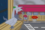
You're making real progress here; it had been a while since I was here last; pikipek and heracross in particular are very good. For things like the rain in skarmory (which is also very good), however, I'd recommend you use solid fills for the raindrops; your style is heavily based on thick contours and surfaces in solid colors; to include lines is to get off-code; on the shading, maybe a single layer of shade could work (tropius is one that comes to mind; right now, the pokemon is lost since the background has a very similar color; shading would aid with that), but I doubt more than that would help you much; your style is already very stylized and cartoonish, due to the heavy contouring, so to include a more tri-dimensional feel to it would, again, go off-code.
Now, the reason that brought me here; there are a few pokemon that were left out of LD, and some new pokemon I have to add, so I thought about inviting another artist, due to my lack of time, and you came to mind, especially now that I see how much you're improving. Would you like to draw for my collection the four oricorio forms?
Now, the reason that brought me here; there are a few pokemon that were left out of LD, and some new pokemon I have to add, so I thought about inviting another artist, due to my lack of time, and you came to mind, especially now that I see how much you're improving. Would you like to draw for my collection the four oricorio forms?
Last edited:
Sure. I'd be happy to help.Now, the reason that brought me here; there are a few pokemon that were left out of LD, and some new pokemon I have to add, so I thought about inviting another artist, due to my lack of time, and you came to mind, especially now that I see how much you're improving. Would you like to draw for my collection the four oricorio forms?
Sure. I'd be happy to help.Though it may take a while since I currently have a couple requests to finish.
Oh, there's no rush at all; I'll send you the spoilers shortly.
Hey, if you're doing requests, could you do Mimikyu, please? Thank you :3
Wow these are amazing, I love the art style on the sketches. How would you feel about designing a custom mat? (I'd pay you of course)
Whoa really? I've got a bunch of requests right now, but I'd be happy to do it once I finish them. I don't really need the money, but if we see each other some time maybe we could trade cards for it?Wow these are amazing, I love the art style on the sketches. How would you feel about designing a custom mat? (I'd pay you of course)
School slowed me down a bit, but here they are! These were requests for MagicalPeachArt and @professorlight.
Gotta say I'm really liking these two. They were a little challenging with the vines and the scribbles but they turned out pretty good. Tangralive was a request for @blahblahbal and Mimikyu's for @thegrovylekid.
that mimikyu is adorable...Gotta say I'm really liking these two. They were a little challenging with the vines and the scribbles but they turned out pretty good. Tangralive was a request for @blahblahbal and Mimikyu's for @thegrovylekid.
can you do a chikorita? or flygon, of you have not already.


