English Altaria from “Crown Zenith” Galarian Gallery Revealed!

Water Pokémon Master

I like Pokemon more than you! :p
Webmaster
Elite Member
Advanced Member
Member
The English version of Altaria from Crown Zenith has been revealed! This is the first English card revealed from the set. As revealed before, it’ll be part of the set’s “Galarian Gallery.” It will be card #GG19/GG70.
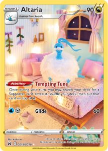

GG19-Altaria-215x300.jpg


Our special Crown Zenith set will start to release on January 20th. You can see all its products here. They will release from January through May.
The Galarian Gallery from our set will be comprised of the secret rare cards from VSTAR Universe and cut cards from recent SWSH sets. Some of the set’s secret rares will also be released as promo cards in English.

Continue reading...
 
the yellow border isn't the problem, its the lack of typing border. What the hell type is this at a glance? bad aesthetic decision, despite the gorgeous art.
 
When I pay dollars for cards that cost cents to print, I think I'm allowed to be a little picky.
I mean yeah for sure, but the options do exists, if you want silver borders, you can get the Japanese variants. The fact that they have been doing yellow borders on character rares and similar variants since Cosmic Eclipse means that they for all intensive purposes will stick to that.
 
Altaria being #19 checks out with our prospective setlist, but I wish they would start showing the cards in the regular set.
 
It's so beautiful, i love Altaria too plus it's way cooler that its crochet artwork!
 
I mean yeah for sure, but the options do exists, if you want silver borders, you can get the Japanese variants. The fact that they have been doing yellow borders on character rares and similar variants since Cosmic Eclipse means that they for all intensive purposes will stick to that.
Sometimes we want cards that we can actually play and read. Unfortunately the yellow borders on the english cards are still in fact undeniably, uh, aesthestically less pleasing than the silver borders. The yellow color just often times clash with extended background art of the cards.
 
Sometimes we want cards that we can actually play and read. Unfortunately the yellow borders on the english cards are still in fact undeniably, uh, aesthestically less pleasing than the silver borders. The yellow color just often times clash with extended background art of the cards.
Oh, I agree entirely, but still am happy all the same. So many Japanese cards have been missed and are likely to never hit the English market. So while it would be an improvement, ultimately, just happy to get the cards in English.
 
in the top right corner there is a symbol that tells you the type of the card
There are two similar looking symbols in the attack, though. why aren't those the type? Maybe its both water and steel? Dang, I wish there was a border that conveyed game information on this card from a game.
And yes, I KNOW its dragon, and I know what type it is. Do you see my point though?
 
There are two similar looking symbols in the attack, though. why aren't those the type? Maybe its both water and steel? Dang, I wish there was a border that conveyed game information on this card from a game.
And yes, I KNOW its dragon, and I know what type it is. Do you see my point though?
You're just trying to create a problem out of nowhere. Type has always been conveyed in the top right corner, it's literally one of the first things anyone learns when playing.
 
Back
Top