TCG Fakes Feedback Needed - Custom Card Creation

Buddy2707

Aspiring Trainer
Member
CustomCard1.jpg

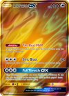
Here is my first draft of a card that I have created, and I need feedback.

Could any seasoned Custom Card Creators reply with the following:

General Feedback:

Please give me feedback on my formatting, font choices and even gameplay balancing. Let me know if I am missing something (aside from Art, Set Icon and Regulation Marker), and please give me feedback on my S&M formatting, as I am accustomed to Pokemon V.
Attached is my Photopea document that showcases what I did to make this card- feel free to check it out and leave feedback on my processing aswell!

Answers to Questions:
I also have 2 main questions
1 - Why are all my icons blurry? I used them from aschefield101's icon sheet, but each one is incredibly blurry. Any way to fix this?
2 - Did I use the correct holosheet? As I have stated previously, my knowledge on GXs are pretty scarce, I want to know if Gold GX cards also use the SunLava holofoil or something different.


p.s. - The name is redacted due to that this is a custom card made for a real person as a birthday present.

Thanks to aschefield101 for the custom blanks and icons!
 

Attachments

  • Custom Card.zip
    4.9 MB · Views: 13
Hi! This is an awesome idea, and while I have faked a lot in the past, it was always text-based so I'll leave the image-based stuff to the real pros. There's a bit of nitpicking to be done about wording, but I don't know how much that matters to you, so I'll stick to balancing only. I'm assuming this card is meant for SM era since you specifically mention it in your post.

-First off, 280 is way too high for a regular Baisc GX - that kind of number is usually reserved for a Tag Team, and those give up 3 Prizes - usually Basic GX range in the 170-190s.
-In the SM era, the player going first is actually allowed to play a Supporter in their first turn by the rules.
-Honestly I think the attack would be okay with [C][C] as cost, or even [some other type][C] if you wanted it to take two attachments, considering you would most likely hit around 100 damage on average.
-Placing damage counters freely is a very powerful effect - Deoxys and Espeon-GX from Unified Minds has a similar attack, and that's a Tag Team. Assuming the same 10 cards in the hands, you'd get the same reward for less drawback. There are a number of ways to go about tuning this, but it all depends on what your idea was behind the GX attack.
-Lastly, [C] Pokemon have [F] Weakness, but if the [P] Weakness is a personal jab at your friend then it doesn't really matter, haha.

Now, all this is to make it a more believable card in the context of the game, but in the end your goal is to make something nice for your friend, so don't take any of this too to heart if you don't want to - your vision is what really matters.
Thanks for the feedback! I should have clarified that this was intended for SSH era, since I have little idea about the S&M format.

I went with a GX because not only do I find the design of GXs appealing in both looks and gameplay, I want to let people know at a glance that it is a card not legal for Standard Play.

I will take into consideration the HP balancing, because after all this is a basic, not a VSTAR. I'll also consider the attack cost being [C][C] so that it can be compatible with DTE or even DCE.

I will leave the GX attack alone, soley because Sableye from LOR places 12, and is only powerful due to the fact it can be used several times.

Thank you for your feedback! And for the little taste of what I missed out lol.
 
Last edited:
Answers to Questions:
I also have 2 main questions
1 - Why are all my icons blurry? I used them from aschefield101's icon sheet, but each one is incredibly blurry. Any way to fix this?
2 - Did I use the correct holosheet? As I have stated previously, my knowledge on GXs are pretty scarce, I want to know if Gold GX cards also use the SunLava holofoil or something different.
I'm not sure where you got the icons from, but mine were to size. Therefore those you have for some reason were made larger, the same goes for the GX icon, ability, type icons, weakness, etc. (When making something larger than it's original size, images will always go blurry. Making them smaller will have no real effect.)

The holosheet is correct, however gold GX's also have textured layers on top and therefore refract light in multiple directions, meaning the base holosheet would need to be moved around/chopped up/edited to accomplish that (the joys of making something 2D look real ey), but this is for someone who wants 100% perfection or as close to.

Edit: just noticed, the icon sheet you've copied into the program has auto fit to window, meaning none of them will be correct. You have to open that resource sheet up on GIMP/photoshop and cut out the icons/text you want and copy/paste in.
 
Back
Top