What do you mean, Kukui? The CHR would be Masked Royal, of course.I could say we'll have Incineroar CHR with Kukui,but we've already got with Rockruff.So I guess we'll have it with the SM\USUM protagonists?
You are using an out of date browser. It may not display this or other websites correctly.
You should upgrade or use an alternative browser.
You should upgrade or use an alternative browser.
Incineroar Line from ‘Paradigm Trigger’!
- Thread starter JustInBasil
- Start date
Ryo Ueda also did the Full Art EX's during the XY era which I consider some of the most well-done 3D cards in the TCG's history.So nothing from this decade
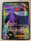

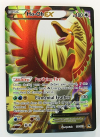
Among others. These cards are some of my favorites in the TCG, and I'd even go so far as to say many regular EX cards look quite good as well:
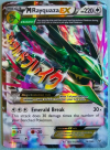

I'm not going to say that anyone's wrong for preferring hand-drawn artwork to 3D cards. I generally do myself as well. Though I think it's incredibly narrow-minded that a lot of TCG fans just instantly equate 3D cards to being bad. There's a lot of good 3D cards when done right. Do they lend the render to a stylish surrounding/background, do they give it interesting shading, posing, etc. or do they just end up being a bland render of a Pokemon in front of a field or something, like many regular GX/V cards were? Because there are so many factors I feel like we should be looking at 3D cards with the same level of fairness as one would give a 2D one. After all, despite being few-and-far between in the TCG, there's plenty of bad 2D artwork out in the world.
- "I dare you to name good 3D art."So nothing from this decade
- This person.
- "Yeah, but, nuh uh! So I'm still right!"
The definition of moving goal posts...
In addition to what @Scoop said, this kind of narrow minded idea that all 3D renders are bad is along the same hivemind mentality of those who storm into an article when Charizard is mentioned just to say "Charizard BAD!" You might prefer 2D art over 3D, as do I, but it takes a lot of talent to make 3D art, and do it WELL.
Also, I like how this was started by pondering what it would be like if chase cards had nice 2D art, selectively forgetting that alt arts are pretty much THE chase cards of any given set now.
Yeah, gonna be honest looks like generic garbageRyo Ueda also did the Full Art EX's during the XY era which I consider some of the most well-done 3D cards in the TCG's history.
View attachment 16796View attachment 16797View attachment 16798
Among others. These cards are some of my favorites in the TCG, and I'd even go so far as to say many regular EX cards look quite good as well:
View attachment 16799View attachment 16800
I'm not going to say that anyone's wrong for preferring hand-drawn artwork to 3D cards. I generally do myself as well. Though I think it's incredibly narrow-minded that a lot of TCG fans just instantly equate 3D cards to being bad. There's a lot of good 3D cards when done right. Do they lend the render to a stylish surrounding/background, do they give it interesting shading, posing, etc. or do they just end up being a bland render of a Pokemon in front of a field or something, like many regular GX/V cards were? Because there are so many factors I feel like we should be looking at 3D cards with the same level of fairness as one would give a 2D one. After all, despite being few-and-far between in the TCG, there's plenty of bad 2D artwork out in the world.
- "I dare you to name good 3D art."
- This person.
- "Yeah, but, nuh uh! So I'm still right!"
The definition of moving goal posts...
In addition to what @Scoop said, this kind of narrow minded idea that all 3D renders are bad is along the same hivemind mentality of those who storm into an article when Charizard is mentioned just to say "Charizard BAD!" You might prefer 2D art over 3D, as do I, but it takes a lot of talent to make 3D art, and do it WELL.
Also, I like how this was started by pondering what it would be like if chase cards had nice 2D art, selectively forgetting that alt arts are pretty much THE chase cards of any given set now.
I'll be honest, I was leaving room for being wrong, but now that I see what his examples are, I gotta say I'm not impressed and am going back to my original statement that unless you're Keiji Kinebuchi, your 3D art looks like ass.
So you saw a grand total of five examples that you personally did not like, and thus, concluded that they all have to be "ass." I have my skepticism that you were indeed willing to be "proven wrong" if you're just concluding something after seeing an immensely small sample. Do you only like Keiji Kinebuchi because of the nostalgia factor? What makes every other 3D artist after him invalid?I'll be honest, I was leaving room for being wrong, but now that I see what his examples are, I gotta say I'm not impressed and am going back to my original statement that unless you're Keiji Kinebuchi, your 3D art looks like ass.
Okay then, so what do you consider a good 3D card?Yeah, gonna be honest looks like generic garbage
I'm asking all of this because I am genuinely curious as to the standard you're putting out here, and want to know if there's more to this than just "I don't like it because I say so."
Sure here's Keiji Kinebuchi's Oddish, one of my favorites to this day:So you saw a grand total of five examples that you personally did not like, and thus, concluded that they all have to be "ass." I have my skepticism that you were indeed willing to be "proven wrong" if you're just concluding something after seeing an immensely small sample. Do you only like Keiji Kinebuchi because of the nostalgia factor? What makes every other 3D artist after him invalid?
Okay then, so what do you consider a good 3D card?
I'm asking all of this because I am genuinely curious as to the standard you're putting out here, and want to know if there's more to this than just "I don't like it because I say so."
![OddishJungle58[1].jpg OddishJungle58[1].jpg](https://www.pokebeach.com/forums/data/attachments/12/12824-00cb923263aaa4f16aca4edbbbb91632.jpg)
Let's talk about why this is great. We have a low angle here from below Oddish that looks up at it as it walks along the forest ground at night, this turns what would normally be just grass into towering trees surrounding it.
![PorygonBaseSet39[1].jpg PorygonBaseSet39[1].jpg](https://www.pokebeach.com/forums/data/attachments/12/12825-64b36ea7fbdd201b35735ecd3e930478.jpg)
Let's take a look at Imakuni?'s Porygon. It looks quite simple, sure, but you'll notice he took the time to illustrate an environment for it. Trees, mountains, a lake and shrub. They look fairly primitive, but then again this is Porygon in a computer simulation, and you can tell that from looking at it. The art has stuff going on in it. It tells a story.
Every one of the cards you provided has a picture of the Pokémon in a void. There's nothing around them, they just look like the Pokémon, perfectly on model and perfectly doing nothing. But even then I feel they're lacking. Let's compare it to Benimaru Itoh's Steelix
![SteelixTrainersPromo[1].jpg SteelixTrainersPromo[1].jpg](https://www.pokebeach.com/forums/data/attachments/12/12826-19acd03d0b5c905646a2796a3720a9da.jpg)
I don't have a copy so I can't tell you what's going on in the background since the Holofoil scans dark. What I can tell you is that even here, Steelix is way more dynamic than any of the modern 3D art.
HTH
For the Kinebuchi ones, I do think those are valid points and I do agree that those cards have charm to them. However, I don't think I can fully agree that the Steelix is more dynamic than *ANY* modern-day 3D art. It's a good card, but that feels too much of a generalization, no? But, let me dissect the Ho-Oh I provided, why don't we? There's more to it than the card just being "in a void." With a Full Art, you have to remember that a lot of the time the background lends to the texture of it. This image here shows off the texture of the Ho-Oh quite well:Sure here's Keiji Kinebuchi's Oddish, one of my favorites to this day:
View attachment 16801
Let's talk about why this is great. We have a low angle here from below Oddish that looks up at it as it walks along the forest ground at night, this turns what would normally be just grass into towering trees surrounding it.
View attachment 16802
Let's take a look at Imakuni?'s Porygon. It looks quite simple, sure, but you'll notice he took the time to illustrate an environment for it. Trees, mountains, a lake and shrub. They look fairly primitive, but then again this is Porygon in a computer simulation, and you can tell that from looking at it. The art has stuff going on in it. It tells a story.
Every one of the cards you provided has a picture of the Pokémon in a void. There's nothing around them, they just look like the Pokémon, perfectly on model and perfectly doing nothing. But even then I feel they're lacking. Let's compare it to Benimaru Itoh's Steelix
View attachment 16803
I don't have a copy so I can't tell you what's going on in the background since the Holofoil scans dark. What I can tell you is that even here, Steelix is way more dynamic than any of the modern 3D art.
HTH
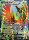
Now, note that the Pokemon looks to be beneath a pillar of light, with a rainbow in the background. The light from the sun is shining down on Ho-Oh, with the texturing beaming down upon it. It makes for an extremely pretty card especially when you have a copy in real life- with a simulated look of light shining down onto Ho-Oh. When you hold it and wave it around, there's a wonderful sheen and reflection to it.
A lot of the time a pure scan/digital image of a Full Art like this can't do it justice, but they're designed around texture, and the way the light reflects off the card is a means to add to it artistically. I know that you may still pass it off as generic garbage, but I do think Ryo Ueda does the work to not only make the card work in that aspect but also provided a stylized shading that makes the cards look more unique than just plopping a boring render in. Compared to a GX Full Art or many regular GX/V cards, I consider that going above and beyond the mold for a 3D card.
EDIT: I appreciate you telling me reasoning for your enjoyment of said cards and I hope you take a moment to consider my points as well.
Last edited:
Empoleon is back! I remember the good old times. Bubble Hold/ Direct Dive for crazy control/ snipe.
Love it. Gritty Claws for a Focus Sash effect, then Reprisal on the next turn (assuming your opponent doesn't do a boss or escape rope). There are still easy counters though.. Like quick shoot, poison and effect KO. ? Still. 1 fire for 320 damage every other turn is pretty insane. ??
Love it. Gritty Claws for a Focus Sash effect, then Reprisal on the next turn (assuming your opponent doesn't do a boss or escape rope). There are still easy counters though.. Like quick shoot, poison and effect KO. ? Still. 1 fire for 320 damage every other turn is pretty insane. ??
I get it but it really doesn't speak to me.For the Kinebuchi ones, I do think those are valid points and I do agree that those cards have charm to them. However, I don't think I can fully agree that the Steelix is more dynamic than *ANY* modern-day 3D art. It's a good card, but that feels too much of a generalization, no? But, let me dissect the Ho-Oh I provided, why don't we? There's more to it than the card just being "in a void." With a Full Art, you have to remember that a lot of the time the background lends to the texture of it. This image here shows off the texture of the Ho-Oh quite well:
View attachment 16804
Now, note that the Pokemon looks to be beneath a pillar of light, with a rainbow in the background. The light from the sun is shining down on Ho-Oh, with the texturing beaming down upon it. It makes for an extremely pretty card especially when you have a copy in real life- with a simulated look of light shining down onto Ho-Oh. When you hold it and wave it around, there's a wonderful sheen and reflection to it.
A lot of the time a pure scan/digital image of a Full Art like this can't do it justice, but they're designed around texture, and the way the light reflects off the card is a means to add to it artistically. I know that you may still pass it off as generic garbage, but I do think Ryo Ueda does the work to not only make the card work in that aspect but also provided a stylized shading that makes the cards look more unique than just plopping a boring render in. Compared to a GX Full Art or many regular GX/V cards, I consider that going above and beyond the mold for a 3D card.
EDIT: I appreciate you telling me reasoning for your enjoyment of said cards and I hope you take a moment to consider my points as well.
Okay. I suppose this conversation won't get anywhere from now on, but I'm just saying to try and keep an open mind, because you came across as extremely close-minded initially- And still can by overgeneralizing (Saying NO modern 3D card is as dynamic as that Steelix, etc). That's the point that I wanted to mostly make mention of. It's fine to have preferences, but don't just shut down everything that came out after an arbitrary year, and actually give things a look every once in a while. Give things a bit of nuance instead of shutting it all down as "trash."I get it but it really doesn't speak to me.
Nah, i like hyperbole and I'll continue to use it until I dieOkay. I suppose this conversation won't get anywhere from now on, but I'm just saying to try and keep an open mind, because you came across as extremely close-minded initially- And still can by overgeneralizing (Saying NO modern 3D card is as dynamic as that Steelix, etc). That's the point that I wanted to mostly make mention of. It's fine to have preferences, but don't just shut down everything that came out after an arbitrary year, and actually give things a look every once in a while. Give things a bit of nuance instead of shutting it all down as "trash."
Reddit momentNah, i like hyperbole and I'll continue to use it until I die
??? okReddit moment
Honestly these are pretty OP
7/9/10
7/9/10


