Contest January 2022 CaC: Energy Acceleration (All Results Up!)

joliticac.png

As I did with a previous CAC, I got some inspiration from an upcoming set for how to go about the card theming. In this case, Brilliant Stars' Trainer Gallery cards featuring human characters alongside Pokémon. I had actually more or less finished the card some time ago, but I was waiting for news to come out about the English set to see whether the Character Rares would use the silver border or the yellow border. For the effect, I decided to think about some Pokémon known for manipulating energy within the games. I settled on this little critter as it isn't able to create electrical charge like most Electric-types, but rather takes it from elsewhere. This may be a relatively well known fact in part due to the somewhat infamous Joltik and Yamper plush that references this, though this isn't the only way Joltik get their charge. My initial idea was an Ability that could discard an Energy from your opponent's Pokémon and in turn, attach an Energy to Joltik from the discard pile. To limit this, it would require Joltik to have damage counters on it, and the use of the Ability would completely heal it. I felt this was a bit too finicky, as there aren't many ways to get damage counters on a weak Basic. So instead I opted to use Joltik's tendency to mooch off of homes as inspiration. There are a few angles I thought of to go with, like requiring your opponent to have the Stadium in play, rather than either player, or to put the Stadium back into a player's hand. I felt that into the hand would be a bit too one-sided in your favor, as it would more easily allow you to possibly get a second use of your Stadium and/or a second use of the Ability with another Joltik. The top of the deck felt a bit more appropriate as it could be a disruption to either side, blocking a player from a fresh card during their next turn. An outage that requires your immediate attention, if you will. I made it grab any type of basic Energy to help it stand out from some of the existing Lightning-type acceleration, but to keep it a bit more useful within Lightning decks, its attack moves Energy only from Lightning-types. As for the art, it is graciously provided by mochafushigi, or もかふしぎ on pixiv, whom I corresponded with concerning matters about the usage of the artwork. Unfortunately, I'm not sure what foil will be used on the English cards so I had to make a bit of an educated guess going off of the Japanese ones.

RCL Garbodor ("Once during your turn, if a Stadium is in play..."), BST Houndoom (...Then, shuffle your deck. If you attached Energy to...in this way...", DAA Staraptor ("Move any amount of Energy from your Pokémon to your other Pokémon in any way you like.") GRI Alomomola ("...its owner's...")
 
CaC 01-2022 Export.png

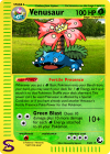
I designed and mocked up this card shortly after entering. I had this Venusaur lying around and figured I could use it for my entry. Then it was a matter of coming up with an acceleration effect for Venusaur, and fertile soils and whatnot made the most sense. I thought I'd come up with something more interesting since, but I haven't, so here we are. It's definitely not as creative as PMJ using discarded Energies from retreating, which is absolutely brilliant. I also really like EM-isthmus using Stadiums as a fuel source.

The card is designed to fit in with the e-series power level. It might look weak to your modern sensibilities, but this card might honestly be top tier in e-series (40+ for only 3 Energies?! On a stage 2? Consistently? This is madness!). It's my honest belief that this card borders on broken if you're only allowed to use e-cards.

The frame is custom-made, but designed to resemble the original e-card frame. I don't entirely want to skirt placement rules and whatnot, so I've tried to make sure at least the middle portion (power and attack) matches up with the official cards as much as possible, as well as the evolution information at the top. This includes the frankly absurd narrowing of the attack and power names instead of simply using a medium bold font. Notable differences between this frame and e-frame is the size of certain elements, a differently sized picture frame, no notch in the bottom right-hand corner, an "S" instead of an "e", the design of the symbols, the frame background, and general shading. The Poké-Power symbol is also narrower than the official one, which affects the title placement.

On to the card itself...

I drew this ridicolous-looking Venusaur based on the original Red & Green sprite (which can be traced back to the original Pokémon design document. You may not like it, but this is what peak Venusaur looks like). I drew it a while ago, but figured I might as well use it since otherwise I'd have to draw something new, and I definitely don't have time for that.

The power is meant to evoke Venusaur's presence making the soil more fertile, which allows new plants to grow better and faster. It felt like a nice way of introducing Energy acceleration into an era which tried very hard not to be broken (and perhaps succeeded too well). I think it's hard to break, but interesting to build around, which is the sweet spot I was aiming for. It also forces some deck-building restrictions, most notably having to use G Pokémon and not being able to use Pokémon Fan Club, one of the best Supporters at the time. It's worth noting that this card shared a format with either Pokémon Breeder or Rare Candy, so it could help accelerate out an early threat if you build your deck correctly.

Green Blast is not a new attack, but the Power helps reframe it. It encourages you to save up basics until you can deploy them with Venusaur in play so you can come out of the gate swinging for massive damage (massive damage being at most 80, a frankly absurd number in e-series). The original Green Blast from Unseen Forces (on a Stage 1) dealt 20+ for only CC, and yet I can't help but feel this 10+ for CCC might still be too high. For comparison, Blastoise for Expedition deals 40 plus 10 more damage for each extra water energy, up to a maximum of 60. Venusaur also deals 40 for 3 energies (assuming they're all G), but can add an unlimited number AND the other Energies don't all have to be attached to Venusaur. It doesn't compare as favourably to Scizor—the best Pokémon in e-series—which could deal 30+ for CCC and could use the then-broken Special Metal Energies to do so, so I don't think it's actively broken, just very good.

4 retreat wasn't used for Venusaur until years later, but it felt like an interesting way of balancing it since it encourages you to attach more Energies to Venusaur itself. Also, look at this Venusaur and honestly tell me it can use anything less than 4 Energy to retreat.

I think that's it. It was fun to participate again! Hopefully I can find the time to do so again.

Good luck to the other participants!
 
deyzw1o-ec171d54-5244-4cbd-a8ff-8f2dc6ba9cce.png

This Fakemon was designed by my friend Lu-gi-oh on DA. He is a very talented artist, especially in making Fakemons.

I modified the blank a bit by deleting the Stage 2 tail as it overlaps with text and is a bit messy in my opinion. I hope that's fine.
 
A whole year since my last CaC. I've fallen a bit out of practice, but I think I still know how to do these.
That being said, I think this is the last Create-a-Contest I will be participating in for a long time. Or... penultimate, depending on the next time a theme comes up that I can apply a currently-unfinished card to. I've gotten so swallowed up in other projects and communities that it's just not feasible to keep attempting to participate in these. I finally understand what people mean when they say that haven't had time in a whole month to make a card.
CaC is absolutely fun, and it's really great to see how my cards match up to others in this incredibly talented community. If I continued to participate, I don't think I could come anywhere near the quality standard I've tried to maintain for all of my entries so far. I don't know if I will return, but I will be happy to watch from the sidelines to see what amazing creations everyone else comes up with in future contests. Especially knowing that my little Omnium project is being used to create some actually spectacular custom blanks.

If you like those blanks, check out my thread for them here! You will need Photoshop, preferably CS6

So, without further beating around the bush, here's my entry.
CaC_09_-_Medicham.png
Medicham – Psychic/Fighting – HP90
Stage 1 - Evolves from Meditite
This Pokémon is both [P][F] type.

Ability: Catalysis
Once during your turn, when you move an Energy from 1 of your Pokémon to another of your Pokémon with the effect of an Ability or Trainer card, you may attach a basic Energy card from your discard pile to 1 of your Active [P] or [F] Pokémon.

[P][F] Chakra Flash 40+
This attack does 20 more damage for each Energy you attached to this Pokémon during this turn. Then, discard up to that many Energy from this Pokémon.

Weakness: Psychic +20
Resistance: None
Retreat: [C]
#308 Meditate Pokémon HT: 4’ 3” WT: 69.4 lbs.
Pearl: Through daily meditation, it hones its spiritual power. It can sense what others are thinking.

Illus. Autobot Tesla - ©2022 Pokémon/CardPone - CaC 09
I went through a couple of Pokémon before Medicham came up, including Whirlipede until I decided that there was no artwork suitable for a full art of this kind. Though, after solidifying the attacks, I think Medicham was a much more suitable pick. A Psychic/Fighting type really sounds like it fits the ticket for the attacks.

As always, keep these in mind for the judging:
  • The wording is SM or the latest syntax of a specific effect if no such effect exists in the SM era.
  • The layout for the attack area is based off of the classic/Neo era. Following that, "Ability" is written in the same red text as the ability name.
  • All Omnium cards are meant to be balanced for the 2010-2011 Standard Rotation, or slightly more broadly any set from Diamond & Pearl base set to Noble Victories.
  • Fonts and placements should be pixel-perfect as they were made using my templates, which places all the fonts exactly where they should be.

So basically, the idea for this card is for it to be paired with something like Lunala-GX or even a simple Energy Switch (the latter of which I just discovered has been in every era of the TCG since e-Card). For each Medicham, you only get one extra energy attachment from Catalysis, no matter how many energy you move around. To get the max effect, you need all four Medicham on the field and one of the above mentioned cards. And obviously you want some energy in your discard pile before trying to get this going as well. You could in theory also add a card with an effect like Gardevoir-GX to up the numbers even more, or even something like Bede, but reliably setting all of that up will undeniably be a challenge.

Most of the time I would expect an efficient deck to be using the default energy attachment plus the ability of 3-4 Medicham to power up the attack once it was at full power, which would deliver a pretty respectable 40+100=140 damage (at best scenario using just your Medicham and an Energy Switch). This is assuming none of your Meditite or Medicham are prized (unlikely) and will inevitably get weaker if your opponent takes any of them down. I see this as a fairly mid-game attacker, and I would think that you would want to build your deck around it if you were to include it; it's hard to see it as a tech card.

The multi-type energy cost is meant to attempt to balance it in some way. I considered increasing the cost, but with such easy control over energy, it doesn't actually feel like it would change a whole lot. Limiting the energy attachment to only your Active Pokémon and only if shares a type with Medicham felt like a decent limitation. Make no mistake: this is a very powerful card for the era it's placed in, I believe, but its cost is more than in just energy. It takes a lot of set-up and, as I said before, does not leave much room for other strategies to pick up if this one doesn't work out. There are some potent counter-strategies to this archetype. Ability lock, for example, leaves it in a pretty good amount of trouble.

Anyway, 90 HP is par for the course for Gen 4 Medicham cards, as well as a fairly low retreat cost. Weakness to Psychic works out well for the dual typing since both Fighting and Psychic are weak to it.

I was a little bit proud of the synergy for the ability and attack here. I don't think these kinds of effects have been seen before (although I didn't have the most time in the world to verify that), so that's always nice. The idea I was going for for the name "Chakra Flash" was that the turn is a flash of energy, all built up with Catalysis and then released in a single blow. To keep the chain going, you're going to want to discard energy every time you attack, even though it's not technically required as part of the attack to discard any of them.
General:
  • DP Medicham cards (1 retreat cost, 90HP, weakness, resistance)
  • DP Stage 1 Pokémon (very loosely for damage output, though it's hard to really nail down the right spot for this considering the weird costs it needs in addition to energy costs)
Catalysis:
  • Venusaur & Snivy GX CEC 1 ("Once during your turn, ... when you...") I omitted the "before your attack" clause because it seemed superfluous when you can only activate the ability via abilities or trainer cards. If Venusaur & Snivy didn't need it, then I don't think this one does either.
  • Lunala GX SUM 66 ("...move [an] Energy from 1 of your Pokémon to another of your Pokémon..."
  • Dust Island UNB 168 ("...with the effect of [an Ability or] Trainer card...")
  • Naganadel LOT 109 ("...you may attach a basic Energy card from your discard pile to...")
  • "...1 of your Active Pokémon." is required terminology for Omnium as it accounts for multi-battles.
  • Shaymin LOT 33 ("...your Active [[P] or [F]] Pokémon.")
Chakra Flash
The wording is really hard to find any kind of precedent for since this effect apparently doesn't show up in the TCG, so here's my best attempt at cobbling together references:
  • The Medicham artwork is by Autobot Tesla. I can't link his page because WPM doesn't like him.
  • The Cracked Ice Holo pattern was extracted by Aschefield101.
  • Everything else, except for the fonts, Create-a-Card symbol, and the Meditite prevocon, are by me.
Special thanks to the PTCG Faking Community Discord Server and friends from my Pokémon League for all the input they provided as I made this card!

Thanks so much to the judges and PokéBeach for making this possible! And to everyone else that entered, I wish you the best of luck!
 
aloninetalesredo2.png
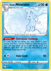
okay, let me preface this by saying i learned what energy acceleration is JUST for this CaC (not too great at the TCG lol)
thought it would be fun to take an energy off one of your pokemon! dont see it too much. in exchange for the loss of the Energy and the condition of not being able to draw the same type, you get 3 energy! thought it would be more interesting than a simple draw.
would give this card a holosheet but accidentally saved the blank and art as a PNG instead of a PSD and since i worked from there instead of redoing the card, there's no good-looking way to put on a holosheet.
@/PMJ was a HUGE help with every part of the card thank you so much
@/Kaleidophoenix also helped with both wording and positioning
@/EM-isthmus helped a ton with wording which i am horrible at
spoilers please work aaaa
EDIT: posted correct version of this card thank you so much for noticing pone
EDIT 2: the old card was listed as an attachment while the new one was spoilered
 
Last edited:
Unfortunately I'm gonna have to drop this one, I haven't had the chance to really get on this quite yet and I won't be able to today.
 
Camerupt ex.png

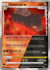
There is the Camerupt ex Delta. The Darkness type mix well with Camerupt's motifs of being an "Angry Pokémon" and also with it's shiny coloration, so we opt for this instead of a rather more standard dual Fire/Fighting one.
As for the actual numbers, abilities and gameplay aspects in general of the cards go, 150 seems fine for an Omnium Stage 1 ex, specially one in the bulkier spectrum, to compensate it's steep Retreat Cost. As for the Abilities, we decided to give this card more tankiness with it's first Ability and then it's second Ability is basically the reason this card is the submission for this month's CaC.
A rather simple Energy acceleration engine, but the fact it works on 2 types, there isn't really many Energy acceleration engines even as of today. Well, of course there are cases of accelerating generic basic energy from the discard pile, but focusing on 2 specific types is a nice touch. And of course, possibilities of cards that synergizes with this ability may rise, specially in Omnium.
As for the attack, it's basically gen 6 Camerupt-EX with a tweaked cost to match the dual type, nothing too groundbreaking but mix well with the Burning Draft Ability, causing it to be quite a powerhouse, maybe even it would see the glory Camerupt-EX didn't see.
 
I'm dropping too, sorry! I couldn't find any interesting ideas until yesterday, but now I'd need at least one more day to work on it ? maybe I'll be able to use it on a future CaC. Can't wait to see the results, I've seen a lot of great entries!
 
dez7ech-84fd6be1-fe63-48b5-aecb-eeb91f14ae0c.png

For this month, I thought I'd try shaking things up with a new mechanic. Rainbow Pokemon were inspired by the new Sparkling Pokemon mechanic, as well as the old Crystal Pokemon. When you play a Rainbow Pokemon, you are able to choose its type, allowing it to reap any rewards associated with that type. This could mean hitting your opponent's Pokemon for weakness or taking advantage of any type-related effects. Since you can only choose its type when you play it, you can't switch to another one until you play it again.

Like my previous cards, this one is balanced for SwSh. The effects of this card are fairly straight forward: the Ability synergizes with Pure Stream, allowing you to attach a bunch of energy to your Benched Pokemon in just a few turns. It can also provide some useful healing when necessary. The damage is kept low since you can choose this Pokemon's type, which could become pretty powerful when taking into account weakness and other effects. I'm still not 100% on the balancing for this one, so I'll probably be making more of these until I can make them more believable.

Once again, the blank is done by me, with the art being from Pokemon Ranger.
 
Text-Based Results

Only two entries :[

Image scores will be coming later today or early tomorrow, along with March's theme, so stay tuned.

Ho-oh HP: 130 [R]
Basic
hooh.png

NO. 250 Rainbow Pokémon HT: 12'6" WT: 438.7 lbs.
Ability: Rainbow Trail
Once during your turn, you may search your deck for 3 basic Energy cards with different types. Attach 1 of them to 1 of your Benched Pokémon, put 1 of them into your hand, and discard one. Then, shuffle your deck.

[C][C][C] Prismatic Flames 10+
This attack does 40 more damage for each different type of basic Energy attached to all of your Pokémon, plus 20 damage for each different type of basic Energy card in your discard pile.

Weakness: [L] x2
Resistance: [F] -30
Retreat: [C][C]

A legend says that its body glows in seven colors. A rainbow is said to form behind it when it flies.


Extremely strong for a one-Prizer Basic, especially since with multiple Ho-Oh in play, you can drop it and swing with it in the same turn. The damage ceiling on this is absurdly high, able to wipe even the burliest Pokemon VMAX without breaking a sweat. A deck built around this would invalidate every multiprizer in the format, and as much as I am all for VMAXes getting brought down a peg, this is a little too extreme even for my tastes.

I see that the power can't be used to attach to your Active Pokemon, but that's easily circumvented by retreating.

To fix this card, I would hard limit the power to once a turn, and fix the damage scaling on the attack.

Wording errors:
General
- The second O in Ho-Oh's name should be capitalized. [-1 point]
Rainbow Trail
- "...basic Energy cards of different types." (Xerneas CEL) [-1 point]
- "...and discard 1 of them. (Watchog GRI; numbers are always written as numerals) [-2 points]
Prismatic Flames
- "Plus" was deprecated a long time ago. I realize that you've used it here because of how the damage is calculated. I'm not sure how else you'd rewrite it. I don't like it but I'm gonna let this slide. [-0 points]

Creativity/Originality: 14/20
(Rainbow-colored stuff is bog standard for Ho-Oh. Even Energy acceleration isn't completely unique to this Pokemon, though you get credit for the manner in which it's accelerated.)
Wording: 11/15
(pkmncards.com)
Believability/Playability: 9/15
(Sends any Pokemon it faces to the shadow realm with no trouble whatsoever)
Total: 34/50
Slowbro - Psychic - HP100
Stage 1 - Evolves from Slowpoke NO. 080 Hermit Crab Pokémon HT: 5'3" WT: 173.1 lbs.

Ability: Pressure Pulse
Once during your turn, you may search your deck for an Energy card and attach it to one of your Pokémon for each prize card that your opponent has taken. Then, shuffle your deck.

[P][C] Psyshock 60+
This attack does 60 damage for each Energy card that is attached to your opponent's Active Pokémon. Your opponent can't attach any energy to their Active Pokémon during their next turn.

Weakness: Darkness (x2)
Resistance: Fighting (-30)
Retreat: [C][C]

Slowpoke became Slowbro when a Shellder bit on to its tail. Sweet flavors seeping from the tail make the Shellder feel as if its life is a dream.

Glad to see you back for another try. Slowbro isn't known at all for Energy acceleration so I'm interested in seeing what you came up with.

Pressure Pulse is an interesting power but it's much too powerful to not be limited in some way. Energy acceleration in Pokemon is extremely powerful as it is, so you need to make sure that you aren't breaking the game when you use it.

Psyshock's damage is okay, but preventing them from attaching any Energy to it basically means they're a sitting duck if they aren't already powered up. These attacks are also traditionally very weak because of how powerful the effect is (Dracozolt V does L for 30 and limits it only to the Pokemon hit by the attack; Masquerain, another Stage 1, does C for 20 with the same limitation).

To fix this card, I would add some limits to the Ability. I like how it works based on your opponent's remaining Prizes, so you can use it to help mount a comeback, but it's far too strong as it is right now. Maybe as a coming into play power?

I'd also remove the attach restriction from Psyshock. Other than that, it's fine.

Wording errors:
Pressure Pulse
- This needs a rewrite to match current era wording. "Once during your turn, you may choose 1 of your Pokemon. For each Prize card your opponent has taken, search your deck for an Energy card and attach it to that Pokemon. Then, shuffle your deck." You have most of the correct pieces though, so I won't give you a blanket -5, but it still needs significant work, so... [-3 points]
Psyshock
- Psyshock as an attack has two established effects. This can be fixed simply by naming the attack something else. [-1 point]
- Psyshock's damage should be 60x, not 60+, based on your wording for the attack. [-1 point]
- The phrase "that is" should be removed from the first sentence. (Stantler FST) [-1 point]
- The second sentence should be, "During your opponent’s next turn, Energy can’t be attached from your opponent’s hand to the Defending Pokemon." (Dracozolt V EVS) [-2 points]

Creativity/Originality: 14/20
(Very rough and in need of polishing. But it's not a typical Energy acceleration candidate, which is cool.)
Wording: 7/15
(Good improvements! Stop by the Discord if you'd like additional help.)
Believability/Playability: 4/15
(Pressure Pulse's absurd acceleration is what's tanking your score here, although Psyshock's big damage + attach limitation also brings it down some.)
Total: 25/50

3rd Place: N/A
2nd Place: I Like Shorts’s Slowbro, with 25/50 points.
1st Place: Falling Skies’s Ho-Oh, with 34/50 points.
 
Image-Based Results

Judge: @Jabberwock

Man oh man, what a turnout! It was great to see so many old faces re-enter the fray this month, and a real delight to see so many fakers of different faking generations, so to speak, all making custom cards in the same environment. You came up with a wide range of effects this month, and as always, it's that diversity of card design that makes CaC so successful.

I apologize for the relative delay in getting results out — I had a slightly busier month than I expected, compounded with some last-minute personal business coming up over the last few days. March’s round will be up sometime in the next 24 hours. Thanks for your patience, and without further ado, on to January’s results!

~~Jabberwock


delta-gardevoir-jan-2022-png.16336


Starting off strong! It’s unusual to see thematic reasons behind a Delta Species card’s typing — more often it just comes down to the art, the effects, or the niche you want it to fill in the metagame. Those are the main criteria I think about, anyway, and I’d be surprised if PCL’s ex-era design philosophy was that different. But this is CaC, and the standards are high, and I like the idea of a real-world myth inspiring this take. If it’s unusual for Delta Species typings to have stories behind them, well, new era, new rules.

It’s been a little while since I’ve seen bartyboy’s dual-type blanks, but they’re a pleasant set to see return. They’re a little busy, and I don’t think I’d use any, say, part-Darkness variants out of concern for the pattern making the text hard to read, but they seem okay here.

One trouble you’ve run into, though, is mixing and matching blanks and font guides — at least, I assume that’s what’s causing the placements to be off around (e.g.) the stats bar, the W/R icons, and the evocon in the upper left. The font guide available in the #resources channel of the Faking Community Discord uses asche’s SM blanks, but bartyboi’s dual-type templates are based on cascade’s. The disparity between them isn’t noticeable on a macro level, except when you don’t adjust the text placements to compensate for it. Unfortunately, this is a case where you’d have to go in with a careful hand and a sharp eye, and compare each placement with the relevant part of a real scan overlaid on the card.

On the effects, if making an ace for a theme deck was your intention, I’d say you’ve achieved it. But the card isn’t as exciting as it could be — its Ability is essentially a carbon copy of Vikavolt SUM’s Strong Charge, and its attack has an effect we’ve seen a million times before.

Were there options here to take the lady-of-the-lake inspiration a little further? I’d say so. You could make the Ability accelerate off-type Energy like [F] or [M] to reflect her kingmaking / sword-giving role in the myth. You could make the Energy acceleration explicitly tied to Pokémon Tools or other Items to emphasize the nature of the gift, or limit it to “kinglike” (i.e. powerful) Pokémon to emphasize the recipient. And it wouldn’t be hard to come up with something more creative for Naiadic Grace. :p

I don’t mean to say that it’s not a solid card — it is! I like how the flavor drives the art, the type, and the attack/Ability names. Just don’t hesitate to take it as far as you can to make the card unique.

Wording errors:
- This is SM, so you need the “(before your attack)” clause in the Ability. [-2 points]
- “[W] or [Y]” -> “[W] and [Y]”, per cards like Electromagnetic Radar. [-1 point]
- “benched” should be capitalized. [-1 point]

Fonts and Placement errors:
- There are several placement errors, mostly having to do with (I assume) using a font guide on a blank not designed for it. Most of them aren’t huge errors, but they’re noticeable enough that I’m going to dock a blanket [-2 points] for them. You’ll want to go back through and make sure they all line up with a high-quality scan.
- The W/R font is Futura where it should be a bold variant of Gill Sans. [-1 point]
- Don’t forget to Justify your attack and Ability text so it lines up on the right side as well as the left. [-1 point]

Creativity/Originality: 10/15
(It’s okay, not great in the uniqueness department. I like the flavor inspiring the card, but I think you could have afforded to take it much further with the effects.)
Believability/Playability: 14/15
(Weakness should be Metal, not Lightning — Delta Species Pokémon historically haven’t had their Weaknesses and Resistances change from their base type.)
Wording: 6/10
(A few errors. Given how similar the Ability is to an existing Ability, these were probably catchable. Don’t forget references!)
Fonts and Placement: 1/5
(The blank is nice, but it got you into some trouble here. Overlaying a high-quality scan on the card should help fix the text placements.)
Aesthetics: 4/5
(I like the art, and the blank might be a little busy but I find myself liking it, too, even if I can’t see it working for every type combination. The docked point here comes from the holosheet, which might need some slightly different blending modes, and also shouldn’t be going over the Pokémon itself.)
Total: 35/50
kpcac06_froslass-megaglalie_gx-png.16346


Traditional art — i.e. pen-and-paper; entirely non-digital — is a daring decision on any card, but especially so on something like a Tag Team Pokémon-GX, where the art takes up so much of the card and draws correspondingly more attention to itself. I respect the initiative to illustrate your own card, but I’m not sure it’s worked out for you here, since you generally want a little more uniformity in the color and shading than it’s really possible to achieve with colored pencils or similar media. There are some ways to touch up the coloring digitally, if you’re interested in looking into them. Furthermore, the background could probably afford to be a little more vibrant, and the Pokémon (the focal points of the image!) could be a little more focal.

The effects are interesting; you’re getting into some underexplored design space by giving it a reusable GX attack as well as a primary attack that plays off of it. Between the auto-paralysis, the situational heavier damage, and the powerfully defensive Ability, it has a great deal of versatility, and gives you enough options that you have to think a little bit when you play it.

That said, though, auto-paralysis is quite powerful, and I’m not convinced there’s enough here to balance it. 3 Energy for 50 damage and repeatable paralysis would be good on any Pokémon, but especially so on a 250-HP tank with a damage-reduction Ability that can survive most hits thrown its way even if the opponent somehow manages to escape the paralysis lock. In fact, this combination is such a potent threat, I’d be surprised if the Energy acceleration ever came into play at all, perhaps beyond very fringe cases.

So the effects might need a little tweaking, but the core concept is solid. Tweak those effects and brush up the art a bit, and I think you have a nice, well-rounded Tag Team GX.

Wording errors:
- “As long as this Pokémon is your Active Pokémon” is preferred over “If this Pokémon is your Active Pokémon” for static effects, but the clause about needing [W] Energy attached to it may be enough to override this rule. We don’t have any concrete references for it, so I’ll give you the pass. [-0 points]
- The Misty & Lorelei wording for the GX attack should be altered slightly (“can use its GX attack” -> “can use this attack”) since you’re not talking about an arbitrary GX attack; you’re talking about this GX attack. You don’t want to start a ruling dispute over Z-Crystal GX attacks, for example. [-2 points]

Fonts and Placement errors:
- Bottom text (Illus. credit etc.) shouldn’t have a stroke on non-FA Pokémon-GX. [-1 point]

Creativity/Originality: 11/15
(Interesting concoction of effects that makes for a potent stall card with a number of tools at its disposal. The Energy acceleration seems like a bit of an afterthought, though, since it’s not like it needs a great deal of Energy to use Chilling Zero — I would have liked to see the theme mechanic play a greater role in the card’s concept.)
Believability/Playability: 9/15
(Some severe balancing concerns associated with being a tank that also functions as a control card. I’d want the paralysis to be a little harder to achieve, and/or the card less powerfully defensive as a whole.)
Wording: 8/10
(One pass, one minor thing that needs changing.)
Fonts and Placement: 4/5
(A minor error.)
Aesthetics: 2/5
(I applaud the initiative to illustrate your own card, but I think the traditional medium is working against you here. It’s not quite vibrant enough color-wise, and it clashes a little distractingly with the holosheet. Plus, don’t forget to make the Pokémon take up most of the frame!)
Total: 34/50
Fg7JC30.png


Nice flavor. Trash Collector is good and Hefty Bomb made me chuckle. I get what you mean about not wanting to fall into a Garbodor discard-pile stereotype, but the fact of the matter is that there’s just so ding-dang much you can do with the discard pile, it’s hard for any one Pokémon to claim enough of a monopoly over it all to become a stereotype. This card’s effects feel both familiar and fresh, so I think you threaded the needle pretty well in the end.

Trash Collector is the card’s high point, and it’s a great original take on Energy acceleration. It reminds me of Wishful Baton, but with a flavor all its own. On the other hand, Hefty Bomb isn’t exactly new as an effect. Even if it’s both thematically and mechanically appropriate, I could wish for something more original to take its place while fulfilling the same thematic and mechanical roles.

Edo’s art looks great on the SwSh Darkness blank. Something about the washed-out colors really pulls the whole thing together. Still, I’d be interested to see what you could do with the typical SwSh holosheet here instead, or other holosheets in general. The galaxy holo is great, but it’s becoming something of a mainstay, and holosheets are definitely something you don’t want to wear out.

Wording errors:
- Trash Collector’s wording feels excessively clunky, and I think it could be drastically simplified by introducing an “if this Pokémon is on your Bench” clause. Something like “Whenever your Active Pokémon retreats, if this Pokémon is on your Bench, you may attach …” [-2 points]

Fonts and Placement errors:
- On point.

Creativity/Originality: 12/15
(Trash Collector is fun and fresh — reminiscent of cards like Wishful Baton, but also something all its own. I wish I could say the same for Hefty Bomb, but unfortunately an awesome name doesn’t make the attack original.)
Believability/Playability: 15/15
(No problems here. There are a few different ways you can accelerate the Ability, and they’re all well balanced with Garbodor being a Stage 1.)
Wording: 8/10
(Excessive clunkiness in the Ability, which seems easily fixable.)
Fonts and Placement: 5/5
(On point.)
Aesthetics: 5/5
(Nice art/blank combination, but don’t be afraid to step outside your comfort zone with the holosheets. Galaxy’s becoming a mainstay, which is something I doubt either of us really wants it to be.)
Total: 45/50
frost-rotom-lvx-png.16370


Hey, welcome to CaC! I practically never see the Rotom forms on custom cards, and definitely never on something as intricate as a LV.X. Props for making an unusual choice there! But LV.Xs are tricky to get right, and it’s gotta hold up.

The Poké-Power uses the same wall-of-text gimmick as Dusknoir LV.X, which is fair enough and not necessarily a bad thing, but it puts a pretty heavy constraint on what you can do with it. When you devote that much of the card’s text space to “This counts as …” and other clauses, you only get a couple lines of actual effect (“as often as you like during your turn, you may attach a [W] Energy from your discard pile to 1 of your Pokémon”). You miss out on being able to include an attack or second power to elevate the card above a simple Eelektrik clone. Instead you rely on the wall-of-text gimmick making Frost Rotom into a Stadium for originality points, and … well, Dusknoir did it first.

It’s in a weird place in terms of balance since it requires you to Knock it Out to gain the acceleration effect, which is mildly better than Dynamotor clones for being able to attach to the Active, but still isn’t really all that extreme, as these things go. Is it good enough to warrant voluntarily Knocking Out your own Frost Rotom? Probably not very often, and it would take quite a specialized deck to take advantage of it. Either it’s a last-ditch effort to return a bunch of discarded Energy in the lategame; or you’d need your whole deck to be loaded with play-from-behind cards like Twins under the assumption that you’ll be activating Snow Machine early, and play-from-behind strategies rarely involve heavy Energy acceleration.

There’s not much else to the card. You get it into play, you blow it up with the Poké-Power, and you get all your discarded Energy back into play at the cost of a Prize. No additional attacks, no additional powers. Even any effects from the baby Frost Rotom are largely irrelevant, since you remove the whole thing from play when you activate Snow Machine. Making it into a Stadium Dusknoir-style is a nice new spin on Energy acceleration, but I could wish the card did more overall. Energy acceleration isn’t just about the acceleration; it’s also about what you can do with it.

Wording errors:
- “Card” never gets capitalized, so “Prize Card” and “Stadium Card” -> “Prize card” and “Stadium card”. [-1 point]
- Energy cards are only “Energy” while attached to a Pokémon — if you’re attaching them from the discard pile, they’re “Energy cards” until they’re attached. [-2 points]

Fonts and Placement errors:
- The HP numerals should be Futura std Heavy; what you’ve got looks a little on the lighter side. [-1 point]
- The LV.X box text (i.e. “Put this card onto your Active …”) should be a variant of Frutiger; my font guides tell me Frutiger LT std. [-1 point]
- There’s something up with the kerning and anti-aliasing of most of the text on the card — it’s hard to pin down exactly what’s wrong without knowing your exact settings, but it may be worth playing around with kerning and anti-aliasing methods and checking them against a real scan that you overlay over the card at 50% opacity. No points docked here because it’s less noticeable; just something to look into for next time. [-0 points]

Creativity/Originality: 9/15
(I like the snow machine flavor, it’s cool that you’re doing something with a lesser-seen Rotom form on a lesser-used old blank, and turning it into a Stadium card seems like a solid way to accomplish the effect you’re trying to achieve. But the effects aren’t much more than a Froslass CRE stacked on top of a Dusknoir LV.X, and I definitely wish the card had more going for it as a whole in this department.)
Believability/Playability: 12/15
(It’s a difficult ask to exchange a Prize card for a bunch of basic [W] Energy, so I’m docking a few points since I have a hard time even envisioning the kind of deck that could pull this off, but it’s not totally outside the realm of possibility. You’d just need a strong synergistic effect to take advantage of it — something this card unfortunately doesn’t have on its own.)
Wording: 7/10
(A couple minor errors.)
Fonts and Placement: 3/5
(Some things to watch out for.)
Aesthetics: 3/5
(It’s actually quite convincing as a LV.X! The pose is great and the snow seems like just the sort of effect I could see a LV.X artist creating in 2009 or 2010. One point docked here to remind you to cut your corners, (they should be rounded like the blank, not square due to added effects) and another because the holosheet is a little underwhelming. Don’t be afraid to go nuts with this holosheet in particular! The holo on the art should be at least as eye-catching as the holo on the border.)
Total: 34/50
40620473998bd2015837b64ff623936cafb63400.png


Oh, wow! Gorgeous art, and I love the subtle way you’ve used the cracked ice holosheet to give Minior a little extra sparkle. The galaxy foil over the swirling nebula-like colors in the background are a great touch too — they make for a really unique aesthetic effect. It goes great with the sleek new look of the blank, and overall I have to say that visually, it’s an outstanding way to make an entrance in a new year of CaC.

Core Reveal is an inspired way to accelerate Energy with a Basic Pokémon. On-drop effects are always a good way to do it, but adding chance — and manipulable chance at that — goes a long way toward balancing the effect and making it fun to use in a wide variety of gameplay scenarios. I can see the Minior player using an Energy Search to search out, say, a [L] Energy, and then announcing Core Reveal immediately afterward. Does the opponent guess [L] because that’s the Energy they know they have? Or something else, since guessing [L] is probably just what the Minior player wants them to do? Every use of Core Reveal has the potential to turn into a mind game like this, and I think that’s a great thing for the game as a whole. It makes me want to find a hundred different ways to play it right off the bat, and that’s the mark of a good creative effect.

Twinkle Therapy is okay; it’s definitely not the highlight of the card. I like that it references Energy acceleration by requiring a lot of Energy to use effectively, but Minior doesn’t provide that level of acceleration on its own. Healing 40 damage isn’t really a viable incentive to discard Energy except in the most desperate of scenarios — compare Super Potion, which heals 60 at the cost of one Energy and even then has rarely seen play. Part of me also wishes that the attack had something to do with multiple different types of Energy, Ho-Oh-style, to emphasize the multicolor nature of the Ability.

That’s not to take away from the ingenuity of Core Reveal, though, or the aesthetic appeal of the art and blank. Potential improvements to Twinkle Therapy aside, it’s an awesome card overall, and you should definitely be proud of it.

Wording errors:
- I think I probably would have gone with “choose 1 of your Benched Pokémon and heal 40 damage from it” for the attack to be more in line with Starmie FST, but this way is fine, too — at least, there isn’t anything that directly contradicts it. [-0 points]

Fonts and Placement errors:
- Looks good to me.

Creativity/Originality: 14/15
(Core Reveal is an inspired Ability, a take on Energy acceleration I truly never expected to see this month. Twinkle Therapy is a little less exciting and could probably synergize a little more with the Ability, though.)
Believability/Playability: 12/15
(Core Reveal’s power levels seem fine; there are enough balancing factors to keep the acceleration effect in check, even on a Basic Pokémon. Twinkle Therapy seems a little underpowered, though — it’s situationally useful for sure, but [C][C][C] is a pretty steep cost, and healing 40 per Energy you discard isn’t very much.)
Wording: 10/10
(Checks out; good references.)
Fonts and Placement: 5/5
(Looks good to me.)
Aesthetics: 5/5
(Beautiful art, sleek new blank, and outstanding blending of holosheets to make the whole thing pop.)
Total: 46/50
chm-cac7-coalossal-2-2-png.16376


Well, you’ve clearly put a lot of thought into this card — any time somebody writes up a multi-paragraph essay to go with their entry, that much is plain to see. :p It’s a very legitimate strategy to draw design inspiration from existing formats and try to imagine how your card would fit into them, and DP-UL is a fertile format for inspiration if there ever was one.

The card does a few things, and it does them pretty well. It accelerates Energy if you hit it with the right type of attack, it can conserve those Energy and move them to another Pokémon later with Geothermal Outflow, and it tanks hard. 140 HP is nothing to laugh at in a format where most attacks do 60-80 damage, and most [R] and [W] Pokémon won’t want to attack into it at all. So you’ve got a bulky wall that can also provide the support a deck needs to run smoothly, if you power it up with the right input. You just need to think about what the ideal input might be. Actually, thinking about it, it’s not so different from a steam engine after all.

You mention Whiscash MT in your post, but I’m not sure it’s necessarily the right partner for this card — do you really want to be attacking with Magnitude all game? Coalossal can power up Lugia LEGEND, Giratina LV.X, Regigigas LV.X; the format’s most untenable attack costs, and it can even play them like a legendary toolbox of sorts. With Whiscash, you’re limiting yourself to an effect that isn’t really that much better than Abomasnow SF’s Snow Play, and requires much more maintenance to run. I think the ideal partner for Coalossal is something like a Water-type Donphan Prime, or perhaps a more reliable Psyduck TM — something that doesn’t require as much setup itself, but lets you efficiently use Coalossal to set up something much bigger.

Anyway, on the rest of the card: Geothermal Outflow isn’t an especially new attack in terms of its effect, but it fits well here. If you don’t have the Pokémon in play that you want to accelerate to, you can accelerate to Coalossal and move the Energy off later. Making Coalossal into a consistently viable target for its own Ability is a nice design touch, and one that will no doubt help the card in plenty of gameplay situations.

On the aesthetics, I like that you’re taking a step back from the all-out bells and whistles you’ve sometimes employed in the past. Still, the card should be clean and consistent, which here basically means not mixing holosheets. Real cards don’t do this because they only have room thickness-wise for one holosheet; two on the same card would be a logistical nightmare. So if you want to holo up both the border and the text area of the card, the realistic approach is to make them the same sheet.

I’ll also give you the same illustration advice I gave Kaleidophoenix in their result, which is that a lot of traditional (non-digital) art styles are hard to make work as illustrations on cards. It’s not outside the realm of possibility, but as a minimum, you want the Pokémon to be the focal point of the image — large, unmissable, taking up most of the frame and screaming “I’m here, look at me!” The sleeping Coalossal here … well, it might just be that it’s not a pose I’m used to seeing Coalossal in, but at first I thought it was just a big pile of rocks. It took me a moment to recognize that it was the Pokémon. If the frame focuses more narrowly on the subject of the illustration, with Coalossal being both the center of the image and the biggest thing in it, it’s harder for the viewer to make that mistake.

Overall it’s not bad work. I like how much thought you put into the design and gameplay potential, as well as the inspiration you took from a real format for it. The effects are genuinely good from a balancing perspective; I have no issues with the card’s believability, and with the right partner(s), it could be quite fun to play. The main things holding you back are all pretty minor — improvements to aesthetics, a more creative attack, etc. — and for the most part easily fixed. It’s an interesting card, and I wish you the best of luck playtesting it!

(As an aside, DP-UL was a format that was pretty light on Energy acceleration overall. The decks that did the best were the ones that could cram every trick in the format into a 60-card list, and high Energy counts on the order necessary for most Energy acceleration decks ran pretty antithetical to that approach. For a deck like your Coalossal/Whiscash concept, which hopes to attach at least 4 Energy a turn while cycling the old ones from the discard pile back into the deck, you need to devote a pretty substantial amount of deck space to your Energy count, and I think the deck’s matchups would probably suffer for it. Furthermore, note that Regice LA’s Regi Move isn’t technically a gust effect — your opponent chooses the Pokémon to switch, and they’re extremely unlikely to choose Nidoqueen. So that strategy for dealing with Maternal Comfort unfortunately doesn’t work. End aside.)

Wording errors:
- The first part of Steam Engine should read “If this Pokémon is damaged by an attack from a [R] or [W] Pokémon,” per cards like Rugged Helmet. The “by an attack” part is important. [-2 points]

Fonts and Placement errors:
- The “100” damage numerals aren’t right; they look like a default font like Myriad Pro. Omnium convention (as well as Classic-through-ex-era convention) is to put them in Gill Sans. Note the difference in the “1”. [-1 point]

Creativity/Originality: 12/15
(Steam Engine is a neat effect with good gameplay potential. Geothermal Outflow is a little less exciting just because it’s a very familiar effect, but it too has good gameplay potential, so the card is solidly well designed as a whole.)
Believability/Playability: 15/15
(No major balancing concerns. Steam Engine could be quite underpowered if you weren’t able to activate it with your own Pokémon, but the synergy makes it workable. The numbers on the attack and HP feel reasonable, too.)
Wording: 8/10
(One error; otherwise looks good..)
Fonts and Placement: 4/5
(Don’t forget to keep an eye on those default fonts.)
Aesthetics: 2/5
(Not bad, but not stand-out. Coalossal taking a backseat in its own artwork hurts you a little here, as does the mixing of the holosheets.)
Total: 41/50
joliticac-png.16379


I think this is the second or third time I’ve seen you debut an existing aesthetic style from the TCG in the faking community, and I gotta say I’m here for it. Even within a single format, where all your standard commons and uncommons keep the same blanks from set to set, there’s a lot of room for aesthetic movement, and it’s awesome to see it being explored even when the exact resources for it aren’t already commonplace in the community. Character rares are no exception — you found some great art for this piece, and I’m glad the talks with the artist went well. The card’s a beauty, and it looks extremely real.

Outage is an inspired effect, and all the better flavorfully since you connect it in the flavor text to Joltik’s habit of leeching electricity from any power source it can find. The level of acceleration it provides isn’t insignificant, but being able to perform it semi-reliably with your own Stadiums is mitigated by the fact that you’re investing an awful lot of eggs in a 40-HP basket, and you need either a usage of Jumpstart or a very good Galvantula to do anything with them.

And apart from the situational acceleration, its capacity to disrupt Stadiums and perform a soft lock by messing with your opponent’s topdeck is another interesting choice — very hard to make work in any long-term meaningful way, but very valuable in the short-term scenarios where it helps out. Having access to some degree of devious control tactics also seems about right for a Joltik, so that helps too. I think on the whole the card is well designed and balanced, and I would be interested to see it in action.

Wording errors:
- Strictly speaking any apostrophes, like the one in “owner’s”, should be curly like [’], not straight like [']. [-0.5 point]

Fonts and Placement errors:
- Looks good.

Creativity/Originality: 15/15
(Great inspiration, great flavor. Effects that riff on Stadiums for accelerative or otherwise beneficial effects aren’t unheard of, but the implementation here feels fresh and exciting. Outage does something new, and Jumpstart supports it so well it doesn’t feel clichéd, even in spite of similar attacks appearing every few sets or so. The concept is good and it’s executed flawlessly. Nice work.)
Believability/Playability: 15/15
(I have a hard time seeing how it could be broken with the tools currently at the format’s disposal, or indeed at all without bringing higher Evolutions into the mix, which is presumably something you’re trying to avoid if you’re using Joltik for Energy acceleration at all. There’s room to extend the Ability beyond its normal one usage or so per turn if you’re playing a deck devoted to it, but nothing crazy, and it’s somewhat skill-testing to pull even that off. Well designed and well balanced.)
Wording: 9.5/10
(One extremely minor thing. Good references.)
Fonts and Placement: 5/5
(Looks good.)
Aesthetics: 4.5/5
(Awesome work here. I’m docking half a point because the holosheet could probably pop a little more — at first glance I thought it was just part of the background and the card had no holosheet at all — but the art is an excellent choice and really elevates the concept to a profound level of realism.)
Total: 49/50
cac-01-2022-export-png.16382


That’s the old Spoon style I’ve been missing! It’s good to see you back, man; your illustrations are practically a trademark at this point, and this piece is no exception. The colors are vibrant, the shading is great, and man oh man that pose. I sort of wish the background was more than just a lightly filtered photograph, but the crazy Venusaur based on the old sprite is almost enough to make up for it on its own. For the rest, maybe a simple galaxy foil to mask the filter and call it a day.

Fertile Presence is fine for what it is — a new effect, but not really pushing too many boundaries with its originality. It’s sort of like Drifblim SF, sort of like a number of fakes I’ve seen over the years; nothing too revolutionary. The synergy with Green Blast is nicely handled; the Poké-Power feeds the attack, but also spreads your Energy around enough that you have other options open to you if the brute-force approach doesn’t work out. The acceleration is open-ended enough that you can tech just about anything: spread attackers, Bench snipers, specific techs to bring down this or that threat, you name it. Just drop your Pokémon and get your Energy.

Balance-wise, I think you’re right in expecting it to be top-tier if not broken. Up to 80 damage right out the gate is stunning, and when it comes with the ability to accelerate Energy so fiercely to your entire board, plus the ability to conserve those Energy rather than invest them all in one Pokémon the way cards like Scizor have to do, it’s a huge force to be reckoned with. If you’re able to reliably build up a Venusaur by turn three or so, the game is probably more or less won — I can’t see very many decks trading favorably with that, unless they happen to play [R] Pokémon capable of streaming attacks for 50 or more damage, or unless they happen to resist [G].

A few potential reworks come to mind if we want to rein in the damage a little, but most of them require changing the attack to something other than Green Blast. You could lower the damage by making it count only Energy not used to pay for the attack’s cost, or cap it at something like 60. Or rework the whole effect entirely. Lots of options out there.

Overall, it’s a neat concept and a great re-entry to the faking scene for sure. A few balancing concerns, but nothing unfixable. Glad to see you back, and hope you’re here to stay a while. :)

Wording errors:
- “put” -> “play”, per Neo-era Unowns E, I, and V. [-1 point]
- “onto your Bench from your hand” is a little awkward; the majority of pre-e-series references (which are mostly Neo-era Unowns) would have you just say “from your hand”. Notably, the only card I can find that has “onto your Bench from your hand” specifically, as opposed to “from your hand onto your Bench”, is Lapras LM, from after e-series’s time. [-2 points]

Fonts and Placement errors:
- The Poké-Power/attack name font looks slightly different than I’d expect it to; something about the kerning, I think. But it also looks like a variant of Gill Sans Bold, or at least very close to it, so I’ll chalk it up to the slight differences between this blank and a standard e-series blank. [-0 points]

Creativity/Originality: 11/15
(A new effect in the Energy acceleration department, but nothing that pushes the envelope too far. Green Blast synergizes well with the Poké-Power, but it too is hardly a revolutionary effect. There’s probably a good amount of room to expand the effects creatively.)
Believability/Playability: 12/15
(Top-tier is definitely the right word, if not outright broken. I’d be cautious about anything with this much versatility and ability to sustain a heavy damage output over the course of a game. If not unchecked, it rapidly grows out of control, and by then it’s too late for the opponent to do anything about it.)
Wording: 7/10
(A minor word change and a quirk of the e-series era.)
Fonts and Placement: 5/5
(Something’s up with the attack name font, but it’s close enough to be valid on the basis of the semi-custom blank.)
Aesthetics: 4/5
(I love the Venusaur illustration, but could wish it had a stronger background or a holosheet to mask the photo-filter effect. The blank is also very nice — the whole card has a very vibrant, eye-catching effect.)
Total: 39/50
deyzw1o-ec171d54-5244-4cbd-a8ff-8f2dc6ba9cce.png


A Fakemon! I rarely see Fakemon on custom cards these days, even in CaC. Your friend knocked out some really great art for this one — the style looks just like a Neo-era Sugimori illustration. The shading, the slight glow, the gradient background … all very realistic, and if I didn’t know any better, I could see it as a legitimate evolution of Quagsire right off the bat.

Unfortunately, neither Muddy Wash nor Mudslide is all that out-of-the-box as an effect. They have their surface-level synergy, of course — the Pokémon Power accelerates Energy; the attack discards it. But that’s not especially new. Muddy Wash is also an extremely good effect for what it is; compare something like Gardevoir RS’s Psy Shadow, which attaches the Energy from the deck, but damages the Pokémon you attach it to rather than healing it. Accelerating Energy straight from the deck is powerful! On most cards that can do so without an attack, it needs some sort of drawback, not an additional benefit on top of the new Energy.

Mudslide is more balanced; 60 damage is a sizable amount for this format, but [W][W][F][F] is a pretty steep cost for it, and there are plenty of other Neo-era cards with similar cost-to-damage ratios. Note that there are already cards with an attack named Mudslide, though, and the TCG has historically done a pretty good job of keeping attack effects consistent with names. This Mudslide does something different than those Mudslides, and that hurts the card’s believability a little bit.

Wording errors:
- The Pokémon is referred to as “GillBender” in the name and “Gillbender” elsewhere on the card; this should be standardized. [-1 point]
- The parentheses in the “(before your attack)” clause should be italicized like the clause itself. [-0.5 point]
- “one of your Pokémon” -> “1 of your Pokémon” [-1 point]
- “it’s” -> “its” in the flavor text. [-1 point]

Fonts and Placement errors:
- On point.

Creativity/Originality: 10/15
(The effects are new only in the strictest sense, in that we haven’t had either of these effects printed word-for-word on a Pokémon card before. Despite some light synergy between the Pokémon Power and the attack, they’re not too out-of-the-box or surprising, and I would have liked to see something a little more unexpected.)
Believability/Playability: 11/15
(Accelerating Energy out of the deck and healing the Pokémon you’re accelerating to is a lot for one Pokémon Power. Based on precedent, you’d want a substantial drawback for such a powerful effect. An additional point docked for Mudslide already existing as an attack and doing something different.)
Wording: 6.5/10
(A few minor errors, and don’t forget to watch out for the name!)
Fonts and Placement: 5/5
(On point.)
Aesthetics: 5/5
(The illustration takes it a long way — it’s simple, but it’s realistic. It looks just like a Sugimori-style illustration from the era. Combine that with a solid holosheet and a nicely laid-out blank, and you’re in business.)
Edited: [-2 points]
Total: 35.5/50
CaC_09_-_Medicham.png


Welcome back, Pone; glad to see you faking again! This one reminds me an awful lot of that Shuckle you made a few rounds back — same blank, same artist, same holosheet, and so on. Part of me wonders whether that was intentional. :p

(As an aside, since you mention it in your entry post: I know designing effects for custom cards can take a while, especially for something like CaC, but I feel obligated to remind you not to hold yourself to a super-high standard of quality on my account, especially if it’s preventing you from enjoying faking. Faking is about having fun seeing your ideas come to life, not quashing all ideas unless they meet a certain threshold of creativity. :p )

That said, with this one, you certainly delivered. Energy acceleration as a piggyback on some other effect — in this case, Energy switching — is a cool niche that hasn’t been explored too much in the official TCG before, and I like what you’ve done to synergize both the Ability and the attack around it. If I have one complaint, it would be that while the effects are cool and interesting on paper, I don’t see them translating into a great variety of gameplay scenarios — most of the time, you’ll probably just be setting up your Medichams, trying your best to keep as many of them as possible in play, and swinging with Chakra Flash turn after turn for super-high amounts of damage. One of the things I look for in evaluating a card’s creativity is how it encourages other creativity down the line, especially on the deckbuilding and gameplay fronts, and the design of this one feels a little too linear to have very many options there. That said, the design space is excellent. If it were somewhat easier to make work with other effects — or if there were less of an incentive to just pound away with Chakra Flash all game — I think it would be a very interesting card on all counts.

The balancing with Chakra Flash is a not-insignificant factor working against you — a reliable 120-140 damage per turn is incredible in the eras Omnium covers. All you need is a few Stage 1s, which aren’t at all difficult to set up in a couple turns, plus a few Energy cards in the discard pile, and you’re set to swing for that much damage pretty much all game. Get a few other damage boosters into the equation and even the eras’ traditional tanks like Steelix Prime and Torterra LV.X aren’t safe from OHKOs. A multicolored attack cost mitigates things a little bit, but the card being dual-type in two great offensive types diminishes whatever mitigating power the attack cost had by a large margin.

It’s definitely a cool card. I think balancing tends to be the category that trips you up, but the underlying concept is sound, and it would probably just take a few tweaks to the numbers to get it in a more reasonable fighting shape. I hope to see more from you in the future!

Wording errors:
- Unique effects, but well referenced.

Fonts and Placement errors:
- Pixel-perfect.

Creativity/Originality: 14/15
(Very unique effects with very good self-synergy. The last point here would come from a greater versatility of options, since right now most of the card’s potential strategies feel pretty linear and not very skill-testing.)
Believability/Playability: 12/15
(Chakra Flash is a lot of damage to be so achievable so reliably. You mention that there are some viable counter-play strategies, including Ability lock, but relying on these for balance is rarely a good idea. A card being able to thrash most of a format but being taken out by one or two severe auto-losses isn’t good balancing except in terms of aggregate results — on a game-to-game playability level, it just leads to an unfun metagame.)
Wording: 10/10
(Well referenced.)
Fonts and Placement: 5/5
(Pixel-perfect.)
Aesthetics: 4/5
(It’s a pretty combination of art, blank, and holosheet — but you’ve used it before! The card appears very similar to your Shuckle from a few contests ago, and I’m afraid following the exact same aesthetic formula, down even to the specific art style of the artist, is only enough to impress me once.)
Total: 45/50
aloninetalesredo2-5-png.16387


Cute card! Steve is great with his color palettes, and his art is always a great choice when the palette matches the blank. Shame about the lack of holosheet, since there’s not much of an aesthetic wow factor right now beyond Steve’s art itself, but ah well. Room for improvement.

Clairvoyant Exchange is an interesting Ability. Trading one of your basic Energy for three of another is relatively new design space, though it does remind me of cards like Smeargle BKT in the type-trading nature of the thing. Three is probably also the right number of Energy to accelerate, crazy as that is to say — in virtually any other format, two would have been plenty, but in SwSh you need a little extra incentive to justify playing Evolution Pokémon like this.

For balancing reasons, I’m cautious about not capping the Ability at one total usage per turn, as opposed to the one-per-Ninetales-per-turn it is now. If you can set up just a couple of these Ninetales, the discard cost is hardly even relevant — you’re still up a net total of 4 Energy of different types, plus your free attachment for the turn. That’s the sort of acceleration power usually reserved for Stage 2s, even in present-day formats.

Icicle Crash is fine; not much to say about an effectless attack, though I’ll note that the name has been used before with a different effect. 2 for 80 is reasonable for SwSh. I wish it did have an effect, though; there’s lots of room left on the card to expand into new design space, new synergies, you name it. Call it something other than Icicle Crash and let your imagination run wild!

Wording errors:
- Blanket rewording of the first sentence of Clairvoyant Exchange: “You must discard a basic Energy from 1 of your Pokémon in order to use this Ability.” Note the reversal of clauses, the deletion of “card” after “basic Energy”, and the capitalization of “Ability”. [-4 points]

Fonts and Placement errors:
- The Ability icon is a few pixels too high and too close to the border, which is also throwing off the placements of the name and other text associated with it. Make sure to check icon and text placements against a scan overlaid on the card at 50% opacity; this is a good way to get them accurate pixel-by-pixel. [-0.5 point]
- The font you’re using for the Ability and attack names looks correct, but it looks like it’s been squished too far horizontally. Check the font width against a scan too. [-0.5 point]
- Icicle Crash is much too low on the card. Compare to cards like Goodra FST and Thievul EVS, both of which have the same number of lines of text as your Alolan Ninetales. [-1 point]
- The “80” damage numeral should be right-aligned with the Ability text box. [-0.5 point]

Creativity/Originality: 9/15
(Getting into some new design space with the Ability, but nothing too crazy. Unfortunately, Icicle Crash having no effect at all hurts you a fair bit here.)
Believability/Playability: 11/15
(I’m a little cautious about the Ability’s usage not being limited to a hard once-per-turn. Being able to use it once for each of your Alolan Ninetales per turn lets your Energy count explode quickly out of control. An additional point docked here for Icicle Crash already existing as a different attack.)
Wording: 6/10
(Points docked for a blanket rewording with a few components.)
Fonts and Placement: 2.5/5
(Don’t forget to check placements against a scan!)
Aesthetics: 3/5
(Nice art choice; the color palette works especially well with the [W]-type blank. The last couple points here would come from the good application of a holosheet or some other wow factor.)
Edited: [-2 points]
Total: 29.5/50
Camerupt_ex.png


Welcome to CaC, Sleepy and Igor! Hope you both found the experience of working together on a card enjoyable. :)

The aesthetic effect here is quite nice, particularly the red and black colors repeated throughout the card. The art works great with the blank, and if I’m not a huge fan of Pone’s Acid Wash holosheet over such a homogeneous background, at least it gives the card a glistening particulate vibe somewhat like the hot air over a volcano.

On the effects, well, the synergy is certainly there. Burning Draft accelerates Energy to Camerupt ex, and Explosive Jet discards them for a lot of damage. It’s a straightforward gameplan, and an effective one. But I can’t say I find the effects very original — Burning Draft is an Ability we’ve seen before and Explosive Jet is an attack we’ve seen before, and both on Camerupt cards, no less!

Delta Protection is there, too. Bringing Pokémon ex to the range of formats covered by Omnium raises some interesting questions about power levels, but I think you’re right that 150 HP is a reasonable place for it to be — it provides the right balance of tankiness from the HP and vulnerability from the two-Prize rule. Delta Protection allows Camerupt ex to be even tankier against opposing Delta Species Pokémon, which I suppose might make the mirror interesting by requiring each player to discard an additional Energy to score a Knock Out on an opposing Camerupt ex. But it’s hard to say how much further it will go without knowing how prevalent Delta Species Pokémon will end up being in the format. Ultimately, the Ability feels a little superfluous — does the card really need the additional yet niche layer of protection? I think I would say no, based on the fact that 150 HP is already a pretty good place for the HP to be. From a design standpoint, Delta Protection sticks out from the otherwise synergistic effects like a sore thumb, and for those reasons I think the card would probably be better off without it.

The card overall is okay. If you’re trying to adapt existing effects for an Omnium format, as I know Igor has been doing for a long time, then I guess it works, but it also means you fall very short on the creativity and originality side of things, which is a critical part of this contest. Don’t be afraid to push the envelope a little to come up with effects I haven’t seen before!

Wording errors:
- Assuming Pone’s SM-based Omnium wording rules, Delta Protection should read “This Pokémon takes 40 less damage from the attacks of your opponent’s Delta Species Pokémon (after applying Weakness and Resistance).”, per Choice Helmet. [-3 points]
- In Burning Draft, “[R] or [D] Energy” should read “[R] or [D] Energy card”, since it’s referring to a card in the discard pile, not attached to a Pokémon. [-2 points]
- Explosive Jet should reference Turtonator DRM, so: “Discard any amount of [R] and [D] Energy from your Pokémon. This attack does 40 damage for each card you discarded in this way.” [-3 points]
- Referencing Camerupt BCR, the Pokédex entry should use an em dash [–] rather than two hyphens [--]. This makes a big difference in how the Sanvito Pro font renders it. [-0.5 point]

Fonts and Placement errors:
- The “Delta Species” bar should probably overlap the “Special Pokémon” bar and not the other way around — it looks weird for the vertical bar to cut into the horizontal one like this. [-0.5 point]

Creativity/Originality: 8/15
(There’s some synergy between Burning Draft and Explosive Jet, but both are effects more or less lifted directly from existing Camerupt cards, so I’m afraid I can’t give you very many points for originality.)
Believability/Playability: 14/15
(Numbers seem fine, and the effects themselves have been tried and tested before in the official TCG. Cautious point docked because it’s hard to foresee how Delta Protection will swing games, but a difference of 40 damage is a lot in an HGSS-adjacent era.)
Wording: 1.5/10
(Points docked for a blanket rewording with a few components.)
Fonts and Placement: 4.5/5
(Don’t forget to check placements against a scan!)
Aesthetics: 4/5
(The red and black art goes great with the red and black blank. It doesn’t quite wow me, partially because Camerupt’s color is a little muted, partially because I don’t think the holosheet does very much over a monotone background like this one, but it’s solid work nonetheless.)
Edited: [-2 points]
Total: 30/50
dez7ech-84fd6be1-fe63-48b5-aecb-eeb91f14ae0c.png


Wow! I’ll be honest, Alpha, I thought I’d seen all your blanks had to offer. Lots of holo rares, lots of multi-Prizers with something close to a GX-style art treatment. But this is something else entirely — Neko’s hexagon-elliptical orbs are great, but for me it’s the texturing that really sets it off. Crazy how something so simple can take a card so far, but there you are. The effect is outstanding.

A Pokémon that can be any type is quite strong, mostly because it means being able to hit for Weakness on 99% of the Pokémon in any given format. But what I like about this card is that there’s another incentive pulling you in another direction — you want to be able to accelerate your Energy to Rainbow Suicune, and you can’t do that if it’s just any old type. Nine times out of ten, the type you choose when playing this card down is probably already determined for you by your decklist and the types of Energy you’re playing in it. But hey, at least you have the option to go off-type to hit for Weakness if you want to.

The Ability and the attack are both great and unique in their own right — we’ve seen plenty of Abilities that pull Energy from other Pokémon to the user, but far fewer that distribute the user’s Energy to your other Pokémon in play. Pure Stream provides the actual acceleration part in a fitting way, and is balanced both by requiring the attack and requiring that Suicune remain in the Active Spot for at least a turn afterward, susceptible to whatever damage your opponent can deal to it in that turn. From a flavor perspective, I reckon they both fit an altruistic Legendary Pokémon perfectly. Nice work!

Wording errors:
- The wording in Pure Stream is a little clunky, but I believe it’s technically correct. Still, you might consider ways to simplify the wording by subtly altering the effect, especially around the healing part.

Fonts and Placement errors:
- Your blank, your rules.

Creativity/Originality: 13/15
(Very well-designed synergy, both between the attack and the Ability and, presumably, with whatever partners you run alongside it. The effects themselves are new, but not too out of the ordinary — new designs, but not exactly new design space, if that makes sense. The Rainbow rule, for instance, like you say in your notes, is pretty close to making a combination of Sparkling Pokémon and Crystal Pokémon. The final two points here would come from something more truly original, something I can’t find anything in the official TCG to reasonably compare it to.)
Believability/Playability: 15/15
(It would be easy for a mechanic like this Rainbow rule to get out of hand, but I think you’ve achieved a well-balanced card here. Having an incentive to choose one type over the others for a reason other than Weakness helps a lot.)
Wording: 10/10
(Technically accurate, but may be worth simplifying by changing the effect.)
Fonts and Placement: 5/5
(Your blank, your rules.)
Aesthetics: 5/5
(Beautiful! The holo treatments give it a lot of pizzazz, but I particularly love the texturing. Well done!)
Total: 48/50

3rd Place: Mick-773’s Minior, with 46/50 points.
2nd Place: AlphaLad’s Rainbow Suicune, with 48/50 points.
1st Place: EM-isthmus’s Joltik, with 49/50 points.
 
Last edited:
Geez, didn't even place cause of a wording error. Guess that goes to show how cutthroat image is.

I hate sunlava something fierce but I'll give it a shot just for you, buddy.

Congrats to the winners, some really stellar work this month. Well deserved.
 
Wording errors:
- “put” -> “play”, per Neo-era Unowns E, I, and V. [-1 point]
- “onto your Bench from your hand” is a little awkward; the majority of pre-e-series references (which are mostly Neo-era Unowns) would have you just say “from your hand”. Notably, the only card I can find that has “onto your Bench from your hand” specifically, as opposed to “from your hand onto your Bench”, is Lapras LM, from after e-series’s time. [-2 points]
I used Rocket's Minefield Gym as a reference, which is as far as I know the only card with a similar effect. It's not the wording I would've personally chosen, but it's the only thing I had to fall back on. I wanted to include it in the original post, but forgot where I got it from myself when posting, so yeah... I'm definitely a bad person for making you trawl through old cards for wording!

isthmus’s Joltik definitely jumped out to me when looking through the entries. A deserved winner!
 
I used Rocket's Minefield Gym as a reference, which is as far as I know the only card with a similar effect. It's not the wording I would've personally chosen, but it's the only thing I had to fall back on.
Ahh okay, I see what you mean. I would probably stand by the Neo-era Unowns as references over Rocket's Minefield Gym, even though the latter matches the full effect more closely, since they're closer to e-cards chronologically and their wording is very easily extrapolated to match the clause needed for Fertile Presence. Minefield Gym is a nice catch though; I wasn't thinking about that as a reference!
 
Ahh okay, I see what you mean. I would probably stand by the Neo-era Unowns as references over Rocket's Minefield Gym, even though the latter matches the full effect more closely, since they're closer to e-cards chronologically and their wording is very easily extrapolated to match the clause needed for Fertile Presence. Minefield Gym is a nice catch though; I wasn't thinking about that as a reference!
It's bracketed by Rocket's Minefield Gym and (new piece of evidence) Miasma Valley, both of which use "put". Both also have "onto his or her Bench", although Miasma Valley does have the more sensible order (hand before bench) you suggested.

... I feel like I'm turning this into an Ace Attorney case, since I don't think I used Miasma Valley as a reference when designing the card :P

I think they only use "play" for the card you're playing itself, and use "put" for everything else to avoid weird edge cases.

This definitely isn't a complaint (I know how annoying trawling through obscure wording can be, and I definitely should've included a reference), but I do feel compelled to defend what little honour I have!
 
It really is a testament to how far the community has come in recent months that one can score a 45 and still not be in the top three. Massive congratulations to EM-Isthmus, AlphaLad, and Mick-773! You really pushed the envelope. Absolutely beautiful cards - especially that Minior!

Now, as for my card:
Welcome back, Pone; glad to see you faking again! This one reminds me an awful lot of that Shuckle you made a few rounds back — same blank, same artist, same holosheet, and so on. Part of me wonders whether that was intentional. :p

(As an aside, since you mention it in your entry post: I know designing effects for custom cards can take a while, especially for something like CaC, but I feel obligated to remind you not to hold yourself to a super-high standard of quality on my account, especially if it’s preventing you from enjoying faking. Faking is about having fun seeing your ideas come to life, not quashing all ideas unless they meet a certain threshold of creativity. :p )

...

It’s definitely a cool card. I think balancing tends to be the category that trips you up, but the underlying concept is sound, and it would probably just take a few tweaks to the numbers to get it in a more reasonable fighting shape. I hope to see more from you in the future!
Those are all great points. I do like to push different visual aspects if I can, which I did try with Shuckle. Unfortunately for this competition I would not have been able to enter if I had spent the extra time to work on new effects. I'm quite happy with a 4/5 in aesthetics for this time around, though.

The quality standard isn't on anybody's account but my own. While Shuckle was admittedly catered a bit more toward you than the other entries, I maintain a personal quality standard for special-type cards like these. I always want to be able to come to this contest with a text effect that has never been seen before, or that at the very least puts a new twist on it. Otherwise I just see it as an effect to try to add to my regular sets and such. To me it doesn't feel worth the effort to try and entry a card with effects that already exist. My personal goal is to always submit something that exceeds my average score (which is 43.9 as of this round). While I was able to achieve that this round, I feel like many in the future may go the way of my Oricorio entry from Nov 2020. If was able to dedicate more time into balancing, which as you say is easily my weakest point, then maybe that wouldn't be so likely. But as I said, too many other projects are competing for attention. My own standard is the standard I'd like to keep. I'll enter in the future only if I feel I can meet that standard. We will see what the future holds in that regard.

That being said, I expect I'll still be just as excited for each new round of CaC. There are always some truly jaw-dropping cards submitted to this competition, and I'm all about checking those out!
 
It's bracketed by Rocket's Minefield Gym and (new piece of evidence) Miasma Valley, both of which use "put". Both also have "onto his or her Bench", although Miasma Valley does have the more sensible order (hand before bench) you suggested.

... I feel like I'm turning this into an Ace Attorney case, since I don't think I used Miasma Valley as a reference when designing the card :P

I think they only use "play" for the card you're playing itself, and use "put" for everything else to avoid weird edge cases.

This definitely isn't a complaint (I know how annoying trawling through obscure wording can be, and I definitely should've included a reference), but I do feel compelled to defend what little honour I have!
No worries haha; I know you know what you're talking about. xD

The bracketing of Rocket's Minefield Gym and Miasma Valley is a good point, but I can also cite Team Magma Hideout alongside the Unowns for a tighter bracketing. I think ultimately the precedent is inconsistent enough that I can give you points if you make your intention clear with those references a priori, but if I'm doing the checks myself then I have to stick with the references closest to e-cards. :p
 
It’s been a little while since I’ve seen bartyboy’s dual-type blanks, but they’re a pleasant set to see return. They’re a little busy, and I don’t think I’d use any, say, part-Darkness variants out of concern for the pattern making the text hard to read, but they seem okay here.
One trouble you’ve run into, though, is mixing and matching blanks and font guides — at least, I assume that’s what’s causing the placements to be off around (e.g.) the stats bar, the W/R icons, and the evocon in the upper left.The font guide available in the #resources channel of the Faking Community Discord uses asche’s SM blanks, but bartyboi’s dual-type templates are based on cascade’s. The disparity between them isn’t noticeable on a macro level, except when you don’t adjust the text placements to compensate for it. Unfortunately, this is a case where you’d have to go in with a careful hand and a sharp eye, and compare each placement with the relevant part.
Yeah, between the overlap of the color of the text on the ability name and where the pink for the fairy part of the card is, I was a bit worried. Also, I did find working with the blank a bit messy in general aside from that, particularly because I did in fact load it over to the font guide as you had guessed. I did attempt to make sure everything looked about right, but definitely just glanced over a couple of things.
Were there options here to take the lady-of-the-lake inspiration a little further? I’d say so. You could make the Ability accelerate off-type Energy like [F] or [M] to reflect her kingmaking / sword-giving role in the myth. You could make the Energy acceleration explicitly tied to Pokémon Tools or other Items to emphasize the nature of the gift, or limit it to “kinglike” (i.e. powerful) Pokémon to emphasize the recipient.
My initial idea was to create either a Honedge or Aegislash (hence the shiny Honedge in the background) that could take what Gardevoir was doing and run with it, but when I actually sat down to do the card I'd just received troublesome news so I ended up speedrunning the card to get it off my plate, and never going back to make the other fake (that would not have been an entry as it wouldn't have had it's own energy acceleration) alongside it out of frustration.
 
Back
Top