Art Gallery VinculumStellarum's Art Showcase

More drawings! The first one is of Lucian Umbra, the prosecutor in the Al Catraz series. The last time I think I actually tried drawing him seriously with colour was back in March, which didn't exactly turn out too well.
lucian-umbra-png.10386

As we can see here, he looks dead-eyed, has really weird shoulders, and just doesn't look right.
However, when I drew him this time around, I think I greatly improved on how I drew him! Here it is:
Lucian Umbra Finished.png
This one was originally done on Pokémon Art Academy and transferred over to my computer. The drawing actually turned out quite nice, especially with the suit sleeves and hair, but I left it without a background at first, deciding to do that on my computer. Needless to say, it still turned out pretty nice. The only issue I have with it is the jagged edges on the drawing from me erasing excess airbrush lines. Nonetheless, it's a cool drawing in my opinion, and if I actually used Lucian as an avatar, this would probably become an avatar for a week or so.
I also tried drawing another Pokémon, since I was playing Pokkén for the Worlds LCQ and got inspired by the many Gardevoir dittos I had. Here it is:
M Gardevoir Shiny (Flamenco? I dunno).png
This turned out pretty okay. Other than the one arm (which looks a bit stiff), I think the actual Pokémon proportions turned out pretty good, and the texturing/lighting ended up coming out alright. I don't really have much to say about this, but I might do a full-body version for a card or something.
That's it for this update! I probably won't be updating this often for a week or so, as I'll be on vacation, but I might be able to do pencil sketches! Until the next update, whenever that happens to be!
 
I really like the lineless style you've acquired recently; it definitely brings a more lifelike, less cartoonish aspect to your drawings. Not sure if that's what you were going for, but I do like it. :p

It looks like Lucian's arms and neck are a bit pixellated around the edges there, but the rest of the drawing looks phenomenal as always. :)

It's cool that you're starting to draw Pokémon, too! The shading's great. Looking forward to seeing more! :D
 
Thanks! I actually haven't been trying to be more realistic at all, but rather just trying to experiment, really. I'm glad to hear you like the new style!

I did notice the pixellation around the arms and neck on Lucian and I quickly fixed it up because I did notice it was a little jarring:
Fixed Lucian Umbra Lineless.png
Still slightly jagged around the neck, but it's much better.

I'm glad to hear you liked the Gardevoir! I really should also draw Pokémon more.
 
I have a few questions. Which programs do you use other than Art Academy? Also do any of those programs have a node adjuster (I think that's what it's called? Idk).

Lovely shading on Lucian btw.
 
Last edited:
Thank you! The program I use is called Clip Studio Paint (first result on Google), and I use its trial version alongside screenshot software, since the trial doesn't expire and has enough features available that the trial alone has just about everything you need. Unfortunately, though, I've never heard of a node adjustor, so I wouldn't be able to help you there. What exactly does the function do?
 
Hmm, I might try that program, the examples there are a lot different than the ones on Inkscape.

It basically lets you connect lines as well as smooth them out. If there's one on either of them it might help smooth out the odd line that goes astray from the outline, if you don't have one though then you're doing a pretty good job in keeping them smooth.
 
I believe you're referring to anti-aliasing and the curve line tool, which this program does have, with four different options for anti-aliasing. It works much differently than in Photoshop or Inkscape, but I find it much easier to use.
 
I think what double o squirtle is referring to should be different to anti-aliasing in Photoshop and Clip Studio Paint. I believe that Inkscape draws in vectors, while in Photoshop you have to paint on layers. Nodes allows you to change a vector within a second, but if you're using Photoshop, you may need to spend a little more time fiddling. Eitherway, Inkscape gives you those crisp, high quality vectors, while Photoshop (and Clip Studio) would give you the more paint-like art.
At least... that's how it works for my software. :p
 
Ohhh, that makes sense. Clip Studio can actually make vector layers, but I don't normally use it. I still don't quite understand what a node is, but I get it a little more than I did before.

Vector Layer Creation.png
 
I've been on vacation for Worlds all week and haven't produced anything for this thread, so I figured I may as well post a WIP of something I kinda wanted to draw before I get on the road to go home tomorrow.
Ness w:Guitar.png
I started this on my 3DS and used my phone to take a picture, so it's pretty bad quality. I'm normally bad at drawing people sitting and people holding things like a guitar, so I'm actually pretty happy with how this is turning out right now. I've decided to try using an outline for this one, which I think will turn out well, but we'll have to see when I finish it.
When I get home, updates will probably return to normal, since I won't be running around a venue and winning merchandise through playing itemlock decks constantly. Until the next update!
 
Last edited:
I've returned home! My 3DS ended up dying, so I haven't finished the Ness yet, but I found two pieces of art I meant to post here a while back and decided I might as well do that today. The first piece is a picture of Amber in my notebook, but I decided to try using pencil crayons to do traditional colouring, which went okay.
Pencil Crayon Amber.png
This didn't turn out too bad, but this isn't something I'd hang on the wall either. The legs are out of line with the rest of the body, and the head shape is a bit weird, but other than that, it's decent. I used a bunch of erasable pencil crayons, and for shading, I used a black pencil crayon, while for lighting I just erased in places. It could use some work, but it's something I can do decently, so I might try it again at some point.
The second piece I made was something back in late July. I had downloaded and tried playing Pokémon Play It! for the pure sake of it, and my brother wanted me to draw a really derpy version of Julie, the in-game guide, whose reference image is in the spoiler below:
Bad reference.png
This character is annoying and stops the game to tell you pointless things every minute. Or at least, I find them pointless; I'm a competitive TCG player so I already know everything the game is trying to teach. I don't even know why I decided to play it.
I decided to half-listen to my brother, drawing the character but actually trying on it, so here it is.
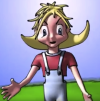
Pokémon Play It! Julie.png
I have to say, this wasn't all that bad. Proportions are pretty good and everything looks nice and polished. I should've probably fixed up the hair a bit and done something better with the feet, but otherwise, I'm happy with this drawing.
That's it for this update! I've got some ideas for something I wanna draw, so I'll probably try to do that and then post them in the next update. Until then!
 
So a few nights ago, I couldn't sleep, so I started a drawing at 11:30 at night and it actually turned out pretty good when I finished it. Here it is!
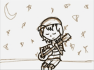
Benjamin Staring into the Moon.jpeg
I'm actually really happy with how this turned out. I tried something new with the trees, and although I could've done them a bit differently, they still came out looking pretty good. The hair is very detailed compared to other art I've done (even with hair strands), and I feel like I've achieved the lighting on the tears very well. The moon shouldn't be so rigid, but otherwise, I think this is really good!

Go ask midnight me why this image is so sad if you want. I guess I was just bored and needed something to draw.
It's kinda funny to think this drawing started off as this:
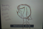
sketch.png
Took this at 1:00 am with my phone, so it's a bad picture, but this was the original sketch. Hard to believe it can change so much into what it is now.

That's it for this update! Until the next one!
 
I'm back with more drawings! There's two of them this time, but I think they're really cool, and you'll see why in this update! Here they are!
For the sake of updates 1.png
So I got bored and decided to draw Benjamin again. Personally, I'm really happy with the shirt sleeves and hair, but its overall execution is also pretty great. The rainbow background actually looks decent this time!
As some of you may know, my Trainer Title used to be Of Gingerbread Cookies and Stuffed Huskies, in reference to Benjamin Cloviet, so I figured it was only fair to draw Pedro and a gingerbread cookie:
For the sake of updates 2.png
This is my first time attempting to draw Pedro, and it could've been better, though it's also okay for a first shot. The tail is oddly disjointed and the fur's all over the place, which makes it look a bit weird, and I even forgot to erase some texturing above the gingerbread cookie, but it's barely noticeable in the smaller version I have.
So I said these were cool. Why? Well, it's in what I'm using them for...
yesinknowhowtodothisnow.png
Yes, I know how to do this now: custom 3DS themes! When I learned how, there was no way I wasn't making one for Benjamin Cloviet, so I went to work on creating this. Unfortunately, I can't tell you what I used to make this––Google is your friend for that. It's very easy, though.

The song that plays with this theme is a custom loop of the song in the spoiler below this. It's an almost perfect loop, with some excess just having been accidentally left over, so I'm going to fix that sometime soon.
I kinda like Japanese stuff. ^v^
That's it for this update! Until the next one!
 
Have some pencil drawings before I lose all my time to school.
Chibi Benjamin.png
This was drawn in ten minutes or so last night and actually turned out decently. The closer sleeve and legs are a little weird, but it was a lazy drawing so I guess it's acceptable.
Edgeworth with Glasses.png
I didn't quite use a reference for this one, so the suit will definitely be off, but I'm pretty happy with the face on this one. It's nice and simplistic, and the hair somehow works. The glasses somehow fit properly too, and I normally have trouble with those.
objection.png
Drew this one in five minutes or so today. It's still quite messy and needs cleaning, but this really didn't turn out bad. I'd even consider this as an avatar. The proportions and hair are so perfect, and it looks really cute. If anything, I'd fix up the pants a bit, but otherwise it's awesome!
That's it for this update! With school having just started, I don't know how much time I'll have left over from school and chat modding (I already had a close call with my staffing position due to school), so updates will probably be either much slower or mostly in pencil. Until the next update, which I hope isn't that long from now!
 
Back with another update! These are mostly pencil sketches, though I did make a new avatar and that will be included!

The first piece here I just drew in the corner of a school worksheet. Not much to look at.
EKnf8b2.jpg

To be honest, for a quick sketch, this isn't all that bad. I should've drawn an extra line by the ear and maybe added the hat, but it's not bad.
The second drawing today is just something I drew during Health and Career, I think. I was just bored and wanted to draw Benjamin and Sakura, so here it is!
6fSXhWm.jpg

This needs some work, especially on the noses and Sakura's proportioning. I'm not even sure why I drew this, other than just being bored. I think the whole idea of this was if Benjamin and Sakura weren't related, but I don't really remember because school is mind-numbing.
The third picture is something I drew at about midnight trying to write more RotI. I was just bored and decided to draw Amber in a school uniform, so here it is!
ljFvTz0.jpg

This isn't what an Academy school uniform would look like. I was "watching" (leaving the tab open and doing other things) an anime OP and saw the uniforms used in that sequence, and I decided to draw Amber in it. It's really not that bad, although it is messy, aside from that one thumb.
The last picture is just something I did for the pure fun of it––Benjamin on a Warp Star. It was something I whipped up quickly after listening to P-R-O-G-R-A-M (Kirby: Planet Robobot) last week at League:
d2IJOfg.jpg

This actually turned out pretty well, and I'm pretty happy with the end result. The legs and arm could use some work, but otherwise, I love it, especially with the perspective on the Warp Star.
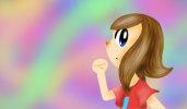
Now, you might recognize that face from somewhere. Just look over to the left of your screen and you'll see why.
Yaay, new avatar.png
I love this. This is just... It's so good~
Seriously though, I'm extremely proud of this, especially with the hair. The face is also really good. Shirt textures could be better but still look nice the way they are.
Now, you might be wondering, "How does she make her art the way she does?" The good news is, you can have a direct look into it! I recorded my screen when I did this drawing, and I uploaded it to my usually dead YouTube channel. I've put the video in the spoiler below!
I forgot to edit in music. Sorry about that.
That's the end of this update! Until the next one!
 
Really beautiful drawings. I like to see sketches with all the construction lines :p

About the second image: I think that simply erasing the pencil marks on the noses would fix them. The boy's ear might need to move away from their eye, like you did with the girl. Also, notice that our neck is attached to the back of our head, and it doesn't come from the middle.

I drew a quick sketch here, in case it's not clear enough:

8c14d8793e.jpg
 
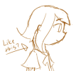
Thanks for the feedback! I understand what you're trying to say and I'll try to incorporate that into my future drawings! Just to clarify, I would draw necks like the below example, right? ^v^

Like this?.png
 
Yep, here are some examples:

a01d6e6b63.jpg


Sorry for making you tilt your head in order to view it, but basically you can see that there is one line, which I bolded, that goes from the back of the head and to the neck. Depending on the direction of the head, there is a slight curve. If the person looks down, the curve would be little, and when the person faces up, the curve would e bigger. Hope that's explains it. :]
 
Thank you so much, Scattered! I've been playing around with those, and while I haven't completely made them work yet, I've been trying my best to!

Today brings more drawings. The first one is actually something I did for Science, where we had an assignment to make a periodic table element a superhero or villain, draw them out, and write a short story about them. I'm not sure if I want to post the story quite yet, but if I do, I'm not entirely sure how I'll do it, since I don't think it deserves its own thread.
14610846_308226042885503_690928921_n (1).jpg
I'm actually pretty happy with the drawing, especially how the suit turned out. I'm pretty sure I'm the only one in my class who decided that a detective would make a good superhero.
The next picture's a bit older, but it's a Lucian drawing I did a few weeks back. Excal used it as his avatar for a bit.
Finished!.png
I really like how this turned out! I feel like the hair shading's a little wonky, and the patterning on the suit's a little too visible, though.
The last one I'll be posting is something I came up with a few days ago. I was playing Rhythm Heaven one night and decided that making a Rhythm Heaven OC was a decent idea, so at 11:30 pm I was up creating a character design for this OC. I'm not even sure why I did it, but it's a decent OC so I'll probably keep him around. Here he is!
Connor Colour Sketch.jpeg
This is the best picture I have on-hand for Connor, so it's not the greatest. I've been playing around with his clothing a bit, and I think I might end up going with more of a sweater or dress shirt in the end. Here's some of the notes I have written down for his character:

• Connor is very musically and rhythmically inclined. He can follow a beat perfectly, ear train songs... things like that.
• A very good dancer, and part of his high school's prolific dance team. He's one of the better dancers on the team, but not the best one, either.
• He's a bit naïve/gullible with new things, especially people that he hasn't properly met. He can be easily manipulated and fed false opinions and rumours while believing them, and he'll even make fun of or bully someone if he's told to and he thinks it's justifiable. Once he gets to know someone, though, it doesn't work on them.
• Is extremely appreciative of his hearing and mobility after what happened to his sister two years ago. Connor was at a dance rehearsal and had just finished a run of the dance when Becky, his sister, approached him. However, one of the other dancers on the team was practicing a move and knocked over a giant speaker, hitting Becky on the back and blasting extremely loud music that burst her eardrums. She instantly starting shrieking for her brother, and while Connor tried his best to help her out and make sure she was alright, her hearing couldn't be saved and she was forced into a wheelchair since she couldn't walk on her own anymore.
• Hates silence. If the world around him goes silent for fifteen seconds or more (oddly specific, I know), Connor gets frightened and begins to be haunted by Becky's cries for help, and if he can't get things louder for about a minute or so, he goes into a nervous breakdown. For this reason, Connor always has music playing through his headphones––to avoid such a thing from happening.
• Has a crush on Sakura Anaman, but she doesn't seem to feel the same way.

I'm working on making a better picture of Connor for my avatar, so expect that to show up anywhere between tonight and Wednesday.
That's it for this update! Until the next one!

10/16/2016 11:25 pm: Made some slight revisions to my new avatar.
Revised Connor Avatar.png
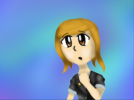
Really happy with this! The shirt actually looks really nice, so I think I'll be sticking with that. The hair also looks really nice and realistic, and the background pops out.
 
Last edited:
Thank you so much, Scattered! I've been playing around with those, and while I haven't completely made them work yet, I've been trying my best to!

Today brings more drawings. The first one is actually something I did for Science, where we had an assignment to make a periodic table element a superhero or villain, draw them out, and write a short story about them. I'm not sure if I want to post the story quite yet, but if I do, I'm not entirely sure how I'll do it, since I don't think it deserves its own thread.
View attachment 12138
I'm actually pretty happy with the drawing, especially how the suit turned out. I'm pretty sure I'm the only one in my class who decided that a detective would make a good superhero.
The next picture's a bit older, but it's a Lucian drawing I did a few weeks back. Excal used it as his avatar for a bit.
View attachment 12139
I really like how this turned out! I feel like the hair shading's a little wonky, and the patterning on the suit's a little too visible, though.
The last one I'll be posting is something I came up with a few days ago. I was playing Rhythm Heaven one night and decided that making a Rhythm Heaven OC was a decent idea, so at 11:30 pm I was up creating a character design for this OC. I'm not even sure why I did it, but it's a decent OC so I'll probably keep him around. Here he is!
View attachment 12140
This is the best picture I have on-hand for Connor, so it's not the greatest. I've been playing around with his clothing a bit, and I think I might end up going with more of a sweater or dress shirt in the end. Here's some of the notes I have written down for his character:

• Connor is very musically and rhythmically inclined. He can follow a beat perfectly, ear train songs... things like that.
• A very good dancer, and part of his high school's prolific dance team. He's one of the better dancers on the team, but not the best one, either.
• He's a bit naïve/gullible with new things, especially people that he hasn't properly met. He can be easily manipulated and fed false opinions and rumours while believing them, and he'll even make fun of or bully someone if he's told to and he thinks it's justifiable. Once he gets to know someone, though, it doesn't work on them.
• Is extremely appreciative of his hearing and mobility after what happened to his sister two years ago. Connor was at a dance rehearsal and had just finished a run of the dance when Becky, his sister, approached him. However, one of the other dancers on the team was practicing a move and knocked over a giant speaker, hitting Becky on the back and blasting extremely loud music that burst her eardrums. She instantly starting shrieking for her brother, and while Connor tried his best to help her out and make sure she was alright, her hearing couldn't be saved and she was forced into a wheelchair since she couldn't walk on her own anymore.
• Hates silence. If the world around him goes silent for fifteen seconds or more (oddly specific, I know), Connor gets frightened and begins to be haunted by Becky's cries for help, and if he can't get things louder for about a minute or so, he goes into a nervous breakdown. For this reason, Connor always has music playing through his headphones––to avoid such a thing from happening.
• Has a crush on Sakura Anaman, but she doesn't seem to feel the same way.

I'm working on making a better picture of Connor for my avatar, so expect that to show up anywhere between tonight and Wednesday.
That's it for this update! Until the next one!
Connor Lockestepp. Where do I know that name from?...
 
Back
Top