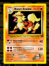
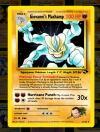
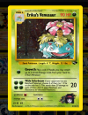
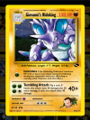
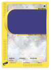
TCG Fakes WOTC Custom Card Creator v1

poketcgshop

Aspiring Trainer
Member
Hi everyone! New member here, huge collector since '99. I am a software engineer by trade, and figured I'd make something fun and exciting for Pokemon fans!

TL;DR; - WOTC Card Creator - Create a Card From Scratch Here - Choose From Existing WOTC Sets Here

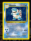
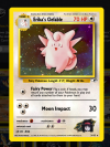
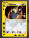
I decided to digitally re-create the WOTC-era Pokemon card templates using HTML & CSS. I was able to re-create the exact proportions of the original cards, and they are scalable! - meaning you can expand and shrink them and they will retain quality. I used all of the original Gill Sans, Humanist, Futura fonts that WOTC used and even found a site that had the TCG backgrounds used from Datacraft Sozajiten.

The ONLY images used (besides the Datacraft Sozajiten BG images) are from the DeviantArt resources for the actual card energy backgrounds (fire, water, grass, metal, etc) - and of course, the Pokemon images themselves. EVERY other image is an SVG, recreated in Illustrator (I will provide all of the SVG's I traced if people want them)

In addition, I noticed the existing card creators out there were rather lacking in features. So, I spent a few months creating what I thought a full-featured WOTC-era card creator should have! Just a glimpse of what I was able to accomplish with the card creator (which was built in ReactJS for any developers on here)

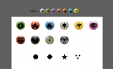
- All card symbols are SVG (lossless quality) - energy symbols, first edition stamp, set symbol, rarity symbols, etc etc
- Ability to change the card energy BG based on Pokemon energy type selected
- Modify ALL info on the card (name, evolves from info, Pokedex info, description, set number, set symbol, illustrator, energy costs, etc)
- Card templates: Base, Gym, Neo, E, VS, Trainer, Energy, Legendary Collection reverse fireworks!
- Ability to have "dark" cards
- Ability to change / remove / add moves (up to 3 on the WOTC templates) - including being able to add up to 5 energies per move, in any order
- Gym templates - ability to change right bottom corner trainer image
- Pokemon & BG image selectors - choose from a pre-existing images library (or use your own hosted image at a URL for complete custom)
- Supports multiple languages! Tested with Japanese, Chinese, & Korean
- Image size tweaking - Ability to change the size, position, & rotation of the Pokemon & BG images
- Different holo sheets - Switch between animated sparkle, old school base set, change to reverse holo, etc
- Blend modes - Choose different blend modes to create really awesome holo and background effects!

I was able to use the card creator to recreate Base through Gym Challenge so far - and I just implemented Neo & E templates so I will start on Neo Genesis next.

Here is a quick video showing what you can do! It is sped up, obviously, just trying to give a preview of some of the features but there are a lot! I would love some feedback from you guys on using it, and if you find any bugs I'd love to know also! I only tested it in Chrome, Firefox, and Safari. It should work on mobile, I added mobile-capable menus to make the UX a little bit better.


And obviously, here is a link to the card creator! - Create a Card From Scratch Here - Choose From Existing WOTC Sets Here

I will be posting updates occasionally on my instagram @poketcgshop - and I appreciate in advance you being my first testers of this really fun card creation tool! I spent hours just playing around creating fun never-before-made cards (like English VS cards and stuff)

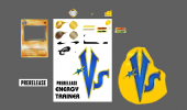
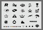
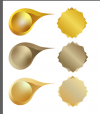
Attached below are screenshots showing the custom SVG's I created by tracing all of the original symbols!

Anyways happy custom card making!
 

Attachments

  • recreated-energies-rarities.png
    recreated-energies-rarities.png
    81.2 KB · Views: 21
  • card-elements-svgs.png
    card-elements-svgs.png
    257.7 KB · Views: 20
  • traced-set-symbols.png
    traced-set-symbols.png
    333.1 KB · Views: 17
Last edited:
Just played with it briefly, but I noticed that longer card names, like Dark Pokémon, shrink. Also noticed that the art frame lacks beveled corners and, if you're trying to make it realistic, Energy/Type should be shaded differently. I think I've got vectors of the Energy icons closer to the actual shading style if you'd like me to send them your way.

EDIT: We also need a way to italicize text.
Thanks for the reply! Yes - that is by design. I tried to create an algorithm for how WOTC sized the text - I actually noticed gym names are a condensed version of the Gill Sans Condensed Bold font - so for longer names like Sabrina's Alakazam I change the font. But - you're right, maybe more flexibility being able to set whether you want a condensed name, non-condensed, etc would be great.

Also - YES on the icons please! I am a developer so my skills are mainly code-based, Illustrator isn't my strong suit but I tried my best to trace and create the shadowing. I would love to actually have a couple of energy icon sets to choose from - I can easily add that feature!

Edit - also I noticed you mentioned beveled corners - yes, I am working on a CSS solution for that as we speak :)

The whole point of this project is to get support and more / better assets from people like yourself, so I am very excited to be posting this here so that we as a community can keep improving it! I will be adding Japanese card templates eventually as well, just have been working on the store portion of the site lately, have a guy who wants to list 20k singles on my site so just doing a lot of testing.

Anyways thanks again, and I will add your icons as soon as you send them!

- Mark
 
Last edited:
Here ya go: https://sta.sh/0t6xz8sx4pa

I made these nearly a decade ago. The symbols themselves could've been traced better (I think I just Live Traced most of these), but they should work well enough at the scale we'll be seeing them. Feel free to tweak them as desired though.

(If the download button isn't working, try using Firefox with Ad Blocker disabled.)

EDIT: Noticed on your Gym template that the Resistance orbs are larger than the Weakness and Retreat orbs.

EDIT 2: And maybe you could change the default apostrophe (') to a curly one (’).
 
Last edited:
Thanks for the symbols! I started implementing them on a separate branch so that I can work on them while I fix other stuff, I may have to tweak them a bit as they have some jagged edges. I am going to try to retain the icons I have since they use clean circle shapes but I will bring over your shading / colors in the next release.

In the meantime - I fixed the 2 issues you found and pushed an update! (You may have to refresh your browser if you were just using the card creator).

- Fixed different energy orb size on gym template
- Made it so the standard (') will show as a curly one even if you type the standard '

Thanks again for finding those bugs! I attached some screens of the updated energy symbols on my other branch so you can see what I mean - the water energy looks good, but colorless is a bit jagged.

Will post another update soon!

-Mark
 

Attachments

  • Screen Shot 2022-02-14 at 1.04.46 AM.png
    Screen Shot 2022-02-14 at 1.04.46 AM.png
    659.1 KB · Views: 16
  • Screen Shot 2022-02-14 at 12.54.32 AM.png
    Screen Shot 2022-02-14 at 12.54.32 AM.png
    585 KB · Views: 16
  • Screen Shot 2022-02-14 at 1.04.00 AM.png
    Screen Shot 2022-02-14 at 1.04.00 AM.png
    126 KB · Views: 16
Hey,
I just checked out your program - it's really awesome!! Very useful for things like Create-a-Card or Fakers Marathon or for own personal use. I have seen many PokeBeach users create their own custom sets using similar software.
However, I feel like this could have negative impact as well. Scammers can use this program to create fake cards, print them, and sell them (sometimes in resealed packs). There are some YouTubers who reveal being scammed like this.
What can we do about this?
Thanks for the kind words! I thought about "locking" the card creator down, by making people create accounts and confirm their email address before they can use the card creator. I can very easily do this (I already have a create account feature), but I thought it would deter people from wanting to use it.

At the very minimum I could make you answer a quick prompt that confirms you're "not a robot" and that you agree to the terms and conditions, which would mention about printing/selling (although I'm sure that wouldn't deter much).

I do think there are enough resources out there already that this shouldn't make much of a difference in terms of the scammers though. At the end of the day, we always have to be careful buying cards and make sure we know what we are looking at. This will make high quality fake cards for sure, but if I am purchasing cards I am paying through a protected service so that if in fact they are proxies, I can prove that and get my money back. I think any card purchase over $600 on ebay now goes automatically to a third party authenticator (CGC if I am not mistaken)

- Mark
 
Hi creators!

I just released another update for you (once again, you may need to refresh to get the latest changes if you are currently on the app).

New in Version 1.1:

- Added embossed frame to give it more of a 3D WOTC frame effect - @Nekoban Ryo mentioned this issue earlier
- Made more adjustments to the name algorithm (trying to find that sweet spot, would love some help with this) - but it is closer
- Fixed trainer image not showing for VS card template
- Added Japanese card back BG image for VS card template
- Fixed "full reverse" holo issue for E series cards
- Added "E Reader ID" field to the card creator for the "ID - 7 - #" value that shows in the stats bar on certain E cards
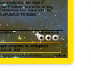
- Show the "Swooshes" behind weakness and resistance values on E cards - (these assets are getting updated to be more accurate)

Coming Soon:

- Finish updating energy symbol shading / colors to more closely match WOTC symbols
- Update Neo / E series "swoosh" weakness/resistance SVG's to more closely match WOTC symbols
- Add gen2 trainer images to selection menu (Faulkner, Pryce, etc)
- Add ability to use custom trainer image URL
- More Pokemon images for the library
- Neo Genesis holo set

Thanks for your continued feedback!

- Mark
 
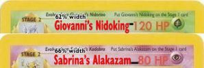
Name is still shrinking for Giovanni's Nidoking.

I don't know if it's possible with coding, but could the name be squished horizontally (not change the font), relative to its distance from the HP? I've found that the space between HP and squished card names is about the width of an en dash for 3 digit HP values or an em dash for 2 digits.
 

Attachments

  • squished.png
    squished.png
    68 KB · Views: 13
Name is still shrinking for Giovanni's Nidoking.

I don't know if it's possible with coding, but could the name be squished horizontally (not change the font), relative to its distance from the HP? I've found that the space between HP and squished card names is about the width of an en dash for 3 digit HP values or an em dash for 2 digits.
Good to know about the space between HP and the name, I must have gone through 1,000 different cards trying to figure out how they sized the text based on name length / stage ?

So the things I was previously doing regarding text sizing via code are changing the letter-spacing to be tighter for larger names, obviously the font-family to ultra-condensed Gill Sans from condensed Gill sans, and adjust the font size itself.

But, to answer your question - YES - I can also adjust the "font-stretch" property which can give the "squishing" effect. I am going to experiment now on a bunch of cards and see if I can come up with an algorithm for this.

https://developer.mozilla.org/en-US/docs/Web/CSS/font-stretch
 
Last edited:
Just to give some more info, here is my current algorithm for adjusting the name:

"small" - name length > 18 characters (includes spaces, ', etc)
"condensed" - not basic & name length >= 15 characters OR name length > 20 characters,
"extra-condensed" - can be turned on or off via a setting

The problem is, instead of making the font name "smaller" (in the case of "Giovanni's Nidoking") - I need to use font-stretch - I noticed WOTC doesn't shrink the font size, rather squeezes it together more, like you mentioned!
 
Side note - just also traced the Japanese 1st ed logo to SVG, today's update will feature VS card templates in first edition now showing the Japanese 1st edition logo SVG :)

It won't let me attach the SVG also so if anyone wants to tweak it, let me know I can email it. It is very close!
 

Attachments

  • Screen Shot 2022-02-15 at 12.12.25 PM.png
    Screen Shot 2022-02-15 at 12.12.25 PM.png
    281.2 KB · Views: 5
hi. thank you so much for your hard work and time.
it's great to have people like you in our hobby ;)
Thanks for the kind words! It's funny - one of my very first websites when I was a 14 years old in 2000 was providing blank Pokemon card templates, and now 22 years later I have a working card simulator!

So I just pushed an update and it is live on the app! (refresh your browser ;) )

Changes:

- Revised the name sizing a bit - I am unable to use font-stretch with Gill Sans, I guess it does not support stretching. I am using scaleX() function in CSS to do it instead, and it works the same. I think I may just give users the ability to override the default algorithm with a slider that changes how condensed the text is :)
- Added first edition logo SVG for E series templates
- Updated the default algorithm for name sizing: (I have 3 levels of "condensing" for now, I can add breakpoints if needed).

'card-name--condensed': not basic and name > 14 chars
'card-name--x-condensed': not basic and name >= 18 chars,
'card-name--xx-condensed': not basic and name >= 20 chars

Here are some tests using gym card set, and a preview of the E first ed logo. I still have to revise the move name sizing algorithm also - and the line break points. I can manually insert line breaks in the move descriptions if I need to, but I'd prefer to determine how WOTC determined it before having to modify all of the descriptions to add breaks for 100% accuracy.

- Mark
 

Attachments

  • Screen Shot 2022-02-17 at 4.34.29 PM.png
    Screen Shot 2022-02-17 at 4.34.29 PM.png
    429 KB · Views: 14
  • Screen Shot 2022-02-17 at 4.34.03 PM.png
    Screen Shot 2022-02-17 at 4.34.03 PM.png
    543.9 KB · Views: 14
  • Screen Shot 2022-02-17 at 4.33.20 PM.png
    Screen Shot 2022-02-17 at 4.33.20 PM.png
    578 KB · Views: 11
  • Screen Shot 2022-02-17 at 4.32.01 PM.png
    Screen Shot 2022-02-17 at 4.32.01 PM.png
    608.4 KB · Views: 13
  • Screen Shot 2022-02-17 at 4.30.02 PM.png
    Screen Shot 2022-02-17 at 4.30.02 PM.png
    579.2 KB · Views: 14
Hi again! No new updates for today, just a quick question -

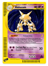
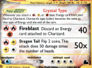
Has anyone ever recreated the background for the WOTC E series Crystal cards? I searched and came up empty, I am trying to see what I can do to easily recreate it in Photoshop.

I also realize today that I have a "dark" frame option but not a "light" option for Light Neo Destiny cards, so adding that to the TO-DO list for next release.

- Mark
 

Attachments

  • Screen Shot 2022-02-19 at 3.16.32 PM.png
    Screen Shot 2022-02-19 at 3.16.32 PM.png
    1 MB · Views: 10
Asche attempted it IIRC, but I think he dropped it because the sheer number of variations there would be. It'd be easy(ish) to rip if all the Crystal Pokémon shared the same texture. :/

Neither are spot on, but I do remember seeing a couple nice Crystal fakes from the community: a Crystal Steelix (Hold3r) and Crystal Manaphy (Delta/Zygarde). I think both used my old, unofficial Crystal texture as a base, or manipulated my Ice texture.
 
Last edited:
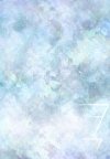
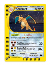
That ice texture you provided seems close! I brought it into Photoshop and layered a couple of the triangular crystals from the original WOTC crystal background template over the top, but mainly kept your ice texture unchanged. It may not be 100% but I think it looks pretty awesome on the cards! A quick crystal charizard from Skyridge attached below.

Also just an FYI this is not live in the app yet, I am just testing first. I will be publishing both this feature as well as the "light" option for Neo destiny light cards sometime tomorrow. Thanks as always for your help!

- Mark
 

Attachments

  • crystal.jpg
    crystal.jpg
    98.8 KB · Views: 13
  • Screen Shot 2022-02-21 at 10.57.29 PM.png
    Screen Shot 2022-02-21 at 10.57.29 PM.png
    445.4 KB · Views: 10
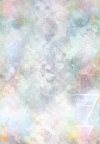
It's still far from perfect, but here's an edited version. I desaturated it and blended my Japanese Colorless texture (with a twirl effect) into it to sort of imitate that rainbow effect around the edges.

I believe the actual Crystal textures use a Colorless texture with the other textures clipped to blurred light ray shapes, with lowered opacity if you want to give it a try yourself in the future. Just might want to make it a universal Crystal texture by implementing all the classic textures/colors. (Attempted it myself earlier but screwed it up.)

EDIT: Attempted it again. Still needs the sparkle effects added though.
 

Attachments

  • crystal2.jpg
    crystal2.jpg
    97.5 KB · Views: 9
  • crystal3.jpg
    crystal3.jpg
    96.6 KB · Views: 8
Last edited:
It's still far from perfect, but here's an edited version. I desaturated it and blended my Japanese Colorless texture (with a twirl effect) into it to sort of imitate that rainbow effect around the edges.

I believe the actual Crystal textures use a Colorless texture with the other textures clipped to blurred light ray shapes, with lowered opacity if you want to give it a try yourself in the future. Just might want to make it a universal Crystal texture by implementing all the classic textures/colors. (Attempted it myself earlier but screwed it up.)

EDIT: Attempted it again. Still needs the sparkle effects added though.
Wow! Looks much better and closer to the end goal! I implemented your first pre-edit image, just published the changes!

In this current update I also included the "light" frame mode functionality, and changed the control to a dropdown so you can select between dark, light, or none (default) for frame mode. - Oh and if you want to select "crystal" type, I added an extra colorless energy to denote the crystal type at the end of the energy selector - it's just a blue colorless energy because I didn't have or find a "crystal" energy icon quickly, but I can tweak later.

Also I removed the Pokemon moves so you can see the full background, attached image below!

I realized after the fact I need to tweak the horizontal lines near the name / evo box (and the evo boxes themselves a bit), will push a separate update in 1-2 days with that fix. Attached the current ones below, the coloring and shapes are slightly off, but they are layered Illustrator objects, and easy to tweak :)

Thanks as always for your contribution! I knew this forum would be a great place to post this tool to make it perfect!

- Mark
 

Attachments

  • Screen Shot 2022-02-24 at 1.58.20 PM.png
    Screen Shot 2022-02-24 at 1.58.20 PM.png
    625.1 KB · Views: 10
  • Screen Shot 2022-02-24 at 2.01.08 PM.png
    Screen Shot 2022-02-24 at 2.01.08 PM.png
    67.2 KB · Views: 8
Same texture, just subtly more saturated around the edges.

View attachment 16448

You'll be making those Weakness and Resistance "swooshes" larger, right? Also, if you need textures for them, feel free to rip them from my Japanese Neo PSD.
Yes! The swooshes have been on my TODO list for a while! My initial tracing of them was poor due to the bad quality of the photos I was working with (and also the energy symbol blocking them) but your PSD helped tremendously since I was able to hide that layer! Thank you so much!!!

Attached a screenshot of where I'm at with completely re-tracing the swooshes - I have the shape perfectly created as SVG using the pen tool in Illustrator, now I just have to overlay that "cloudy" pattern and get that under-shadow effect (looks like white on the left, black on the right from the template you linked)

From looking at a bunch of different card templates it looks like the swooshes themselves are somewhat transparent and show part of the card's energy background - that's good news as I won't have to make different ones for each different card energy type.

Also - this crystal background template is getting better and better! Attached an updated E crystal template (still has the old swooshes but you can get an idea at least).

Once I finish the swooshes I will update the live app with them and the new crystal BG!

Thanks as always!

- Mark
 

Attachments

  • Screen Shot 2022-02-26 at 10.05.11 PM.png
    Screen Shot 2022-02-26 at 10.05.11 PM.png
    140.1 KB · Views: 12
  • Screen Shot 2022-02-26 at 10.19.32 PM.png
    Screen Shot 2022-02-26 at 10.19.32 PM.png
    1.1 MB · Views: 13
Back
Top